London holds around 8.8 million residents according to the 2021 census, with current estimates closer to 9.1 million, making it the most populated city in Western Europe. It covers 607 square miles (1,572 km²). The 2021 census recorded an overall density of 5,598 residents per square kilometre (14,499 per sq mi), more than double the density of other major English cities. At comparable regional scale, that puts London well above the New York or Paris metropolitan areas, both of which spread population across far larger surrounding territories. Paris city proper appears dramatically denser, at around 20,000 per km², but only covers 41 square miles (105 km²), roughly the area of Haringey. The comparison changes entirely depending on which boundary you draw.
Inside London, the distribution of that population is anything but uniform. Over 47% of the city’s land area is green space in some form — parks, commons, private gardens, tree canopy and open water. Large portions of the outer ring are protected by Metropolitan Green Belt designation, with restrictions on residential development that have been in place since the mid-20th century. What that means in practice is that the city’s residential density is compressed into a much smaller proportion of its physical footprint than the overall figures suggest. Within that built residential zone, the variation between boroughs is astonishing. The lowest density is 2,197 residents per square kilometre (5,690 per sq mi) and the highest is 15,802 per km² (40,929 per sq mi).
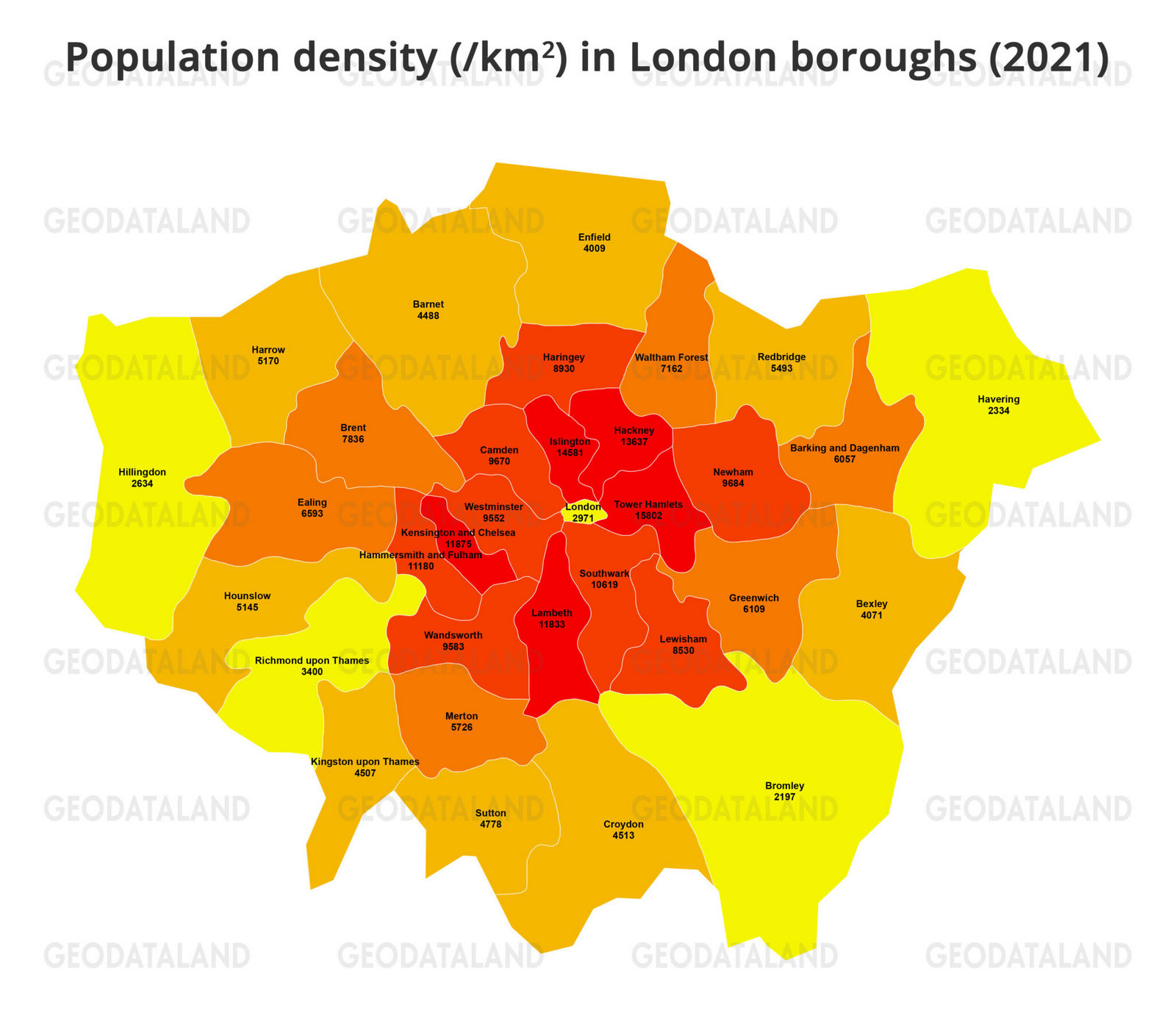
The map below, created by Geodataland, shows the population density of London boroughs.
Tower Hamlets is not merely London’s most densely populated borough. It is the most densely populated local authority in England and has the fastest-growing population of any local authority area across England and Wales
Islington ranks second nationally and Hackney third. The top 20 most densely populated local authority areas in England are all London boroughs.
Bromley’s position at the other end of the scale. Around 60% of the borough falls within Metropolitan Green Belt or Metropolitan Open Land, which prevents most residential development. At 58 square miles (150 km²), it is also London’s largest borough by area.
The City of London registers as a separate case. Resident density is 2,971 per km² (7,695 per sq mi), near the bottom of the table. The census counts only the people who sleep within the square mile. On a busy working day, between 500,000 and one million people pass through, but the density figure is based on usual residents, not daytime workers.
Inner London as a whole averaged 10,260 per km² (26,573 per sq mi) in 2021, compared to 4,502 per km² (11,660 per sq mi) across the outer boroughs. That roughly 2.3 to 1 ratio between inner and outer has been broadly consistent for more than a century.
Westminster comes in lower than its location might suggest, at around 9,510 per km² (24,631 per sq mi). Large parts of the borough are given over to commercial, governmental and royal uses, particularly around St James’s and Mayfair, where few people permanently reside. Newham illustrates the reverse: classified as an outer borough for statutory purposes, it reaches 9,694 per km² (25,107 per sq mi), above Westminster and comparable to Wandsworth. Barking and Dagenham, east of the traditional inner ring, still records 6,063 per km² (15,703 per sq mi), higher than several boroughs that are geographically more central.
Borough
Zone
Density per km²
Density per sq mi
Tower Hamlets
Inner
15,802
40,927
Islington
Inner
14,512
37,585
Hackney
Inner
13,519
35,014
Kensington and Chelsea
Inner
11,832
30,645
Lambeth
Inner
11,819
30,611
Hammersmith and Fulham
Inner
11,131
28,829
Southwark
Inner
10,480
27,143
Camden
Inner
10,069
26,079
Newham
Outer†
9,694
25,107
Westminster
Inner
9,510
24,631
Wandsworth
Inner
9,503
24,613
Haringey
Outer†
9,152
23,704
Lewisham
Inner
8,595
22,261
Brent
Outer
7,804
20,212
Waltham Forest
Outer
7,083
18,345
Ealing
Outer
6,422
16,633
Greenwich
Inner
6,123
15,859
Barking and Dagenham
Outer
6,063
15,703
Merton
Outer
5,573
14,434
Redbridge
Outer
5,481
14,196
Harrow
Outer
5,158
13,359
Hounslow
Outer
4,982
12,903
Kingston upon Thames
Outer
4,767
12,347
Sutton
Outer
4,735
12,264
Barnet
Outer
4,554
11,795
Croydon
Outer
4,520
11,707
Enfield
Outer
4,110
10,645
Bexley
Outer
4,077
10,559
Richmond upon Thames
Outer
3,416
8,847
City of London
Inner**
2,971
7,695
Hillingdon
Outer
2,676
6,931
Havering
Outer
2,315
5,996
Bromley
Outer
2,197
5,690
†Newham and Haringey are statutory Outer London boroughs but are grouped with Inner London for ONS statistical purposes. **The City of London is a separate ceremonial county, not a London borough. Its density reflects usual night-time residents only; daytime population typically reaches 500,000 to 1,000,000.
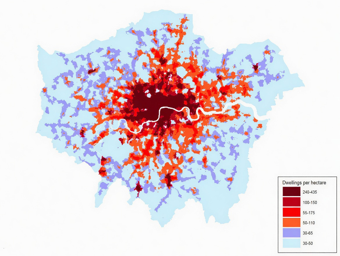
Population density and housing density track each other closely in London, because the same historical forces shaped both. The map below plots dwellings per hectare across a 200m × 200m grid from 2015 LSOA data.
The map above uses 2015 LSOA housing data on a 200m x 200m grid, recording homes per hectare in each square. Parks, roads, hospitals and industrial areas have been removed where possible, so the focus is on genuinely residential land.
Density (dw/ha)
Per km² (dwellings)
Per sq mile (dwellings)
Housing character
Typical location
30–50
3,000–5,000
7,800–13,000
Detached and semi-detached houses, gardens, driveways
Outer boroughs, e.g. Bromley, Bexley, Havering
30–65
3,000–6,500
7,800–16,800
Semi-detached houses, wider suburban terraces
Outer zones, e.g. parts of Barnet, outer Ealing
50–110
5,000–11,000
13,000–28,500
Victorian and Edwardian terraces, some low-rise conversions
Tower blocks, large housing estates, heavily converted rows
Densest pockets of inner London, e.g. Tower Hamlets
Most of what these maps show was established before the First World War. London’s Victorian and Edwardian industrial economy concentrated employment in docklands, factories and warehouses within a few miles of the old city core. Workers lived close because they had to: daily rail travel was beyond the means of most. Between roughly 1840 and 1914, a vast programme of terraced housing was built across what are now Hackney, Islington, Lambeth, Southwark and Tower Hamlets to house that working population. Those streets are still standing. Even as the industries that created them closed or relocated, the housing remained, and the density that came with it.
The railways and, from 1863, the London Underground created a parallel process for the middle classes. Commuter lines extending south from London Bridge and Victoria, west toward Richmond and Ealing, and north toward Barnet and Enfield allowed people who could afford fares to live further from their workplace. The housing built along those routes was designed around the assumption of a garden, a driveway and separation from neighbours. The outer boroughs’ lower density is the physical legacy of that demographic sorting, done largely in the interwar period.
The green belt codified the result. The Town and Country Planning Act 1947 gave local authorities the power to restrict outward development, and subsequent national policy formalized a protected ring around London that prevents residential land from being created at the city’s edge. Rather than spreading outward, growth pressure has been redirected back into the existing urban area. Post-war reconstruction reinforced this: in Tower Hamlets, Southwark and Lambeth, where wartime bombing had cleared large areas of Victorian housing, the replacement was not low-rise suburban streets but council housing estates, built to higher densities on a smaller footprint. The inner boroughs were rebuilt denser than they had been before.
Bromley’s trajectory ran the opposite way. Most of its built environment dates from interwar suburban expansion along the southern rail routes. The Metropolitan Green Belt designation that now covers around 60% of the borough preserves that low-density character. It is the continuation of a development pattern already in place, not a new constraint on one that might otherwise have been different.


")


