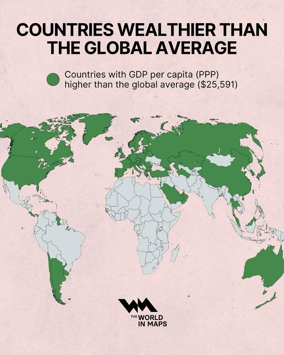
We hear about GDP all the time, but what happens when you compare the average person’s income across the world, not just total national wealth? That’s exactly what the map created by @TheWorldinMaps does.
Using data from the International Monetary Fund (IMF), 2024, it shows which countries have a GDP per capita (PPP) higher than the global average of $25,591.
Most of Europe, North America, Oceania, and parts of East Asia are in the green. So are a few countries in the Middle East, South America, and Central Asia. Meanwhile, most of Africa and South Asia remain below the average.
It’s important to note that this uses purchasing power parity (PPP), which adjusts for differences in cost of living. So even though $10 might buy lunch in one country and barely a coffee in another, PPP tries to smooth that out for better comparisons.
This kind of map doesn’t tell the full story of inequality, quality of life, or opportunity—but it does give a useful starting point for understanding how wealth is distributed around the world.
The Richest and Poorest Countries in 2024
Let’s take a look at who’s at the top—and who’s at the bottom—based on World Bank data.
Top 10 Richest Countries (GDP per capita, PPP):
Rank
Country
GDP per capita (PPP, USD)
1
Luxembourg
$150,772
2
Singapore
$150,689
3
Ireland
$131,175
4
Macao SAR
$128,268
5
Qatar
$126,110
6
Bermuda
$119,719
7
Norway
$101,032
8
Switzerland
$93,819
9
Brunei Darussalam
$90,007
10
Cayman Islands
$86,689
11
United States
$85,810
Bottom 10 Poorest Countries (GDP per capita, PPP):
Rank
Country
GDP per capita (PPP, USD)
1
Burundi
$950
2
South Sudan
$1,155
3
Central African Republic
$1,264
4
Somalia
$1,601
5
Mozambique
$1,700
6
Congo, Dem. Rep.
$1,710
7
Eritrea
$1,742
8
Malawi
$1,859
9
Madagascar
$1,884
10
Liberia
$1,885
That’s a difference of over $140,000 per person between the top and bottom.
How Has This Changed Over Time?
Some countries have moved up fast. China, for instance, went from around $2,964 in GDP per capita (PPP) in 2000 to over $27,105 today (World Bank). That’s almost a tenfold increase.
Vietnam has seen its figure jump from just over $2,500 in the early 2000s to more than $16,386now. Even countries like Bangladesh – long considered one of the poorest – are climbing quickly. It’s currently around $9,647 in PPP terms.
Meanwhile, some richer countries like Japan and Italy have grown more slowly. Their positions haven’t fallen drastically, but they’re not pulling away from the pack anymore.
What’s also changing is the way countries build their wealth. Singapore, Ireland, and Luxembourg aren’t resource-rich—but they’ve become economic hubs thanks to finance, tech, logistics, and (in some cases) favorable tax regimes. In contrast, countries like Qatar and the UAE have used energy wealth to build infrastructure and diversify.
What Else Stands Out?
Small countries lead the ranking. Luxembourg, Ireland, Singapore, and San Marino may not be large, but they punch well above their weight in income per person.
Size doesn’t mean prosperity. India has the 5th-largest economy by total GDP, but its GDP per capita (PPP) is under $11,159.
Energy still plays a big role. Qatar and the UAE remain near the top thanks to their oil and gas sectors, although they’re investing heavily in other industries.
If you’re curious to dig deeper, check out the full World Bank Database. You can search by country, region, or metric.