To emphasize the significant influence of democracy on our general well-being, I have created some more visual representations that highlight the correlation between the democracy index and other measures of quality of life such as GDP per capita, life expectancy, and the Happiness Index. These graphics aim to shed light on the symbiotic relationship between democratic values and key indicators that contribute to our collective quality of life. As we navigate an era where democracy faces challenges, it is crucial to appreciate the value it brings to the fundamental aspects of our societal health and prosperity.
Interrelationship of the Democracy Index and GDP per capita
While there is a general belief that democracy and economic development are positively correlated, the relationship is nuanced. Democracies are thought to provide a conducive environment for economic growth by fostering political stability, ensuring the rule of law, and protecting property rights. Citizens’ participation in the decision-making process and the presence of accountable institutions are seen as factors that can contribute to long-term economic development.
Conversely, high GDP per capita levels can also influence the strength and stability of democratic institutions. Wealthier nations may have the resources to invest in education, infrastructure, and social programs, which can, in turn, contribute to the sustainability of democratic practices.
However, this correlation is not universal, and exceptions exist. Some countries with high GDP per capita exhibit less democratic governance, and certain authoritarian regimes may achieve economic success in the short term. Additionally, achieving a balance between democratic principles and economic growth requires navigating various challenges, including issues of inequality, corruption, and the distribution of resources.
The world map below shows the interrelationship between the democracy index and GDP per capita. North American and Western European democracies boast some of the highest GDP per capita globally.
Based on the 2022 Democracy Index published by the Economist Group, there are 24 full democracies, 48 flawed democracies, 37 countries with hybrid regimes, and 57 authoritarian states.
Full democracy countries boast the highest average GDP per capita at $53,959. Flawed democracy countries, on the other hand, have a GDP per capita more than twice as low, at $18,183. Authoritarian countries claim the third position in the ranking, with an average GDP per capita of $7,905. Finally, hybrid democracies exhibit the lowest level of GDP per capita, averaging $4,905.
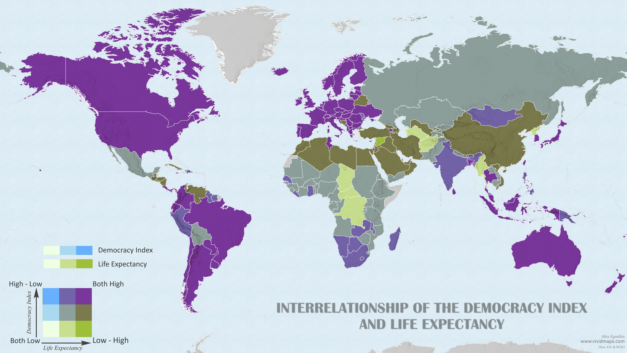
Interrelationship of the Democracy Index and Life Expectancy
Democratic societies often prioritize individual freedoms, access to healthcare, and social welfare programs, creating an environment conducive to better public health outcomes. Citizens in democratic nations may have greater access to healthcare services, disease prevention measures, and educational resources that collectively contribute to increased life expectancy.
Conversely, non-democratic regimes may face challenges in providing equitable access to healthcare, enforcing public health policies, and ensuring overall well-being for their populations. Political instability, lack of transparency, and inadequate public services in non-democratic settings can negatively impact health outcomes.
In general, there is a positive correlation between democracies and higher life expectancy.
Here is the map of the world that shows the interrelationship of the democracy index and life expectancy.
On average, residents of full democracy countries live for 81.85 years, while those in flawed democracies live for 75.83 years. Countries with hybrid regimes have an average life expectancy of 71.40 years, while in authoritarian countries, it averages 69.87 years.
Interrelationship of the Democracy Index and Happiness Index
However, it’s crucial to recognize that the relationship between democracy and happiness is intricate. Various factors, including economic conditions, social equality, mental health support, and cultural values, play significant roles in shaping the happiness of a population. Additionally, some democratic nations may grapple with challenges related to inequality, and certain non-democratic countries may exhibit high levels of happiness despite limitations on political freedoms.
The map below shows the interrelationship between the democracy index and happiness index.
On average, residents of democratic countries have a happiness index of 6.89, while those in flawed democracy countries have a slightly lower index of 5.86. The lowest average happiness index is observed in hybrid regime and authoritarian countries, at 4.92 and 4.87, respectively.
What other indicators of quality of life and the democracy index do you think would be interesting to visualize?
For a deeper understanding of democracy and its impact on nations, explore the following books.


")


All 3 bubble charts are Democracy / GDP Per Cap. Please fix. Very interesting info.