The World’s Biggest Governments, Mapped
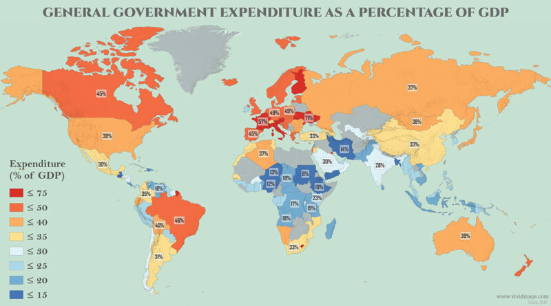
Kiribati’s government spends 98% of the country’s GDP, the highest share on earth. A cluster of wealthy European countries very nearly match that number, for an entirely unrelated reason.
Read MoreMaps to explain economic geography.
Kiribati’s government spends 98% of the country’s GDP, the highest share on earth. A cluster of wealthy European countries very nearly match that number, for an entirely unrelated reason.
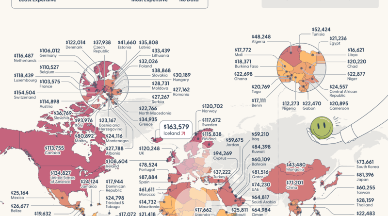
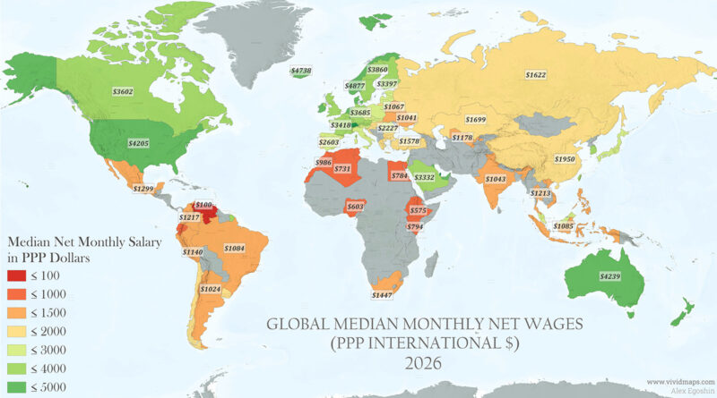
Read MoreResearchers at Purdue University found there’s a specific income level where more money stops improving how you feel about your life. That threshold is very different depending on where you live: $163,579 in Iceland, $134,827 across the U.S., and just $10,176 in Ethiopia. Only one country’s average wages actually cover the cost.
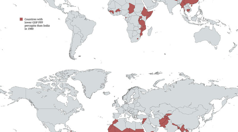
Read MoreIn 1980, India had a per capita income of $533. China was even lower at $275. Both sat near the very bottom of global income rankings. By 2026, India has climbed to $12,964, passing roughly 60 countries on that measure. China, however, has reached $31,023 — more than double India’s figure.
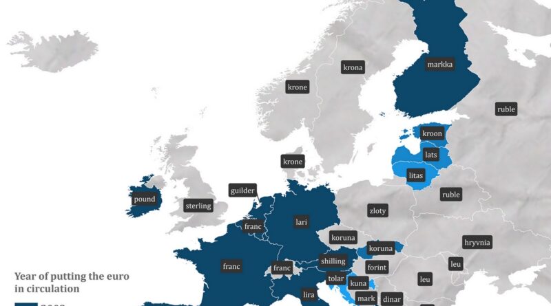
Read MoreGermany used marks, France used francs, Italy used lira, Spain used pesetas. This map shows the currency each European country used before the euro.
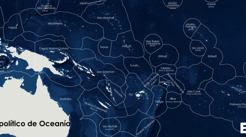
Read MoreA political map of Oceania shows the region’s vast Exclusive Economic Zones, where small island states like French Polynesia, Micronesia, and the Marshall Islands control huge ocean territories.
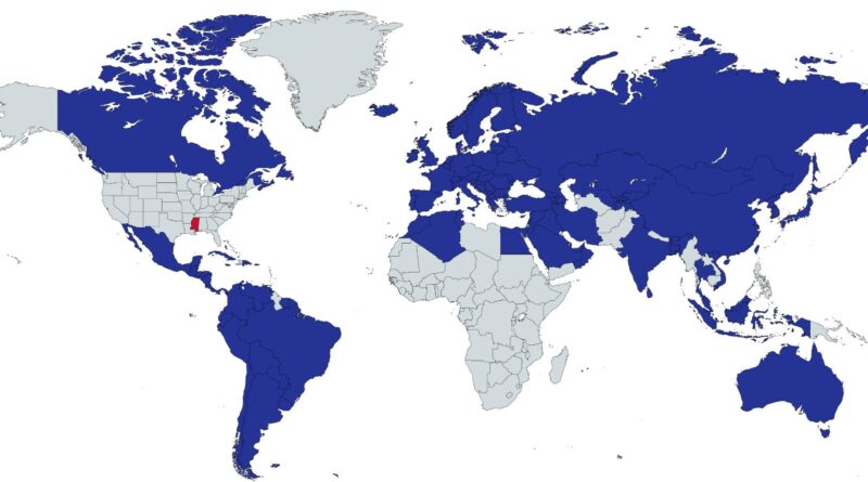
Read MoreHow does the poorest U.S. state look next to nations around the world? Life expectancy, HDI, and GDP per person show some unexpected contrasts.
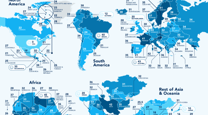
Read MoreHow much paid leave do workers get around the world? This maps reveal major global differences – from generous European policies to countries where paid vacation is rare.
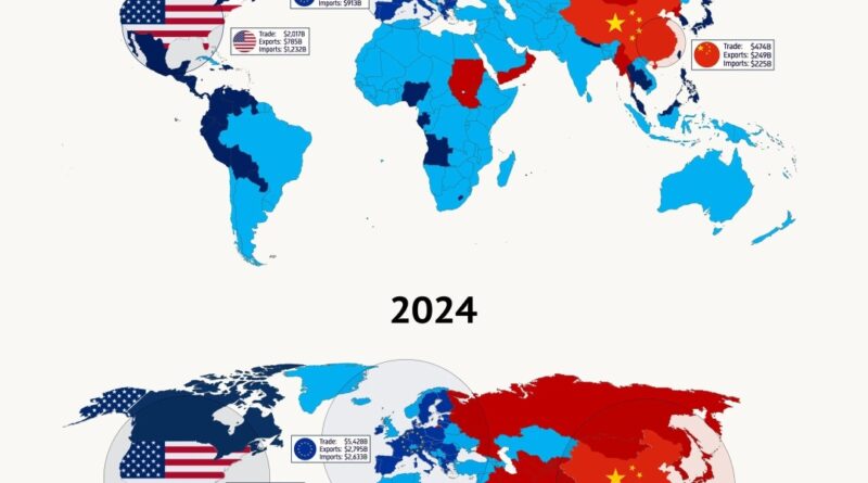
Read MoreA side-by-side world maps show how global trade has changed since 2000. China has rapidly expanded its influence, becoming the top trading partner for much of the world – overtaking both the U.S. and the EU in many regions.
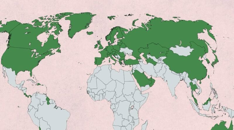
Read MoreThis map shows which countries have a GDP per capita (PPP) above the global average. It offers a clear visual of the world’s economic divide – where wealth is concentrated, and where it’s not.
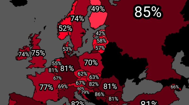
Read MoreA new map shows how many people in each European country support higher taxes on the wealthy. The differences may surprise you—see where your country stands.
Read More