Absolute and relative inequality among U.S. counties in life expectancy & age-specific mortality risks
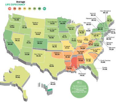
By 2014, life expectancy in the U.S. had increased for men and women to 79.1 years. But there’s a gap of more than 20 years between counties with the lowest and highest life expectancies.
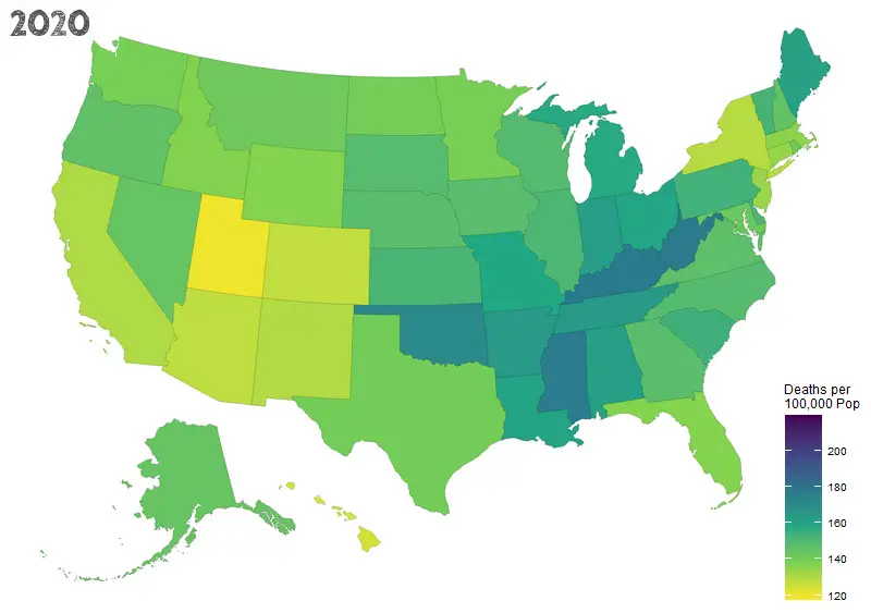
Between 1980 and 2014, life expectancy at birth for both sexes combined in the United States increased by 5.3 (95% UI, 5.3-5.4) years, from 73.8 (95% UI, 73.7-73.8) to 79.1 (95% UI, 79.0-79.1) years (6.7 [95% UI, 6.7-6.8]) years, from 70.0 [95% UI, 70.0-70.0] to 76.7 [95% UI, 76.7-76.8] for men; 3.9 [95% UI, 3.9-4.0] years, from 77.5 [95% UI, 77.5-77.6] to 81.5 [95% UI, 81.4-81.5] for women). This masks massive variation at the county level; however, counties in central Colorado, Alaska, and along both coasts experienced much larger increases, while some southern counties in states stretching from Oklahoma to West Virginia saw little, if any, an improvement over this same period.
Absolute geographic inequality in life expectancy at birth increased between 1980 and 2014, with the gap between the 1st and 99th percentile increasing by 2.4 (95% UI, 2.1-2.7) years.
Source: jamanetwork.com


