Demography
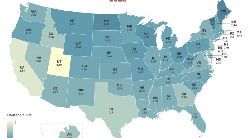
American Households Keep Shrinking
Average household size in America ranges from 2.99 people in Utah to just 1.99 in Washington D.C. Using recent Census data, this map visualizes how household size varies dramatically across the United States. Utah’s higher birth rates and California’s diverse population contribute to larger households, while Vermont, Maine, and D.C. show the smallest. The national average stands at 2.55 people per household, down from 3.33 in 1960.
Read More
Child mortality is decreasing throughout Africa
Via www.ourworldindata.org
Read MoreThe German States compared to countries of similar size & population density
Germany consisting of 16 administrative units known as states. Germany has a population density of about 227 per square kilometer,
Read MoreThe average age in Germany according to the latest issue of “die Zeit”
The median age of Germans in 2017 was 47.1 years (male – 46.0; female – 48.2 years), implying that half
Read More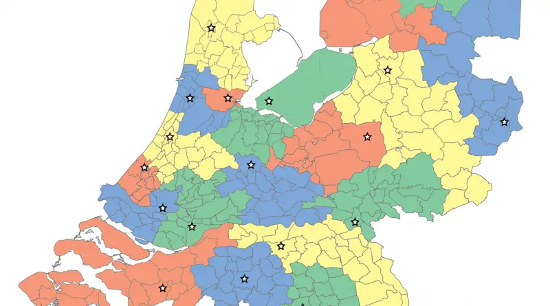
Unpacking Population Density in the Netherlands: A Land of Compact Living
Delve into the unique aspects of population density in the Netherlands, one of Europe’s most densely populated countries. From the bustling urban areas of the Randstad to the innovative solutions like floating homes and vertical living, discover how the Dutch manage their crowded land efficiently and sustainably. Learn about the historical factors, current challenges, and future outlook of this compact yet thriving nation.
Read More% of the population aged 65 older in 2010
United States younger than much of Europe and Japan, older than most other region. Top 10 countries with the highest
Read More