Life expectancy in the United States
Life expectancy is determined as the average number of years that a person could expect to live if they experienced the age-specific mortality rates prevailing in a given nation in a select year. It does not include the impact of any future decline in age-specific mortality rates.
In 1930, life expectancy at birth in the United States was 58 for men and 62 for women. By 2001, the average U.S. life expectancy was 74 for men and 80 for women. In 2018 the average life expectancy was 80 years for males and 84 years for females. According to forecasts, life expectancy in the United States to rise 86 by 2075 and to 88 by the end of the century. The maps below show life expectancy by U.S. state and U.S. county.
Table of Contents
Life expectancy by U.S. state

In the orange-colored U.S. states, many people live inactive lifestyles; They don’t get involved in physical activity regularly enough. Eat carb-laden diets with laughably large portions suffer from poor education or poverty.
In the U.S., black Americans have lower life expectancies than white Americans. For example, white Americans born in 2010 are expected to live until age 78.9, but black Americans only until age 75.1. This 3.8-year gap, however, is the lowest it has been since 1975 at the latest. The most significant difference was 7.1 years in 1993. In opposition, Asian-American women live the longest of all ethnic groups in the U.S. (85.8 years). The life expectancy of Hispanic Americans is 81.2 years.
The map below show life expectancy by U.S state and comparable nations.
Live expectancy by U.S. states and comparable countries
California has the same life expectancy as Canada. While in Mississippi, life expectancy corresponds to that of Belarus.

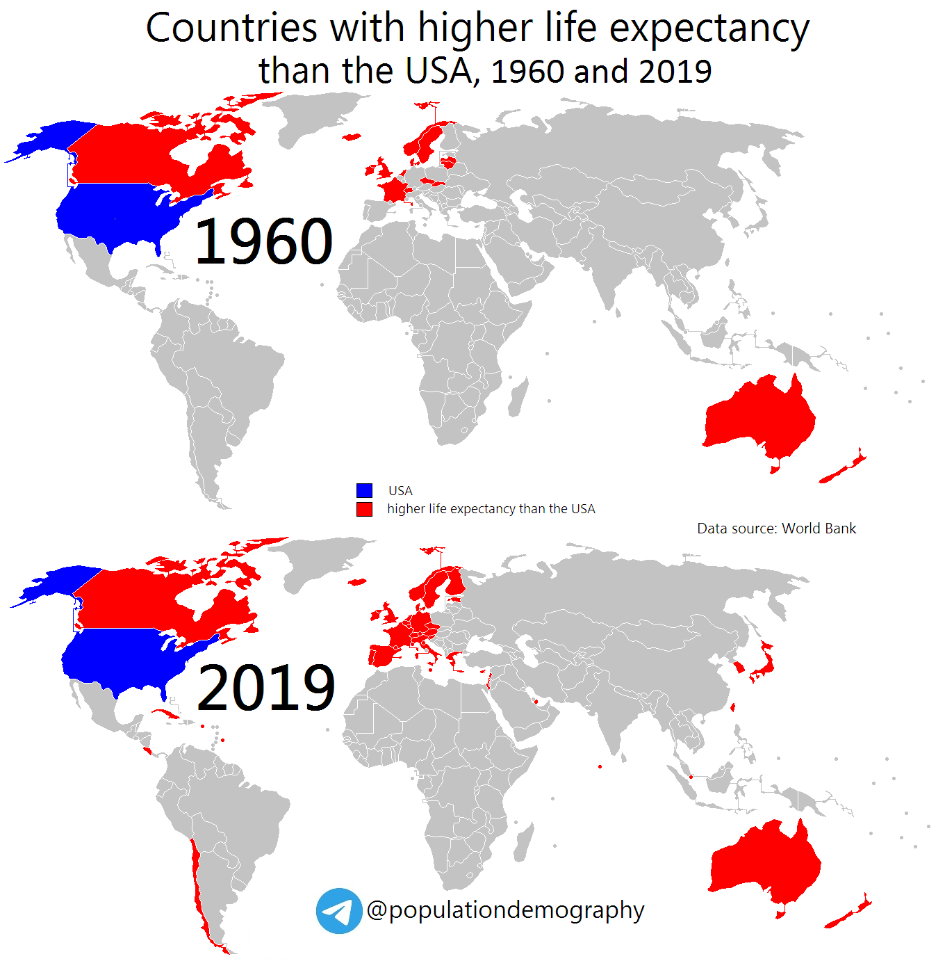
Countries with higher life expectancy than the United States are predominantly located in Europe.
Countries with higher life expectancy than the United States: 1960 vs 2019
And finally, a map of life expectancy in the United States by county.
Life Expectancy by U.S. county

20 U.S. counties with the highest life expectancies (years)
1. Summit County, CO – 86.83
2. Pitkin County, CO – 86.52
3. Eagle County, CO – 85.94
4. Billings County, ND – 84.04
5. Marin County, CA – 83.8
6. Aleutians East Borough, AK – 83.73
7. Aleutians West Census Area, AK – 83.73
8. San Miguel County, CO – 83.73
9. Fairfax City, VA – 83.73
10. Fairfax County, VA – 83.73
11. Douglas County, CO – 83.72
12. Presidio County, TX – 83.72
13. San Juan County, WA – 83.7
14. Hinsdale County, CO – 83.66
15. Los Alamos County, NM – 83.49
16. Teton County, WY – 83.46
17. Collier County, FL – 83.43
18. Loudoun County, VA – 83.19
19. Santa Clara County, CA – 83.14
20. San Mateo County, CA – 83.11
20 U.S. counties with the lowest life expectancies (years)
1. Oglala Lakota County, SD – 66.81
2. Union County, FL – 67.57
3. Todd County, SD – 68.51
4. Sioux County, ND – 68.59
5. Buffalo County, SD – 69.05
6. Owsley County, KY – 70.21
7. Breathitt County, KY – 70.22
8. McDowell County, WV – 70.27
9. Perry County, KY – 70.6
10. Kusilvak Census Area, AK – 70.83
11. Tunica County, MS – 70.93
12. Holmes County, MS – 71.01
13. Dewey County, SD – 71.02
14. Coahoma County, MS – 71.14
15. Wolfe County, KY – 71.15
16. Leslie County, KY – 71.17
17. Roosevelt County, MT – 71.2
18. Phillips County, AR – 71.28
19. Mingo County, WV – 71.38
20. Harlan County, KY – 71.45

")

?")


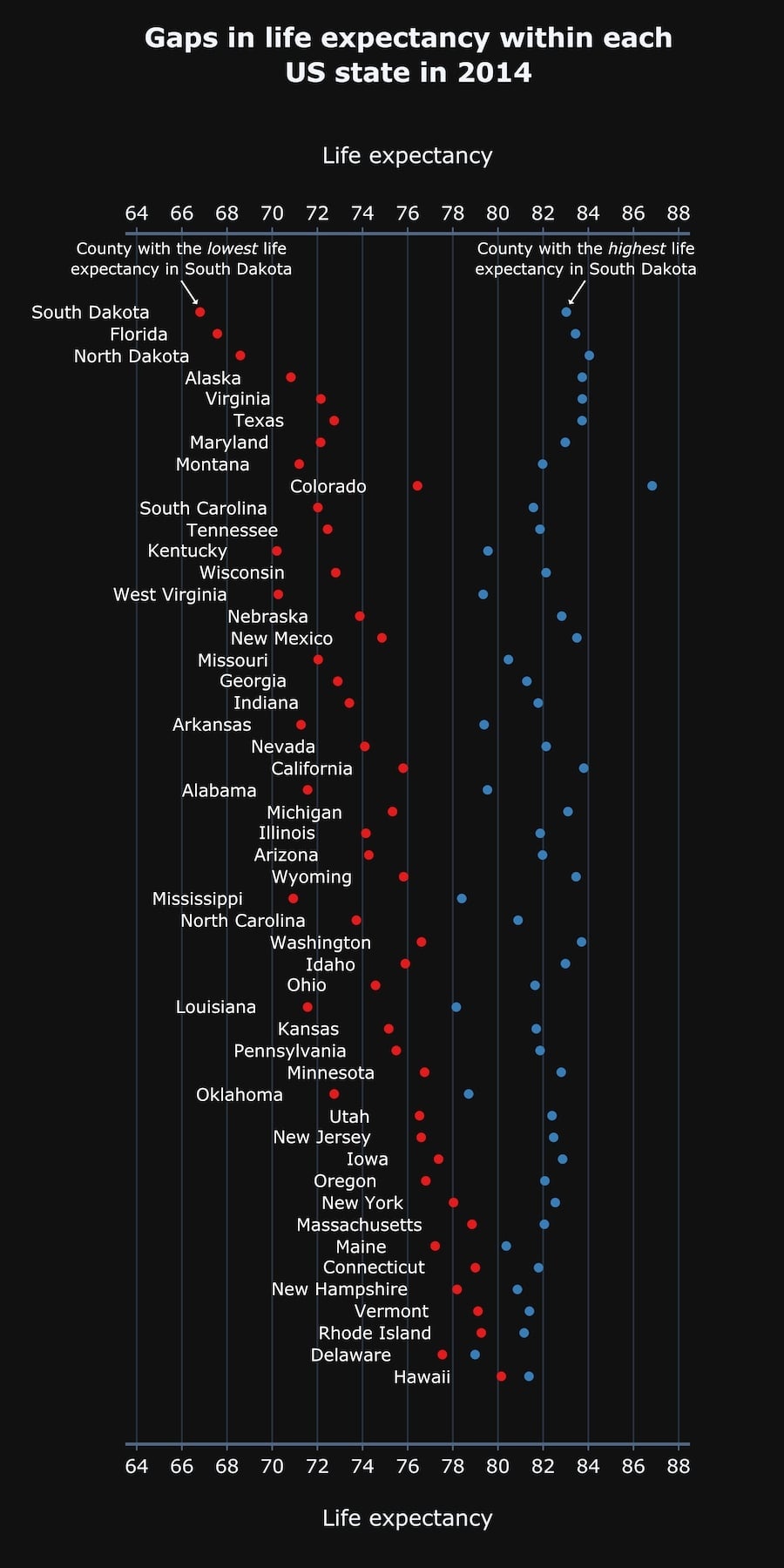
Gaps in life expectancy within each U.S. state