Mapping every person in Finland
The map represents the distribution of the population in Finland. A set of random points has been created within the building polygons inside a postal code area based on the population of the area. Thus all postal code areas have as many points as there are inhabitants.
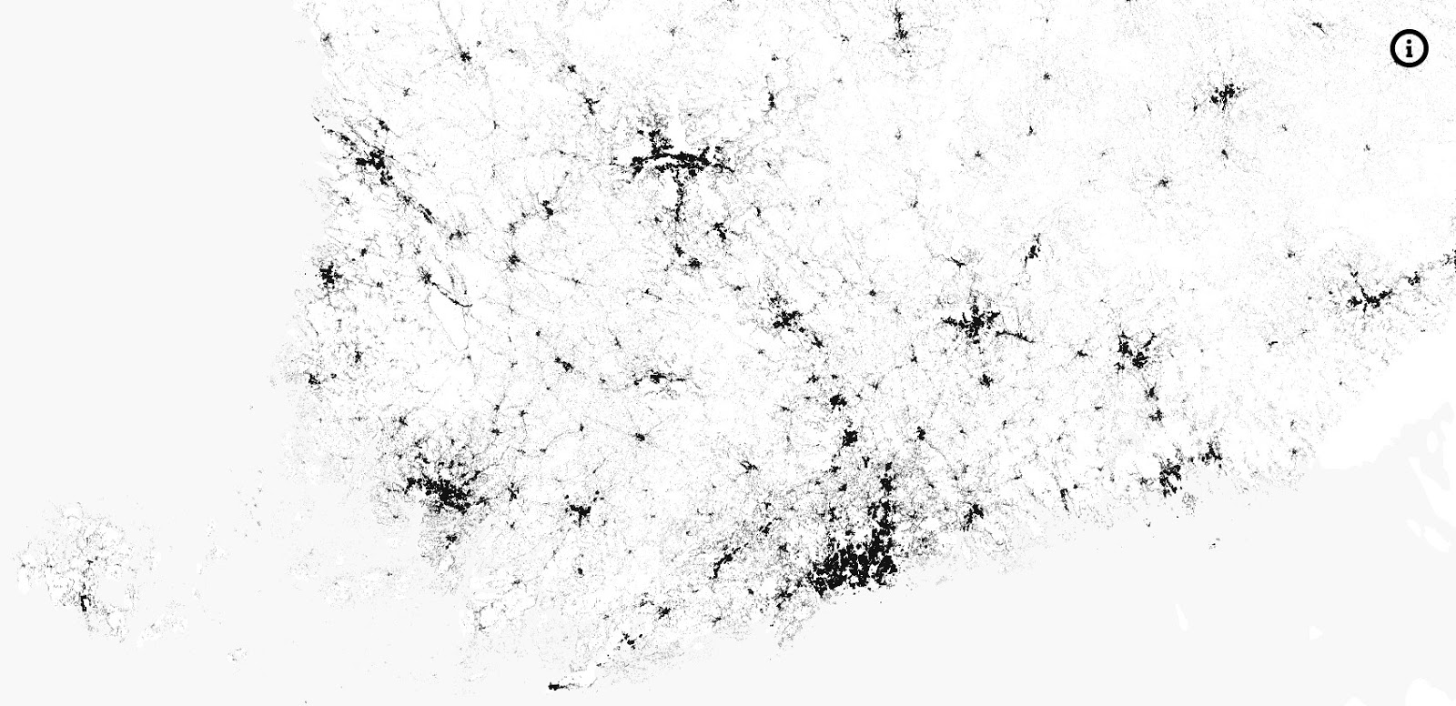
Source: www.columbo.navici.cloud
Related posts:
– Mapping every person in Scotland
– USA: The racial dot map
– Mapping immigrant America
– Florida, color-coded by race
– UK ethnicity map (one dot per person)
– Australia: The racial dot map
– Indigenous population dot map of Australia
– Toronto, color-coded by race
– Brazil’s racial dot map
– South Africa’s racial dot map
– The dot density map of women

