6 ways to divide the Roman Empire
At its height, the Roman Empire stretched over 5 million square kilometers — about 1.93 million square miles. From rainy Britannia to sunbaked Syria, it covered an enormous range of languages, cultures, and ways of life. And, naturally, everyone had opinions about everyone else.
This series of six maps by Reddit user CountZapolai doesn’t try to explain the Roman Empire with census records or battle dates. Instead, it uses modern stereotypes layered on ancient borders to satirize how people often reduce large regions to clichés, especially when viewed from afar.
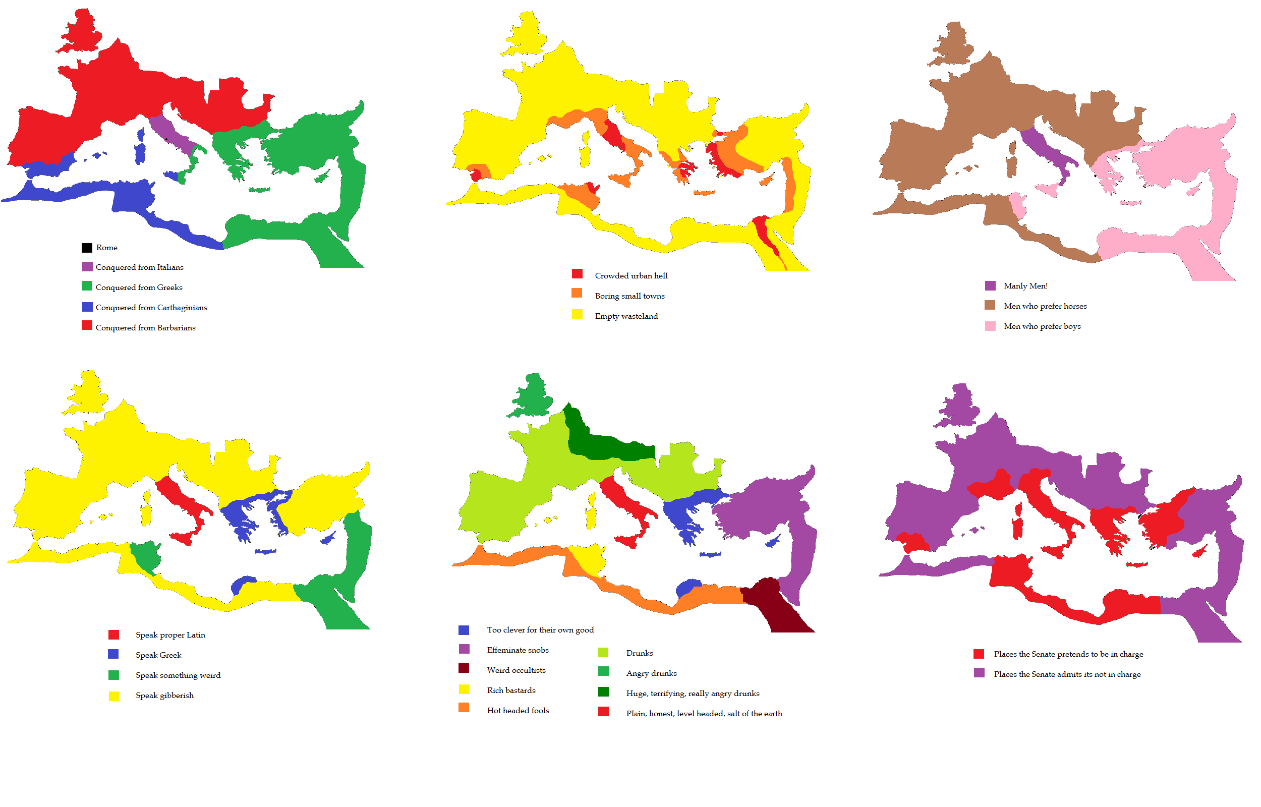
The first map breaks down the empire based on who it was conquered from: Greeks, Italians, Carthaginians, and Barbarians. It’s a reminder that Rome’s reach was built through centuries of absorbing and defeating others, and that different parts of the empire had very different origins.
A second map sorts the regions by lifestyle density: areas labeled as “Crowded urban hell,” “Boring small towns,” or “Empty wasteland.”
Another map focuses on gender stereotypes, with labels like “Manly Men,” “Men who prefer horses,” and “Men who prefer boys.” It’s deliberately exaggerated, and not meant to reflect anything factual — just the kind of offhand assumptions people make when projecting ideas across cultures.
There’s also a language map separating those who “Speak proper Latin” from others speaking Greek, “something weird,” or flat-out gibberish.
Then comes a broader social judgment: regions are grouped by labels such as “Weird occultists,” “Effeminate snobs,” “Hot-headed fools,” and “Huge, terrifying, really angry drunks.” It’s a kind of satirical character map, shaped less by facts and more by exaggerated impressions.
And finally, a political breakdown: places where “The Senate pretends to be in charge” vs. where it “admits it’s not in charge.” This one especially plays with the reality that Roman authority was often more symbolic than practical, depending on how far you were from Rome.
This map set is not based on academic sources or real demographic data. It reflects the creator’s mix of humor, modern biases, and historical tropes, similar in spirit to Yanko Tsvetkov’s Atlas of Prejudice (Amazon Link), a popular book that reimagines world maps based on national and cultural stereotypes.


Love it – but one thing in #5 puzzles me. Sardinia and Corsica as the lair of “rich bastards?”