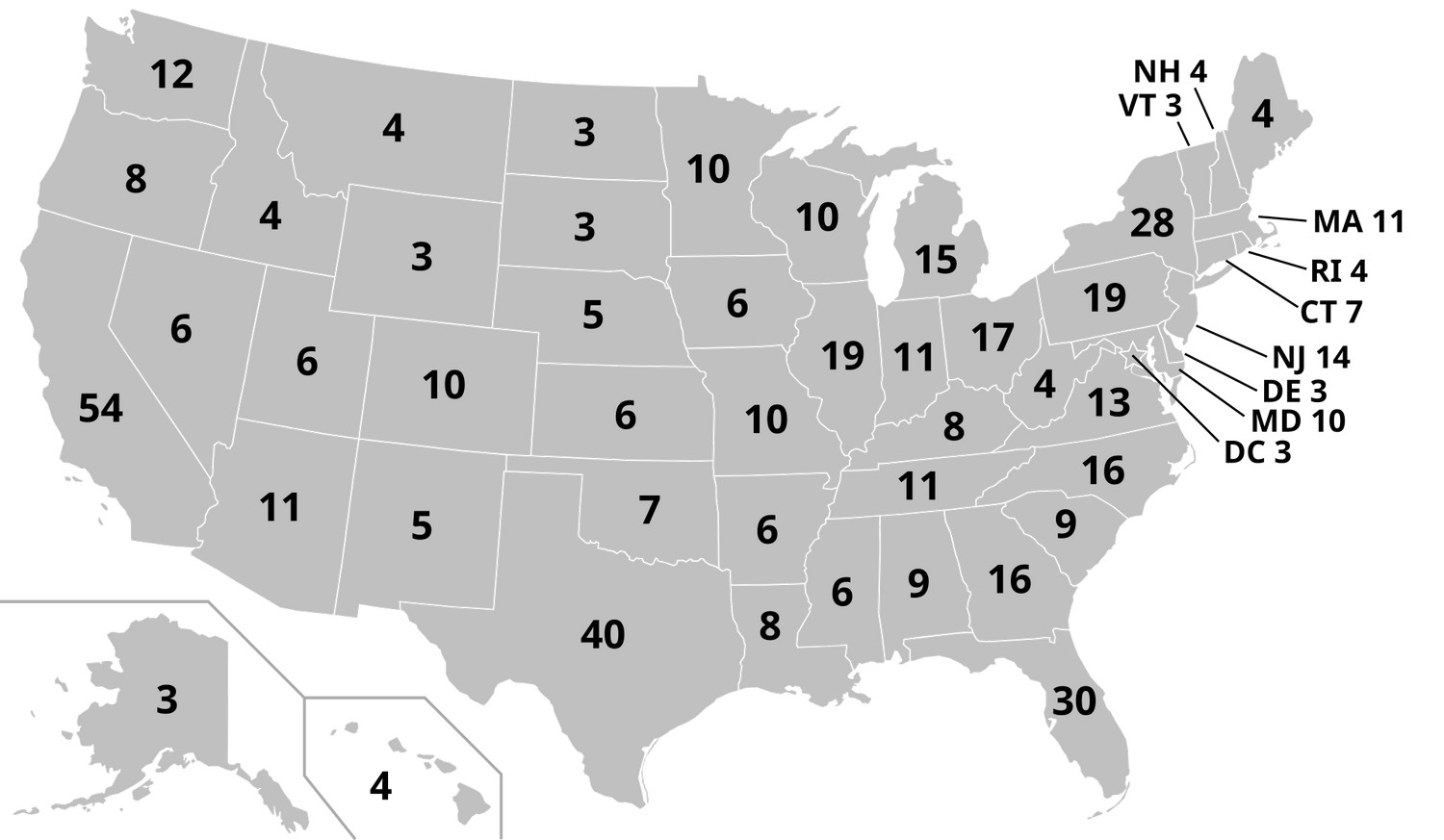
The number of electoral votes each state holds isn’t static – it changesevery 10 years after the U.S. Census. The first map shows how many electoral votes each state, plus Washington, D.C., will have in the 2024 and 2028 presidential elections. These totals come from the 2020 Census and will stay the same until the next reapportionment after the 2030 count. Texas and Florida both gained seats thanks to rapid population growth, while states like California and New York saw small decreases.
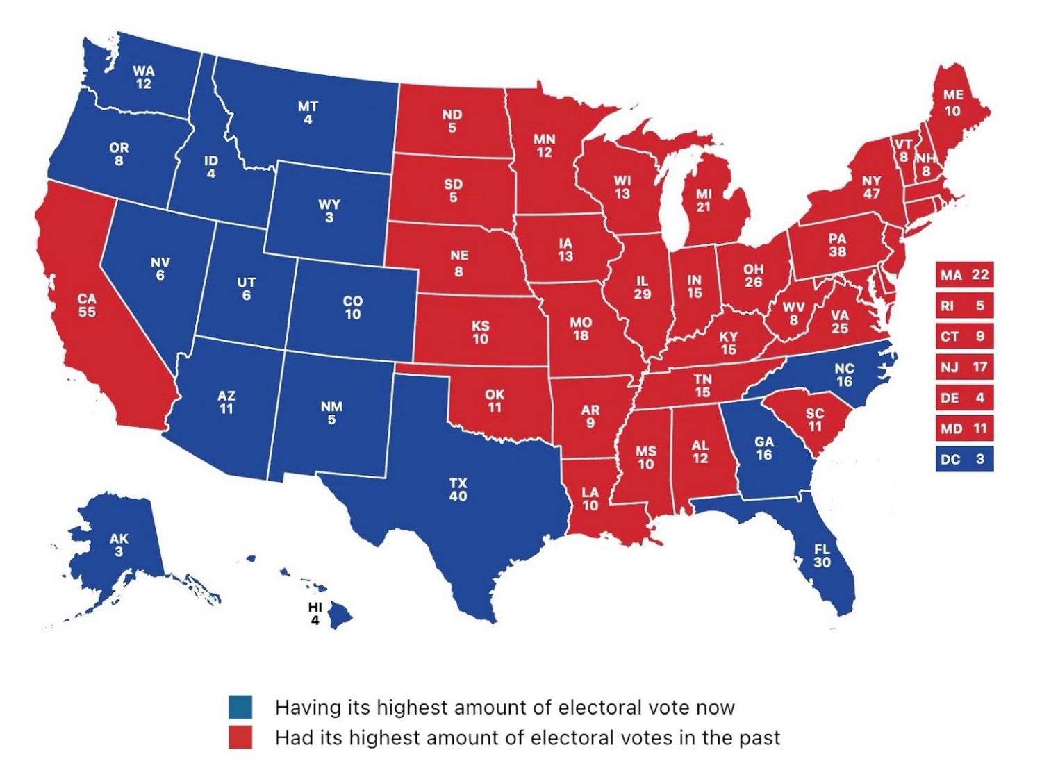
On the map above, created by Reddit user Express-Succotash248, U.S. states shown in blue are currently at their highest number of electoral votes ever. States in red reached their peak in the past – often during periods when their populations were growing faster than the national average. It’s a simple way to see how long-term demographic shifts have reshaped political influence.
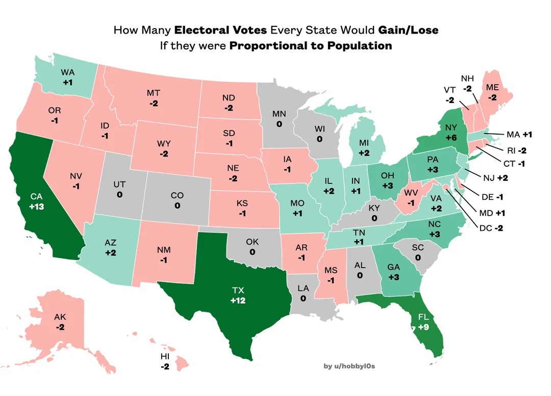
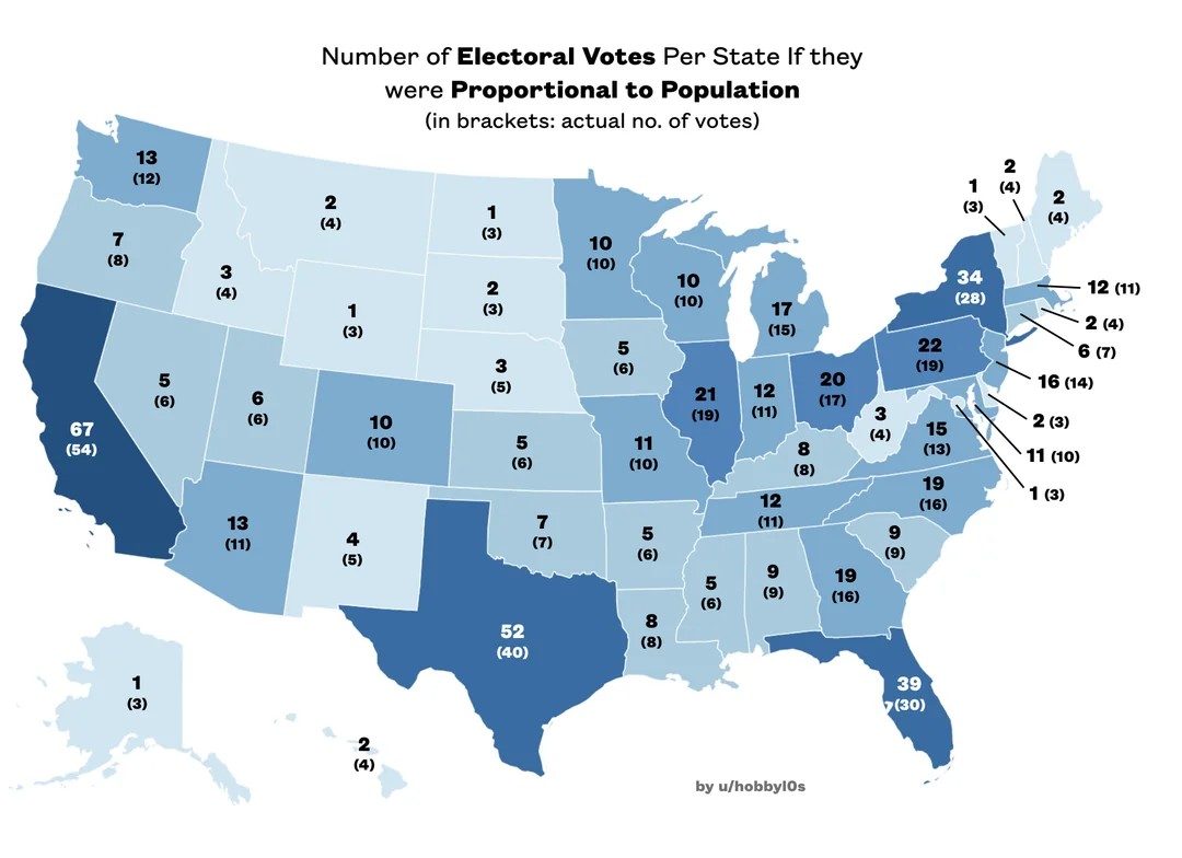
The next two maps created by Reddit user hobbyl0s show what the Electoral College might look like if each state’s votes were based purely on population – no automatic three-vote minimum and no extra boost from Senate seats. In the first of these maps, you can see how this approach would change the balance: smaller states would lose votes, while the largest states would pick up quite a few. The second map shows the full set of adjusted vote totals for each state, with today’s numbers noted in parentheses so you can see the differences at a glance.
When you compare all these maps, it’s clear that the current Electoral College gives smaller states more influence per voter than larger states. A fully proportional system would shift much more political weight toward the biggest population centers. Whether that would be fairer or less fair is something people have been debating for years – and probably will for many more.


")


