When Americans went to the polls on November 3, 2020, they didn’t just elect a president – they painted a fascinating picture of a nation divided not only by politics, but by geography, economics, and way of life.
Joe Biden made history as America’s oldest incoming president at 78, while Kamala Harris shattered multiple glass ceilings as the first woman, first Black person, and first person of South Asian descent to become Vice President. But perhaps even more remarkable was the election’s turnout – a staggering 66.9% of eligible voters cast their ballots, the highest since 1900, telling a story of an increasingly engaged America.
The electoral math was clear: Biden’s 306 electoral votes to Trump’s 232. Donald Trump became the first U.S. president since George H.W. Bush in 1992 and the 11th incumbent in the nation’s history to lose a bid for a second term. Joe Biden secured the largest percentage of the popular vote against an incumbent since 1932.
The maps presented below are my original work, created using election results data from multiple authoritative sources including Fox News, Politico, the New York Times, and the State of Alaska’s official election website (Alaska.gov). County-level demographic and economic data were sourced from the U.S. Census Bureau, while the GDP analysis comes from the Brookings Institution’s 2020 report on metropolitan economic performance.
These maps don’t look drastically different from 2016, but they tell a compelling story: Joe Biden won the majority of the people, while Donald Trump won the preponderance of the land. What’s particularly striking is how the election results mirror America’s economic landscape. According to the Brookings Institute, Biden-voting counties aren’t just home to more Democrats – they’re economic powerhouses, generating 70% of U.S. GDP. Picture this: just 100 counties produce half of America’s economic output, and nearly all backed Biden.
To better understand the nuances of voter preference, I created a map that shows the presidential election results when considering vote margins by blending each blue and red vote within each U.S. county:
U.S. Presidential election 2020: choropleth unclassed blended hue
The 2020 election saw unprecedented voter participation. Joe Biden received more than 81 million votes, surpassing Hillary Clinton’s 2016 total by almost 15 million and Trump’s by 18 million. Trump also improved his performance, gaining 11 million more votes than in 2016, reaching over 74 million votes total.
Below is my visualization that combines both vote margin and population data to give a more complete picture:
2020 election map colored by voter margin and vote total
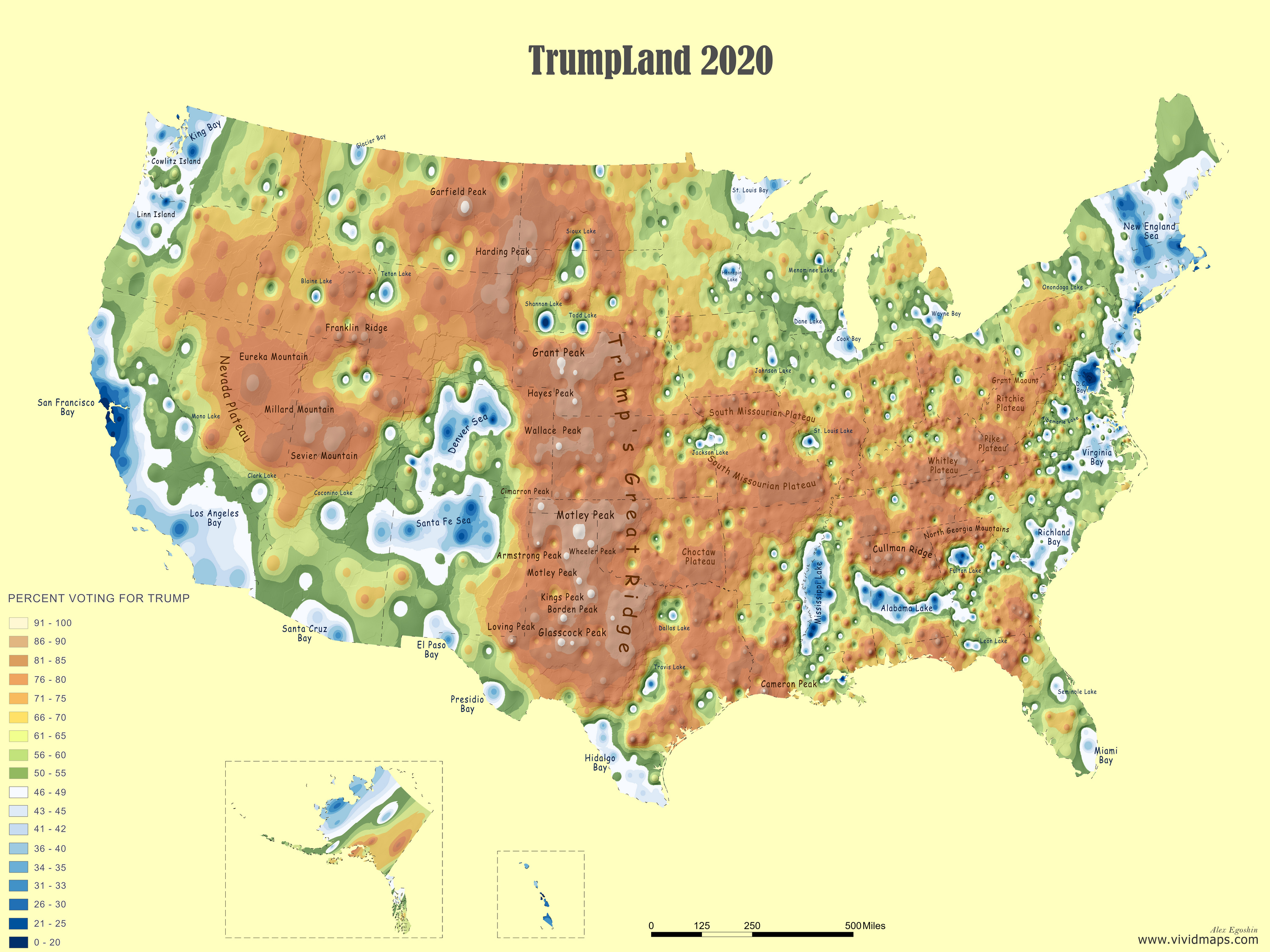
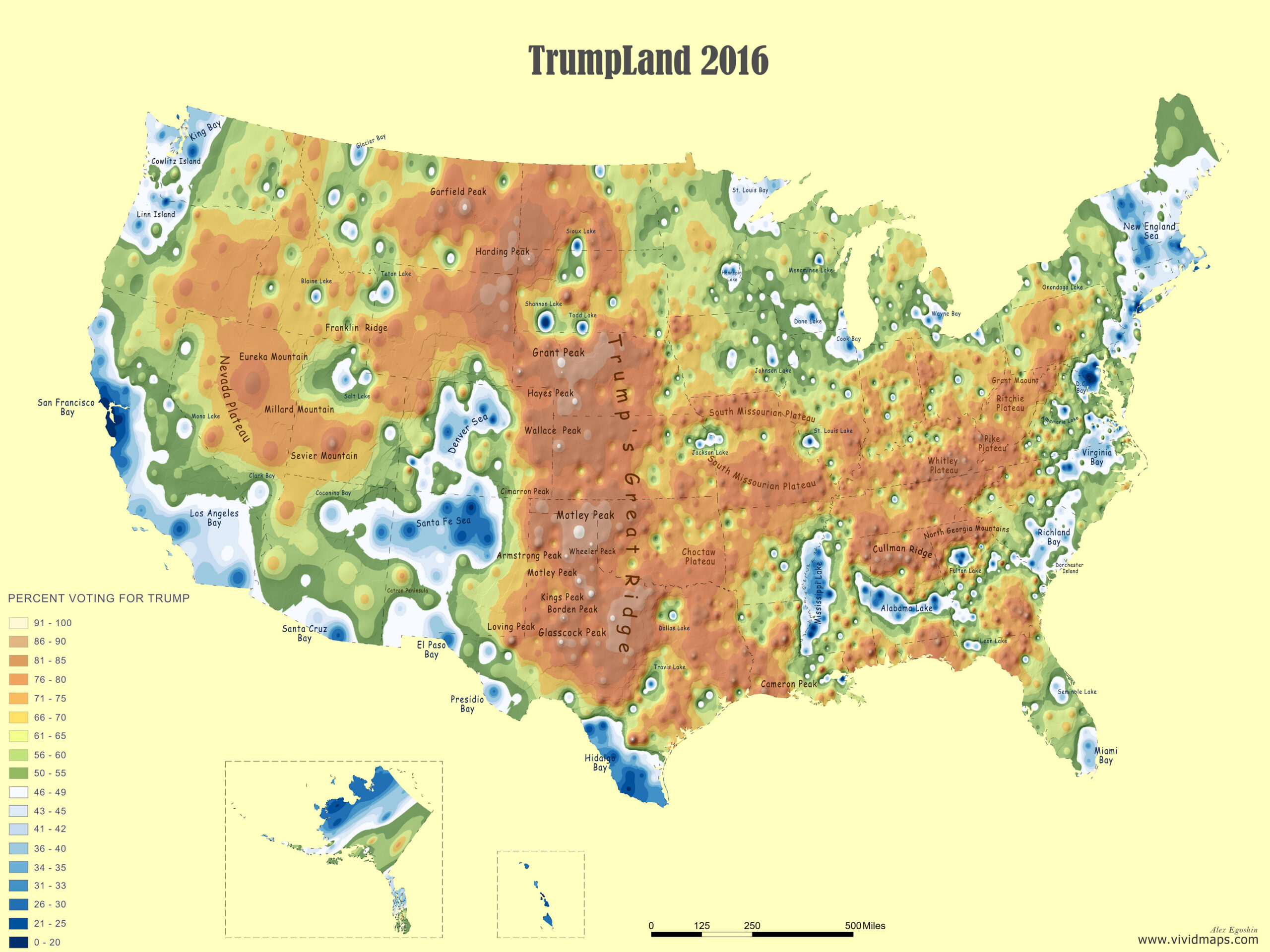
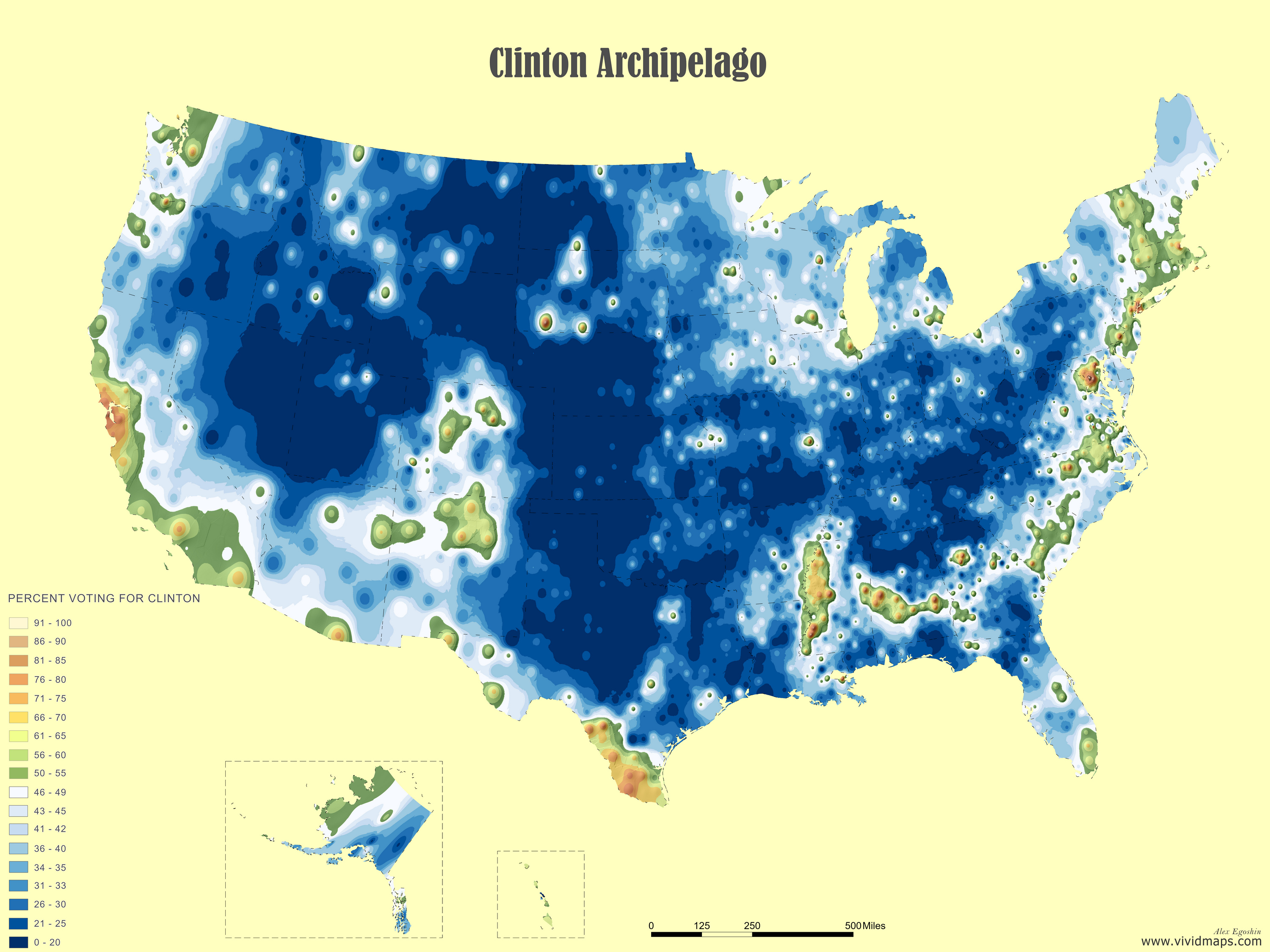
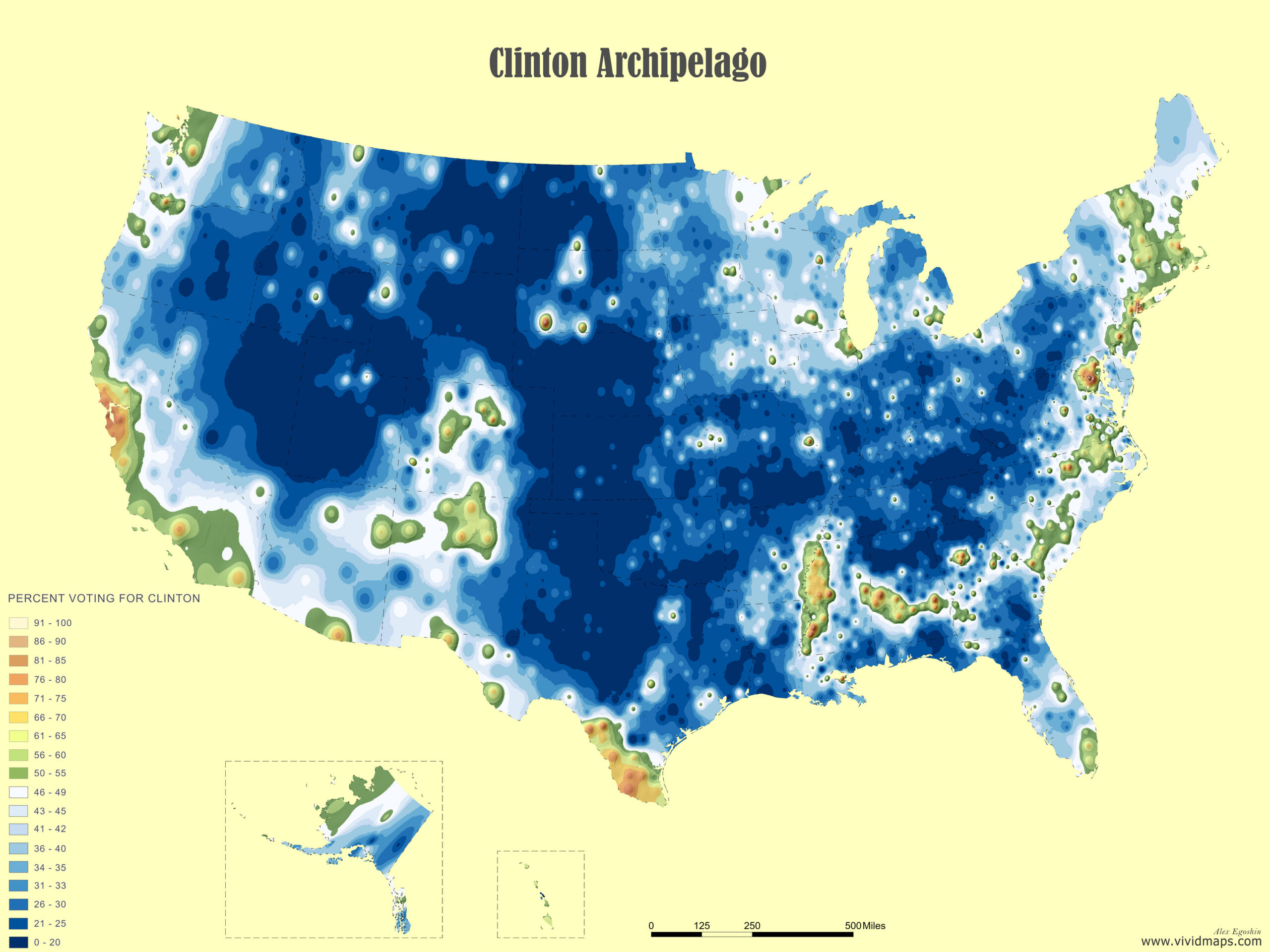
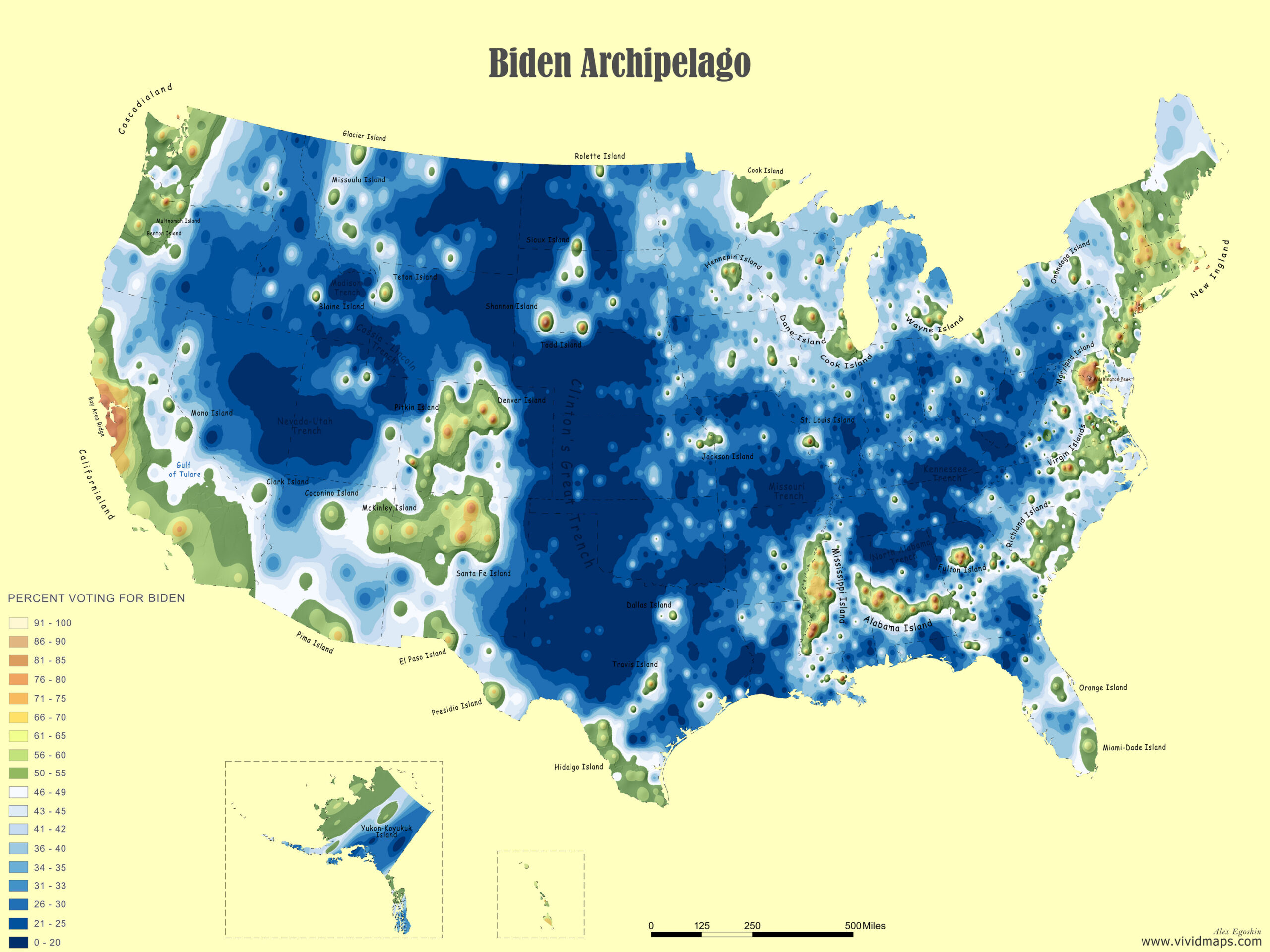
In 2016, I created the original “Trumpland” and “Clinton Archipelago” maps that went viral, reaching millions of viewers worldwide and being shared across numerous media platforms. The concept resonated because it provided a striking visual representation of America’s political geography. Now, four years later, I’ve updated these signature visualizations with the 2020 election data, allowing us to see how these political “lands” and “islands” have shifted.
These visualizations reveal more than just election results – they show two different Americas coexisting side by side. In one, dense urban centers drive innovation and economic growth; in the other, vast stretches of land preserve traditional ways of life and values. Neither is more “real” America than the other – they’re both essential parts of the national story.
The maps also illuminate the growing urban-rural divide in American politics. Democratic strongholds appear as islands in a sea of red, concentrated in urban areas where population density and economic activity peak. It’s a stark visualization of not just how Americans voted, but how they live, work, and see their country’s future.
What these maps make clear is that the 2020 election wasn’t just a contest between two candidates – it was a referendum on two different visions of America’s future, mapped out across our landscape in red and blue.


Jackie – Are you out there?
Great