Every Home Owner and Renter in the U.S.: A Dot-by-Dot View of American Housing
Have you ever wondered how homeownership varies across America? One dot map gives us an unprecedented view of this pattern, with each of the 308 million Americans represented by a single point. This remarkable visualization, created by Ryan Thorpe Miller using 2010 U.S. Census data, shows us where owners and renters live across the entire country.
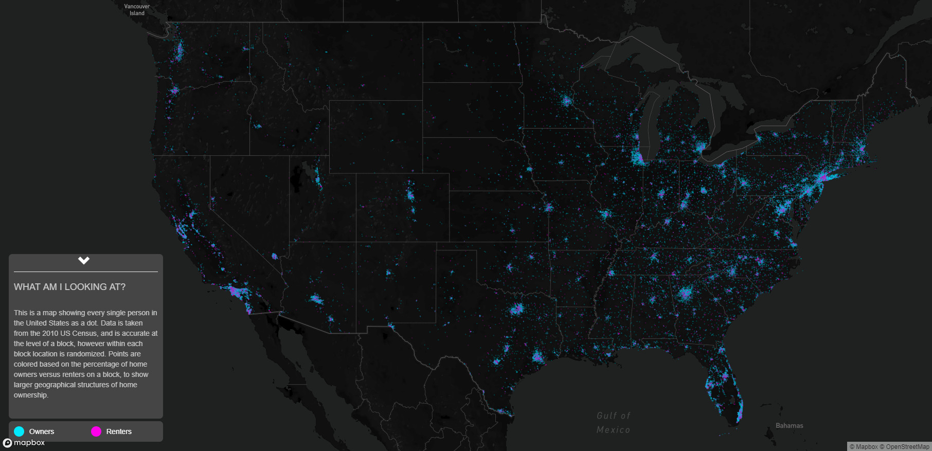
The map uses a simple but effective color scheme: blue dots represent homeowners, while red dots show renters. While the data is accurate to the census block level, individual positions within each block are randomized to protect privacy while maintaining statistical accuracy.
What immediately stands out is how the map reveals both expected and surprising patterns. Dense urban cores typically show more red, indicating a higher concentration of renters, while suburban and rural areas tend toward blue, showing higher rates of homeownership.
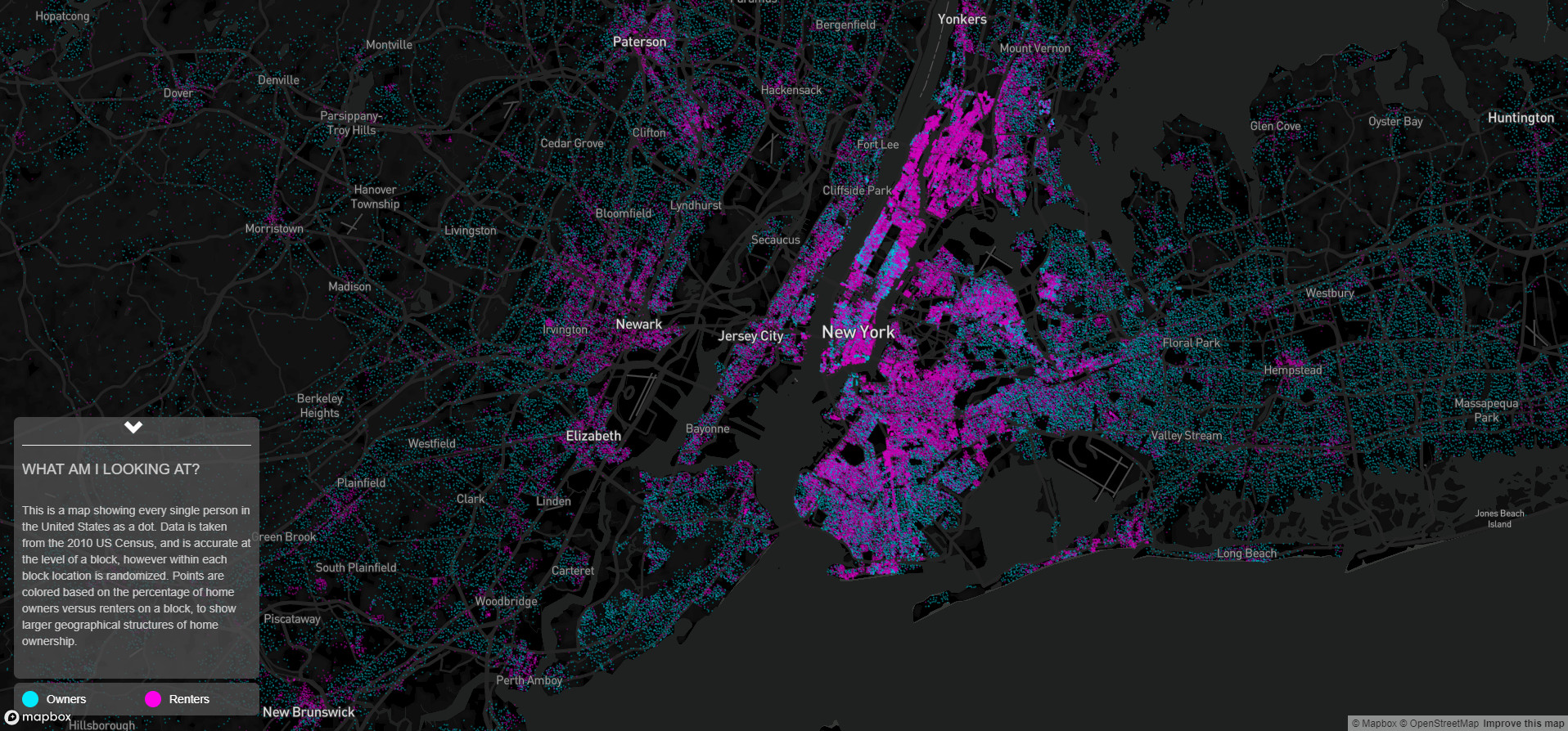
Every Home Owner and Renter in New York City
New York City shows one of the most striking patterns in the country. Manhattan appears as an intense cluster of red dots, reflecting its 69% renter rate – one of the highest in the nation. According to the NYU Furman Center‘s latest housing report, this trend has only intensified since the map’s creation.
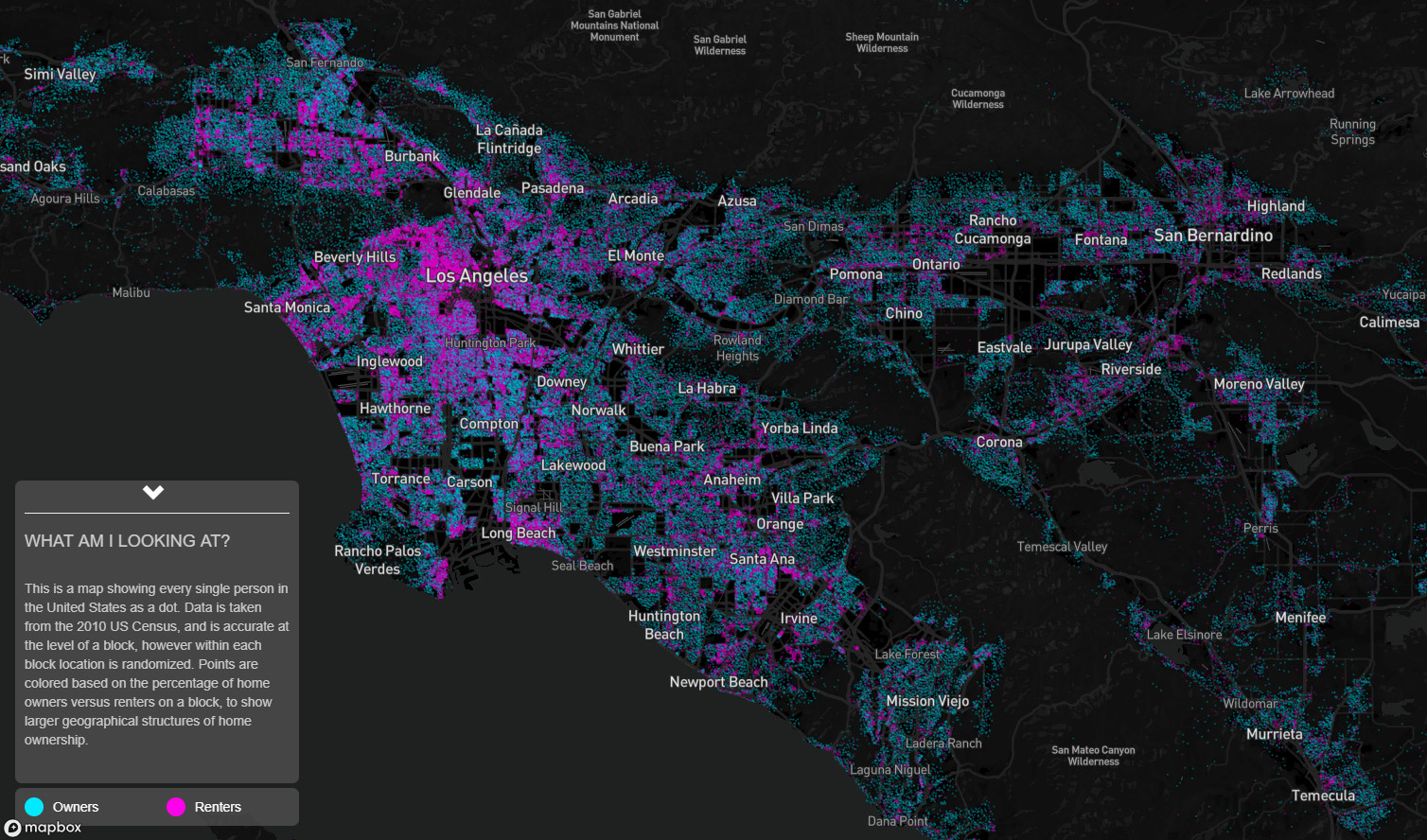
Every Home Owner and Renter in Los Angeles
Los Angeles presents a fascinating mix, with clear divisions between renter-heavy urban cores and owner-dominated suburbs. The stark contrast between coastal and inland areas tells a story about property values and housing accessibility.
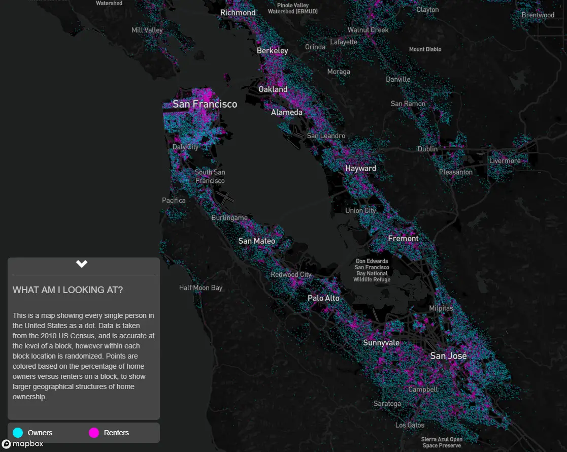
Every Home Owner and Renter in San Francisco
The Bay Area’s housing pattern reflects its unique geography and economics. Dense renter populations cluster around San Francisco and Oakland, while suburban areas like Marin County and the Peninsula show stronger homeownership patterns.
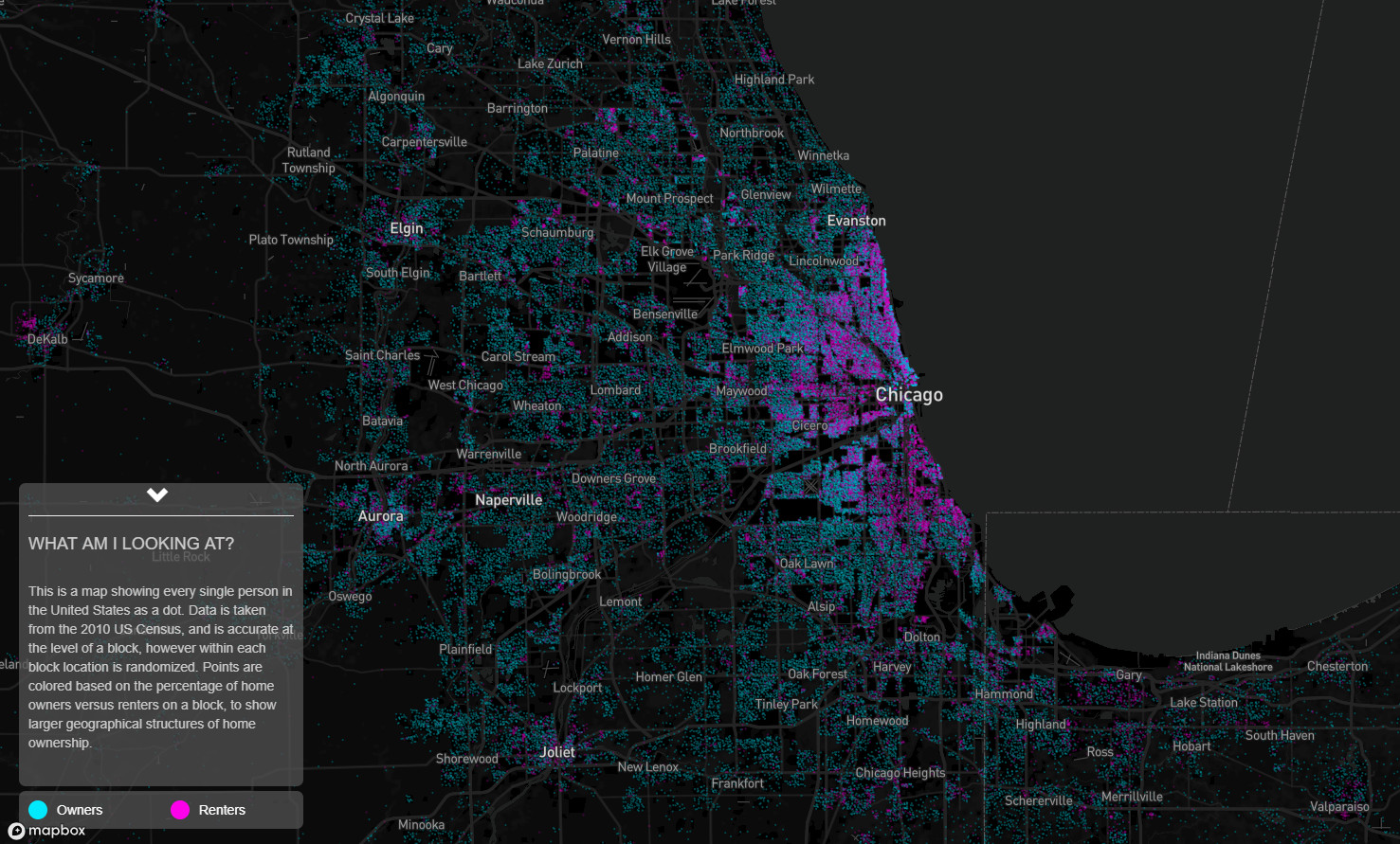
Every Home Owner and Renter in Chicago
Chicago’s map reveals clear socioeconomic boundaries, with distinct patterns between the city’s North and South sides. The suburban ring around the city core shows strong homeownership rates, typical of many Midwestern metropolitan areas.
The Housing Landscape Today
While this visualization uses 2010 Census data, recent trends suggest even more dramatic shifts in housing patterns. The Urban Institute reports that national homeownership rates have fluctuated significantly, with notable changes in major metropolitan areas.
For those interested in decorative maps of the United States, here are some noteworthy options available on Amazon:
About the Data
This visualization was created by Ryan Thorpe Miller using block-level data from the 2010 U.S. Census. While individual dots are randomized within each census block, the overall patterns accurately represent the true distribution of owners and renters across the country.
Have you noticed similar housing patterns in your area? The comments section below is open for your observations and experiences with local housing trends.


