Global tree cover
There is a long tradition in the emotional relationship between people
and forests. We can get an understanding of the extent of the global
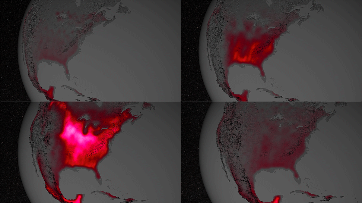
tree cover from satellite sensors such as NASA’s MODIS
Calculating the average tree cover in an area allows us to estimate the
extent of the world’s forests. Forest landscapes can be mapped in
various ways and is often done in conventional maps. However, much of
the land area is not covered by forest and the few remaining untouched
forest landscapes keep shrinking while deforestation continues.
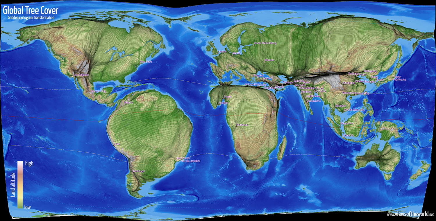
This visualisation of the global tree cover shows the quantitative
distribution of the world’s forests. In a ‘gridded cartogram’, each of
the grid cells shown covers an equal physical space and is then resized
according to the total amount of space covered by trees in this area.
Additional topographic features showing the elevation similar to normal
topographic maps (from green for the lowest lying areas to brown and
white for the highest regions), and the surrounding bathymetry of the
world’s oceans remain as guiding elements in this cartogram.
While conventional maps are ‘equal area’, ‘equal distance’ or other
projections, this map gives us a new visual understanding of the
distribution of the world’s forests while preserving the geographical
accuracy by retaining the topology between each of the grid cells.
The visualisation is an image of the fragile forest-landscapes which
make up approximately 31 per cent of our land area. They are the world’s
lungs, providing home for a multitude of the most complex and diverse
ecosystems on the planet. However, they are also the basis for the
livelihoods of many people, and an important economic factor, and are
therefore under threat of deforestation – especially in the tropics –
which make up a lot of the spaces in this map.
Forest-scapes can also be seen through different lenses, such as how the
distribution of tree cover relates to the distribution of people on
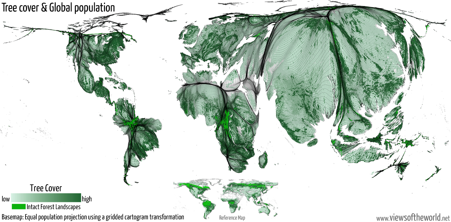
earth. The following map shows an equal population projection (based on a
gridded cartogram transformation where each grid cell is resized
according to the total number of people living within that area)
superimposed by the same data of global tree cover that is visualised in
the above map. What can be here is not where which quantities of trees
are in the world, but how much tree cover there is in those spaces where
most people live. While there apparently is less tree cover where
people live, there are some obvious variations, as this map shows.
In
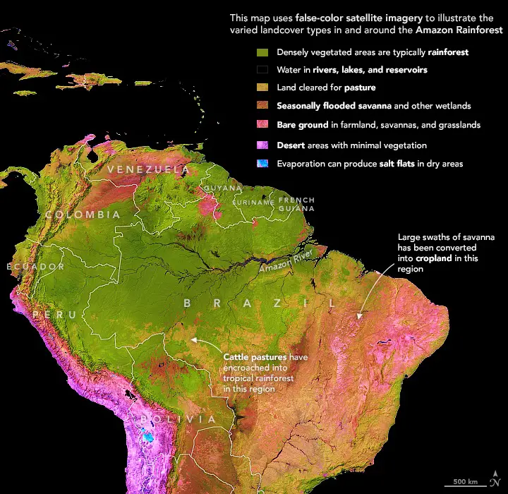
regions such as in the Eastern United States of America or the tropical
rainforests quite a significant amount of tree cover can be found in the
more densely populated areas. The most an unbroken expanse of natural
ecosystems within the zone of current intact forest landscapes
in the world, however, describing the forest extent which is showing no
signs of significant human activity, which take up much of the space in
the above map, almost disappear from this map (shown in bright green
here):

