Europe faces a growing humanitarian crisis as increasing numbers of refugees enter the continent after fleeing the troubles in Syria. In Hungary an estimated 3,000 people are camping outside Budapest’s main station desperate to travel on to Germany and Austria.
El Diario has mapped the number of asylum applications received by each European country in 2015 and the percentage of applications accepted by each country. The size of the red dots on the Refugee Distribution map represents the number of asylum applications received by each country and a choropleth layer shows the percentage of asylum applications accepted.
One of the arguments being used by some of Europe’s political leaders for not accepting more asylum applications is that this will only encourage more refugees to head to their countries. This map seems to suggest that there is no strong correlation between a high acceptance rate of refugees by a country and the number of refugees seeking asylum in that country.
If the willingness to accept asylum seekers affected the number of refugees to then apply for asylum then the dark green colored countries on the map should have the largest red dots. This clearly isn’t the case. For example, Germany only agreed 42% of asylum applications in 2014 and yet it is by far the most popular destination for asylum seekers.
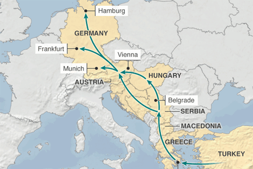
In fact the current crisis in Hungary is because the country is right in the middle of one of the most popular migration routes to Germany. The BBC has published a static map showing the migrant route from Greece and Turkey to Germany. With Hungary being a popular gateway to the passport-free Schengen zone in the European Union.
The BBC says that Germany is expecting 800,000 asylum applications this year. Many of those refugees will have successfully followed this migrant route through Hungary. Hungary’s response to this growing refugee crisis has been to build a 110 mile razor wire fence.
This fence is just one of many fences now being built or planned in Europe. The Washington Post, in an article entitled Fortressing Europe, has mapped some of these construction projects designed to block some of the most popular migrant routes into Europe.
These fences include the fence being built by Hungary along its border with Serbia, a 100 mile fence being constructed by Bulgaria along its border with Turkey and Greece’s own fence along its Turkish border.