New York City’s subway system is a marvel of urban transportation, but have you ever noticed how different the subway map looks compared to the actual geography of the city? A fascinating animation by Reddit user playhouse_animation brings this discrepancy to life, morphing between the familiar subway map and the true geographic layout of the lines.
This eye-opening visualization highlights just how much the subway map distorts distances and directions for the sake of clarity. For instance, did you know that the 1 train actually travels in a zigzag pattern through Upper Manhattan, rather than the straight line shown on the map? Or that Staten Island is much closer to Manhattan than the subway map suggests?
The iconic NYC subway map we know today was designed by Massimo Vignelli in 1972. While visually striking and easy to read, it sacrificed geographic accuracy for simplicity. This trade-off has been a point of debate among cartographers and transit enthusiasts for decades.
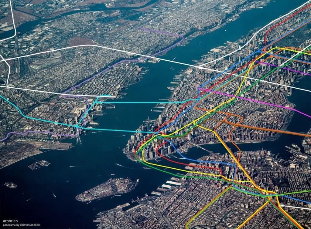
An alternative view is provided by an aerial photograph overlaid with subway lines, showing the true path of trains through the city’s streets and tunnels. This perspective reveals how the subway system adapts to New York’s unique geography, weaving between skyscrapers and burrowing under rivers.
Understanding these spatial relationships can be crucial for newcomers to the city. A tourist might be surprised to find that a short walk could be faster than taking the subway for certain trips, especially in Manhattan where stations can be densely packed.
The NYC subway carries over 5.5 million riders on an average weekday, making it one of the busiest rapid transit systems in the world. Despite its complexity, this network is the lifeblood of the city, connecting diverse neighborhoods and enabling the frenetic pace of life that defines New York.
Next time you’re navigating the Big Apple, take a moment to appreciate the artistry of the subway map, but remember – the city above might look a bit different when you emerge from underground!
For those interested in exploring more about NYC’s subway system and maps, here are some relevant books available on Amazon: