Animated mapsFoodMapping Health

Percent of eligible children vaccinated by U.S. county

This post may contain affiliate links. As an Amazon Associate, we earn from qualifying purchases.

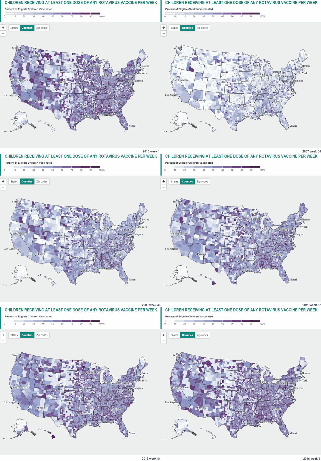
This map below shows the weekly vaccination rate of at least one dose of any vaccine. The data are animated using a 12-week rolling average to reduce excessive variation in low population areas and is animated weekly from 2006 to 2016.

Children receiving at least one dose of any rotavirus caccine per week

Source: merck.axismaps.io

0 0 votes
Article Rating
Subscribe
Notify of
guest

0 Comments
Oldest
Newest Most Voted
Inline Feedbacks
View all comments
0
Would love your thoughts, please comment.x
()
x