The News Co-occurrence Globe
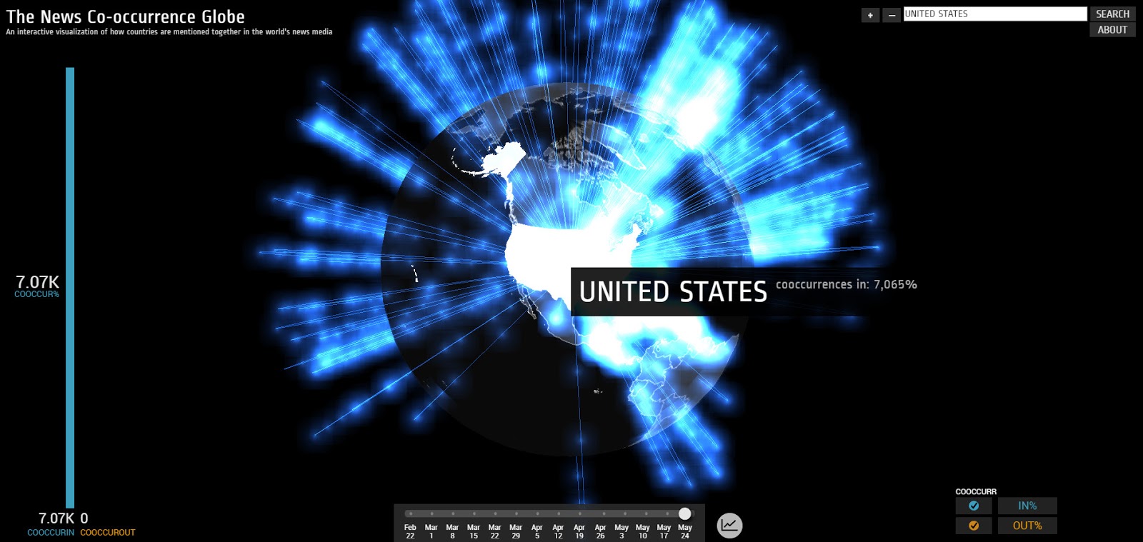
An interactive visualization of how countries are mentioned together in the world’s news media.
This data visualization captures the inherent geographic community structure of the world’s news – how the news groups countries into distinct geographic clusters. In essence, for every monitored news article published anywhere in the world that mentions a given country, we compile a list of all other countries also mentioned in those articles, by week from Feb 22, 2015 through the week of May 24, 2015. Blue incoming lines indicate countries where at least 10% of coverage mentioning the source country also mentioned the selected country. Red outgoing lines indicate countries where at least 10% of the coverage mentioning the selected country also mentioned the destination country. The size and number of energy pulses moving along the line indicate the percentage of co-occurring mentions.


