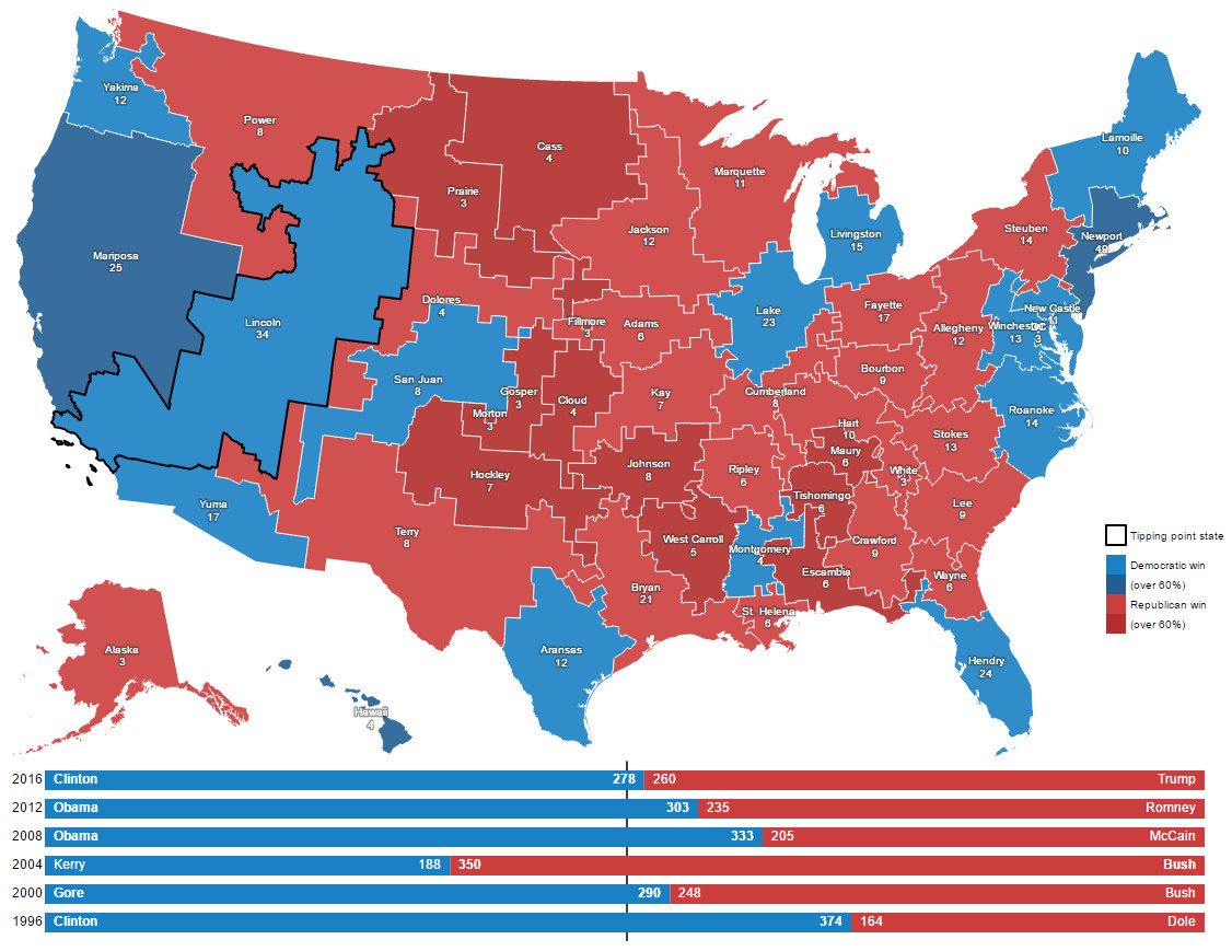
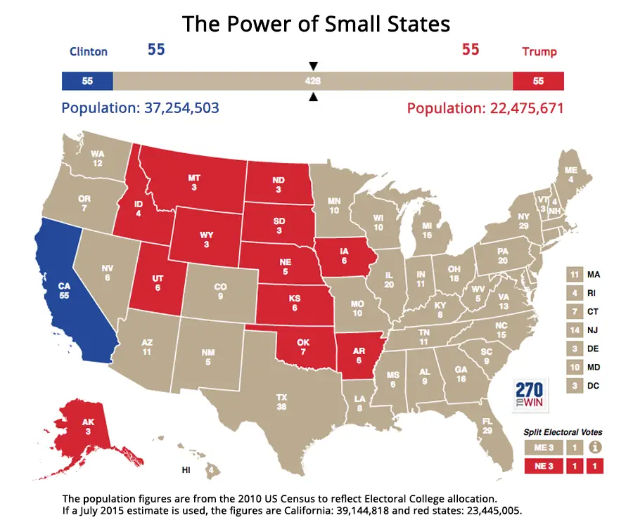
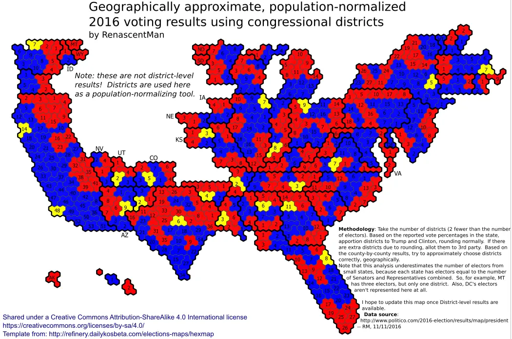
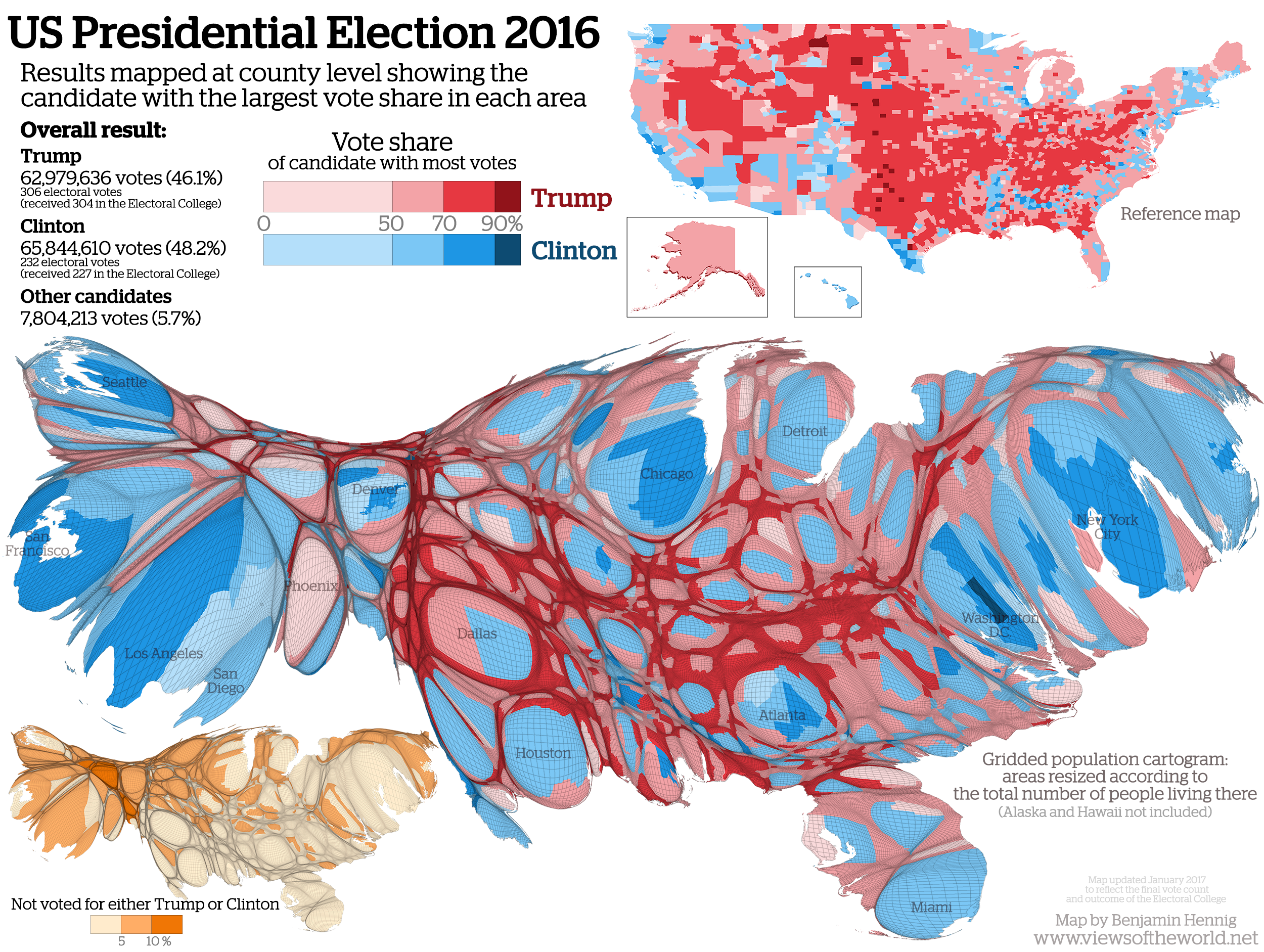
U.S. Presidential Election 2016 (Cartogram)
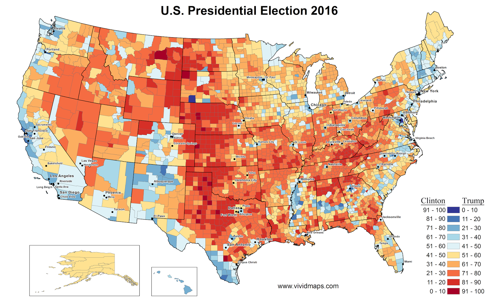
Results mapped at county level showing the candidate with the largest vote share in each area.
Related posts:
– How America voted in every election (1824 – 2016)
– The fewest counties in the fewest states required to win the U.S. presidential election
– If “Did Not Vote” was a candidate in 2016, it would have won by a landslide
– The America That Never Wanted Hillary To Be President
– Red Shift: Change in Democratic vote share in presidential election (2012 – 2016)
– Wisconsin election results by county (2008 – 2016)
– Where each candidate outperformed election forecasts
– U.S. Presidential Election (2016)
– How the presidential election of 2016 would look like if only millennials voted
– Hex map of U.S. electoral votes
– Electoral Map Upon Trump’s Victory
– Every United States presidential elections (1788 – 2016)
Related Posts: