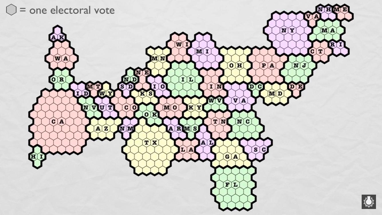
Let’s take a journey across the political landscape of America with a fascinating map of the United States that goes beyond mere state boundaries. This intriguing visualization showcases the distribution of electoral college votes, offering a unique perspective on the nation’s political power dynamics.
This map of the United States created by Reddit user Trepach reveals some striking insights about electoral representation. Following the 2010 census, 12 electoral votes shifted among 18 states, reshaping the political playing field. Eight states saw their electoral influence diminish by one vote each, while New York and Ohio experienced a more significant drop, losing two votes apiece. On the flip side, eight states gained electoral clout – six added one vote to their tally, Florida secured an extra two, and Texas emerged as the big winner with four additional votes.
The total electoral pie consists of 538 slices, mirroring the composition of Congress: 435 representatives and 100 senators, plus three electors allocated to Washington, D.C. When you look at our map of the United States, you’ll notice that electoral power isn’t evenly distributed. The heavyweight contenders are California (55 votes), Texas (38), New York (29), Florida (29), Illinois (20), and Pennsylvania (20). In contrast, the seven least populous states – Alaska, Delaware, Montana, North Dakota, South Dakota, Vermont, and Wyoming – each wield just three electoral votes.
But here’s where it gets really interesting. Our map of the United States highlights a stark imbalance in representation. Consider this: California, with its massive population of 39.5 million, commands 55 electoral votes. Now, shift your gaze across the map to find a collection of 23 other states. Together, their combined population matches California’s 39.5 million. Yet, these 23 states collectively hold a whopping 101 electoral votes – nearly double California’s influence!
California’s lack of representation in the Electoral College
This comparison brings into sharp focus the ongoing debate about fair representation in the Electoral College system. It prompts us to question whether the current map of the United States truly reflects the principle of “one person, one vote” or if it gives disproportionate power to less populous states.
As you explore this captivating map of the United States, consider how these electoral imbalances might influence presidential campaigns, policy decisions, and ultimately, the future direction of the country. It’s a visual reminder that in American politics, where you live can significantly impact the weight of your vote.
Whether you’re a political junkie, a history buff, or simply curious about how our democracy functions, this electoral map of the United States offers a wealth of insights. It’s a powerful tool for understanding the complex interplay between population, geography, and political representation in our diverse nation.
Here are some links to maps of the United States available on Amazon: