Mapping the Footprint of Australia’s First Nations
In 2011, there were 699,900 Indigenous people living in Australia, accounting for around 3% of the total national population. Understanding the spatial distribution of this diverse population segment is crucial for effective socio-economic planning and policymaking.
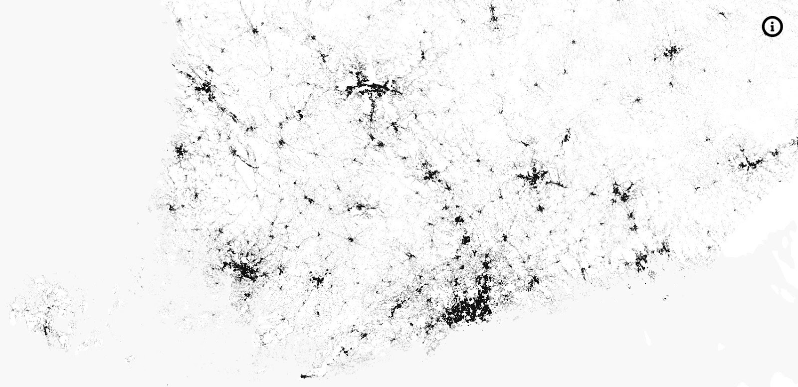
This remarkable dot map, created by researchers at Monash University for the 2015 GovHack event, visualizes the precise location of every single Indigenous person counted in the 2011 Australian Census. With one dot representing each of the 699,900 individuals, the map provides an unparalleled geographic perspective on where Australia’s First Nations peoples reside.
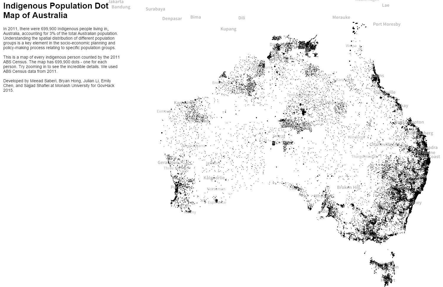
According to the Australian Institute of Health and Welfare, the Indigenous population is notably younger and more widely distributed across the country compared to the non-Indigenous population. This dot map clearly reflects those patterns, with concentrations visible not just in major cities but also throughout regional and remote areas.
Zooming in on the map reveals fascinating regional variations. The high density of dots in the Northern Territory, for example, aligns with the territory’s substantial Indigenous population, which makes up around 30% of all residents. Conversely, the sparse distribution across the vast Nullarbor Plain in Western Australia underscores the immense challenges of living in some of Australia’s most remote corners.
For those interested in exploring Australia’s geography and population in greater depth, here are some excellent map resources available on Amazon:


