The Mercator Problems
When you look at most world maps, you’re probably seeing the Mercator projection – a map style created by Gerardus Mercator, a Flemish geographer, back in 1569. This map became incredibly popular for sailors and navigators because it represented travel routes as straight lines, making navigation much easier.
But here’s the problem: the Mercator projection is seriously misleading about the size of countries and continents. The further a landmass is from the equator, the more dramatically it gets stretched out. This means countries in the Northern Hemisphere look much larger than they actually are.
A perfect example of this distortion is Greenland and Africa. If you’ve ever glanced at a typical world map, you might think these landmasses are roughly the same size. In reality, Africa is actually 14 times larger than Greenland! The map systematically exaggerates the size of northern countries like Greenland, Russia, and parts of North America, while minimizing the scale of regions closer to the equator.
Despite its inaccuracies, this map is everywhere – from school textbooks to smartphone apps to Google Maps. It’s so ubiquitous that most people don’t even realize how much it misrepresents the true proportions of our planet.
Reddit user neilrkaye made an amazing animation of the Mercator projection to correct shape and size.
If one were to calculate the areas of various landmasses based on their physical representations on a Mercator map, the areas would differ significantly than the actual areas of each of those landmasses, particularly for those in the Southern Hemisphere. The chart below shows these differences.

Greenland seems the same size as Africa when, in reality, Africa’s area is 14 times as large. In reality, Greenland’s actual area is comparable to the Democratic Republic of the Congo alone.
Africa appears to be approximately the same size as South America when, in reality, Africa is over one and a half times as large.
Alaska seems to be the same size as Australia, although Australia is 4.5 times as large. Alaska also takes as much area on the map as Brazil, whereas Brazil’s area is about five times that of Alaska.
Madagascar and Great Britain look almost the same size, while Madagascar is more than twice as large as Great Britain.
Here is a mosaic of world countries retaining their correct size and shape created using ggplot in R. Largest nations, also shown in the bar graph.

For creating this map, each country was projected to the spherical projection and placed at the center of where it appears in the Natural Earth projection.
This demonstrates you can’t fit shapes on a sphere back together again once you place them on the flat.
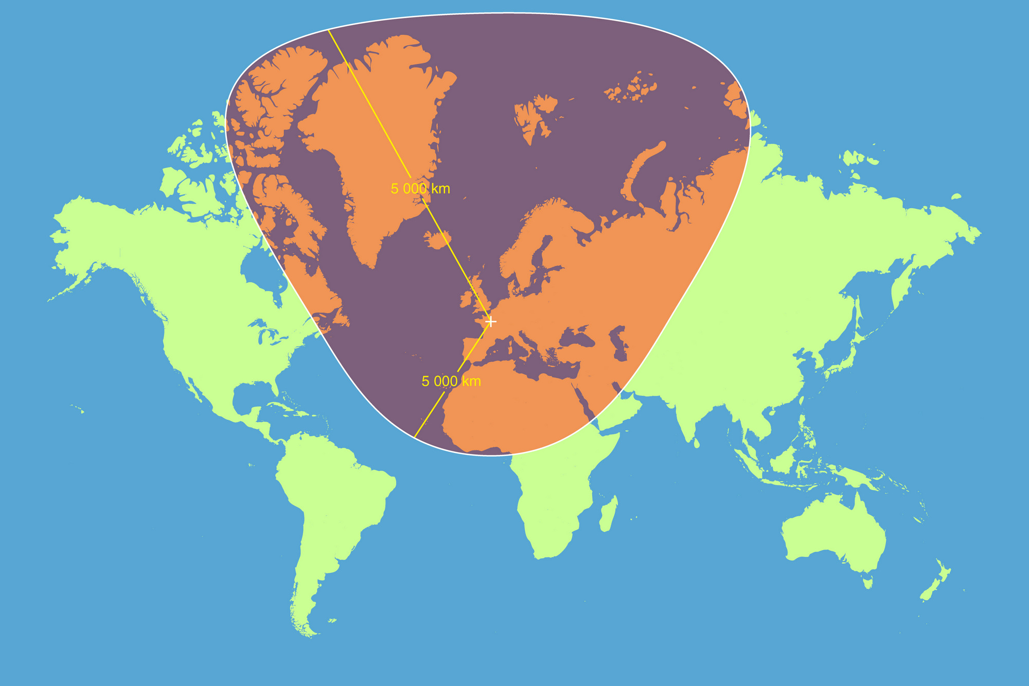
And to add another impressive illustration, a Reddit user named dranerertiam created a map that vividly demonstrates how the Mercator projection distorts geographical shapes. The map shows a circle with a 5000-kilometer radius, centered in Paris.
The Mercator projection is a fascinating yet flawed cartographic technique that has shaped our global understanding for centuries. While ingenious for navigation, it creates a deeply misleading visual representation of our planet, systematically inflating the size of northern landmasses and minimizing equatorial regions. Understanding its limitations reminds us that maps are not neutral representations of reality, but human-created tools with inherent biases that can subtly influence our perception of the world.


