Everyone knows the golden rule of NYC real estate: location, location, location. But what exactly makes a location valuable in New York? The answer often lies underground – in the subway system that keeps the city moving.
Looking at fascinating research from RentHop.com, we can see how rental prices cluster around subway stations across the city’s five boroughs. The patterns tell an interesting story about New York’s ever-evolving neighborhoods and might even help you save money on your next apartment hunt.
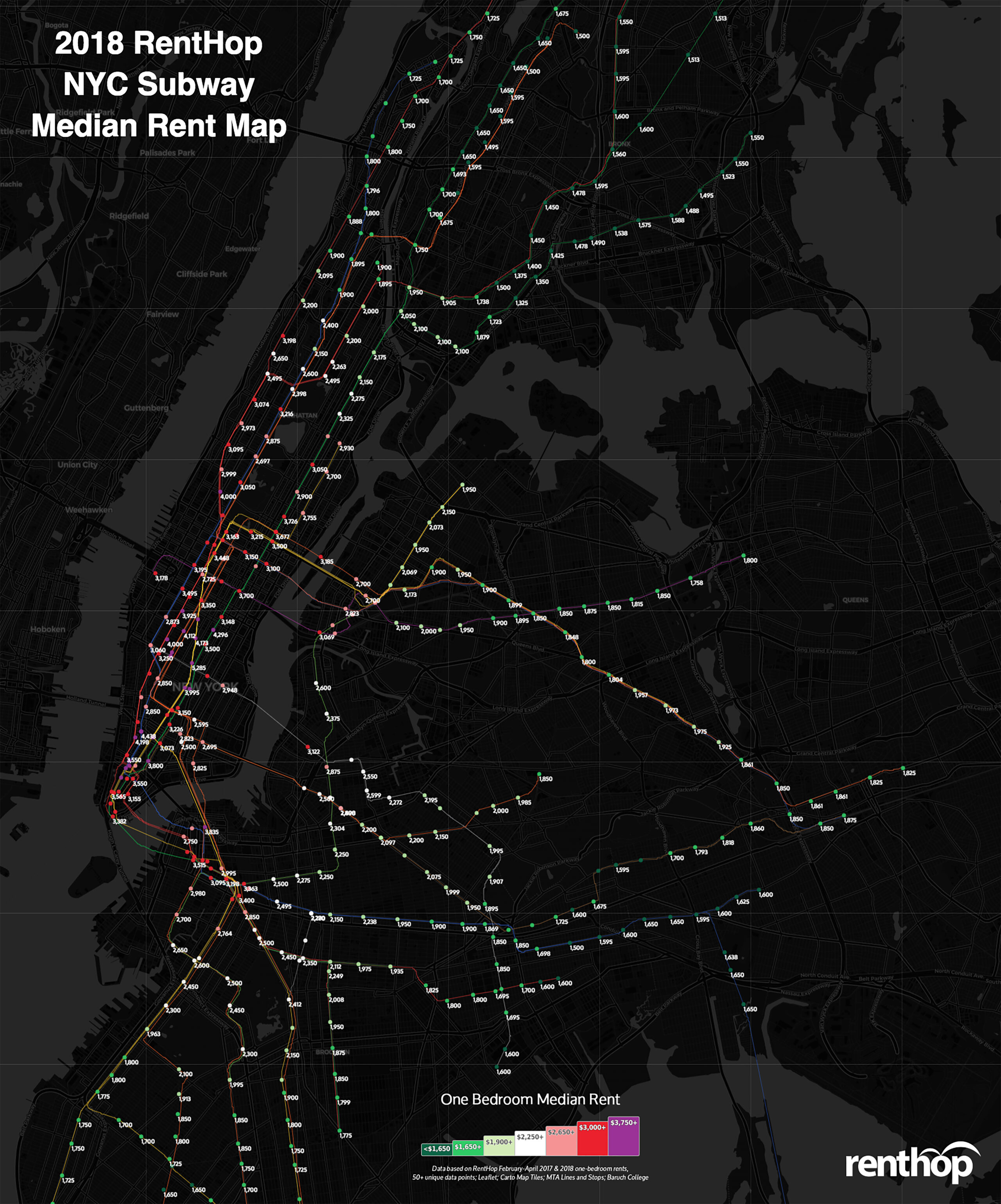
The Price of Convenience
The data reveals some surprising trends. While Manhattan’s prime locations like Union Square ($5,285 for a one-bedroom) remain predictably expensive, we’re seeing significant changes in traditional patterns. According to RentHop’s analysis, about half of Manhattan’s subway stops saw decreasing rents, with some notable drops:
Herald Square, despite being a major transit hub, saw an 8.2% decrease to $3,350 14th Street and 6th Avenue experienced a 10.2% drop to $3,995 Chambers Street stations showed a similar decline of 10.2% to $3,550
Brooklyn’s Shifting Landscape
The research demonstrates interesting developments in North Brooklyn. Williamsburg and Greenpoint, long considered prime real estate territory, are showing signs of price corrections. The Bedford Avenue L train stop, once the poster child for Brooklyn gentrification, recorded a 2.5% decrease to $3,122.
Smart Money Moves: The One-Stop Difference
Perhaps the most practical finding for apartment hunters is the dramatic price differences between adjacent stops. For example:
Between 66th Street-Lincoln Center and 72nd Street on the 1/2/3 lines, moving just one stop uptown saves $1,000 in monthly rent The N/W line between 59th Street and Queensboro Plaza offers $800 in savings
A Broader Urban Geography Perspective
These patterns reflect more than just real estate trends. According to recent research from the Regional Plan Association, subway accessibility remains one of the strongest predictors of economic opportunity in New York. The relationship between transit access and rental prices illustrates broader urban development patterns that have shaped the city since the subway’s inception in 1904.
What Does This Mean for New York’s Future?
As work patterns continue to evolve post-pandemic, we might see further changes in these traditional price relationships. The Municipal Art Society of New York suggests that hybrid work models could reshape how New Yorkers value proximity to transit hubs, potentially creating new opportunities in previously overlooked neighborhoods.
Have you noticed changes in rental prices around your local subway stop? Share your observations in the comments below – your insight could help fellow readers make informed decisions about their next move in New York City.