Ration map of the United States
Edward McCandish created a rare and intriguing map in 1944, known as the ‘Bill Whiffletree’ Ration Map of the United States. This pictorial map offers a satirical take on the government’s controversial rationing program during World War II. Similar in style to McCandish’s earlier Bootlegger’s Map, the ‘Bill Whiffletree’ map humorously depicts the challenges and frustrations of the rationing system.
During World War II, the Office of Price Administration (OPA) implemented a rationing program, issuing coupon books for items such as sugar, meat, cheese, fish, and milk. These coupons were required for purchasing these goods, leading to a mix of patriotic duty and frustration among citizens.
The map features humorous commentary, highlighting the struggles of the time.
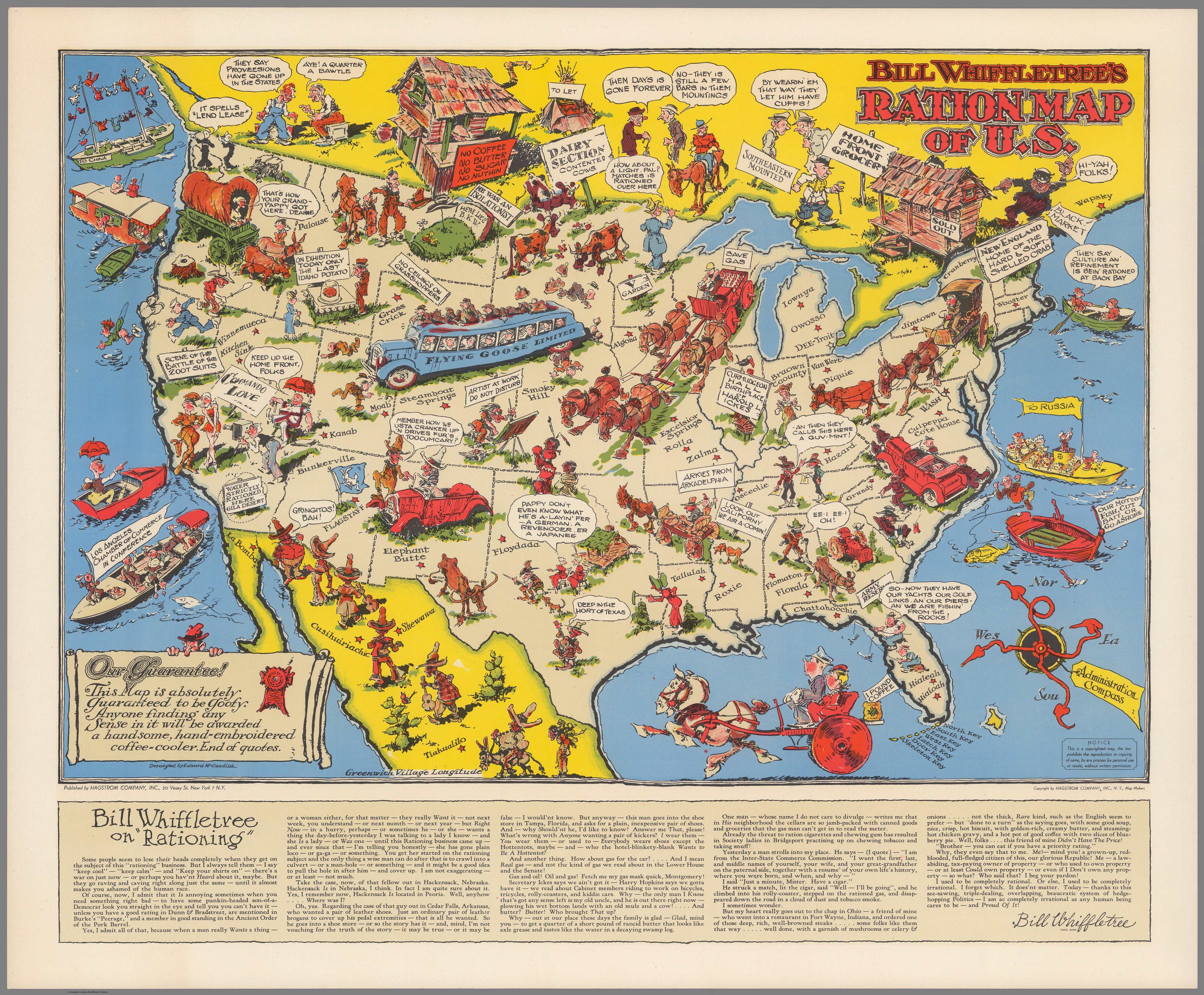
Today, the map’s message remains relevant as it reflects debates over personal sacrifices for the greater good, whether related to epidemics, the environment, or fiscal policy. It also touches on class distinctions, illustrating the disparities between those with plenty and those struggling under rationing.
Rationing in the United States began after the attack on Pearl Harbor in 1941, with President Roosevelt establishing the OPA to implement price controls and rationing. While some viewed rationing as a patriotic duty and a means to ensure fair distribution of goods, others saw it as a restriction on personal liberty, leading to hoarding and a black market. Rationing largely ended in the United States by August 1945, except for sugar, which continued until 1947.
You can buy this Bill Whiffletree’s Ration map of the U.S. as a wall poster on Amazon.


")