Breaking Into the Top 1%: How Income Thresholds Vary Across the USA
Ever wondered what it takes to be part of the top 1% of income earners in the United States? This threshold varies significantly depending on the state you reside in.
In 2024, an individual needs an income of $430,000 to break into the top 1% of earners nationwide. However, for households, the income required is even higher at $631,500. These thresholds offer a fascinating glimpse into the economic landscape of the United States.
Using data from IPUMS CPS, I created maps to visualize the income thresholds required to join the top 1% across different states. These maps reveal fascinating patterns and significant variations that offer a deeper understanding of income inequality in the U.S.
Income Thresholds by State: A Closer Look
In 2024, an individual needs an income of $430,000 to break into the top 1% of earners nationwide. However, this threshold varies dramatically by state. While Connecticut has the highest individual income threshold at $761,957, New Mexico’s is significantly lower at $256,007. These disparities underscore the influence of regional economic conditions, cost of living, and industry concentrations.
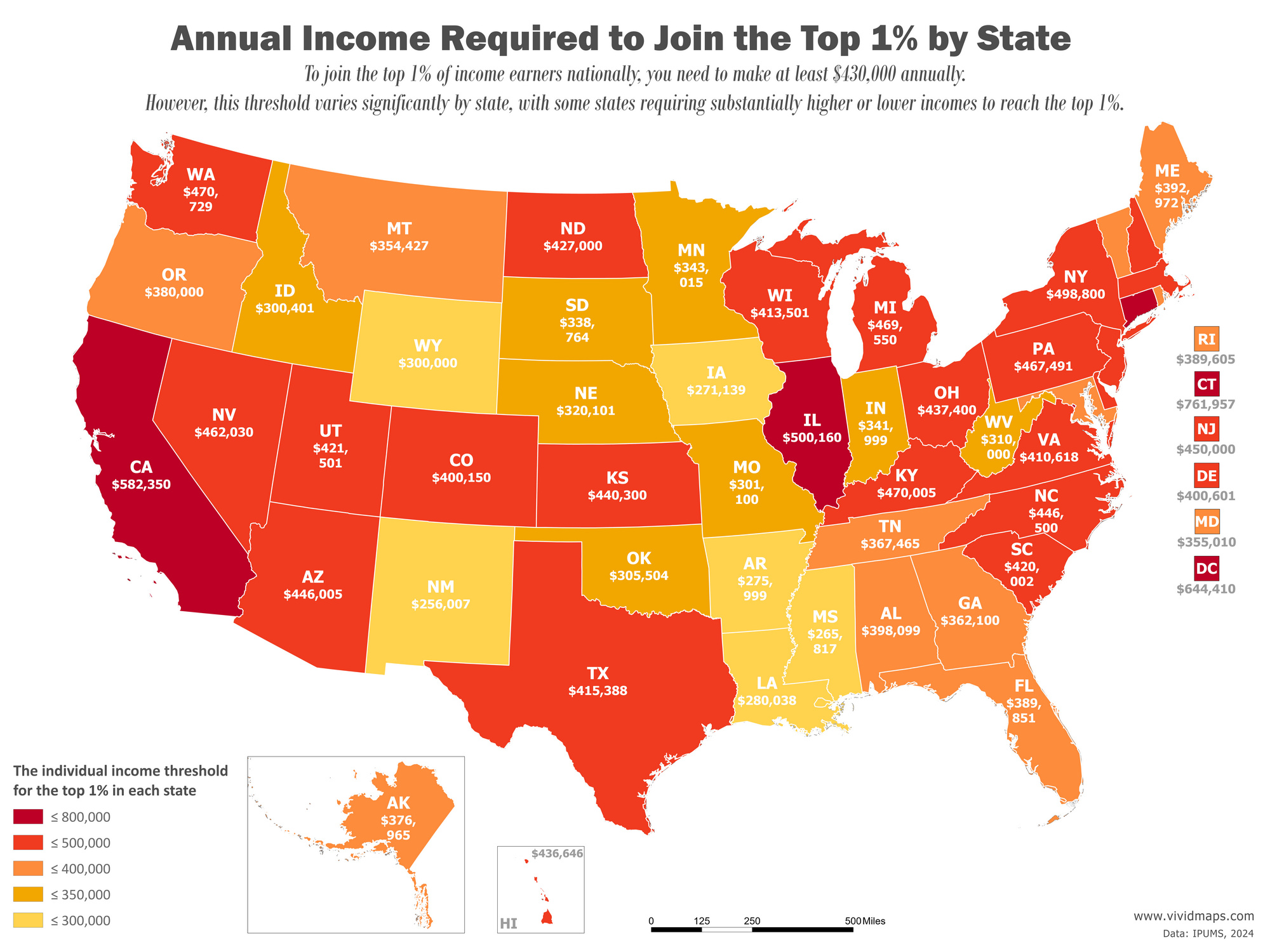
This map highlights notable differences in individual income thresholds across the country. For example, Connecticut leads with the highest threshold at $761,957, followed by states like California at $582,350 and Illinois at $492,403. These figures reflect the influence of thriving industries, such as finance in Connecticut, technology in California, and diverse corporate sectors in Illinois, alongside high costs of living.
Household income thresholds demonstrate even starker contrasts. For example, households in Connecticut need an income of $1,135,999 to enter the top 1%, the highest in the country. On the other hand, states like New Mexico and Mississippi require much less—$256,007 and $265,817, respectively. California, known for its high cost of living, also ranks near the top, with a household threshold of $849,049.

This map illustrates how household thresholds vary due to regional economic factors and family dynamics. States with thriving industries, such as Connecticut, California, and New York, exhibit some of the highest thresholds, driven by wealth concentration and dual-income households. In contrast, states like Arkansas and New Mexico, with lower thresholds, reflect more affordable living costs and different economic structures.
The Influence of Age on the Top 1% of Income
Income thresholds don’t just vary by geography—age also plays a significant role. For example, a 16-year-old earning $85,000 a year qualifies for the top 1% of their age group, while a 46-year-old would need to earn a whopping $920,000. This trend reflects career progression, where younger earners typically start lower, while peak earning years usually occur in one’s late 40s and 50s.
| Age | Top 1% Income by Age | Median Income by Age |
|---|---|---|
| 16 | $85,000 | $8,000 |
| 17 | $85,000 | $8,500 |
| 18 | $88,000 | $13,000 |
| 19 | $108,000 | $20,000 |
| 20 | $86,406 | $25,000 |
| 21 | $100,000 | $26,400 |
| 22 | $115,000 | $30,000 |
| 23 | $119,225 | $33,000 |
| 24 | $179,998 | $37,000 |
| 25 | $200,000 | $45,000 |
| 26 | $190,000 | $46,800 |
| 27 | $200,000 | $47,000 |
| 28 | $300,000 | $50,000 |
| 29 | $270,000 | $55,000 |
| 30 | $300,000 | $55,000 |
| 31 | $300,000 | $55,000 |
| 32 | $300,000 | $58,000 |
| 33 | $278,002 | $60,000 |
| 34 | $400,000 | $60,000 |
| 35 | $400,000 | $61,500 |
| 36 | $380,000 | $60,000 |
| 37 | $380,000 | $60,000 |
| 38 | $430,000 | $60,000 |
| 39 | $500,000 | $62,500 |
| 40 | $410,000 | $60,000 |
| 41 | $410,000 | $60,000 |
| 42 | $400,000 | $62,400 |
| 43 | $400,000 | $65,000 |
| 44 | $400,000 | $61,250 |
| 45 | $400,000 | $60,000 |
| 46 | $920,000 | $65,000 |
| 47 | $500,000 | $60,000 |
| 48 | $440,000 | $65,000 |
| 49 | $500,000 | $65,000 |
| 50 | $420,000 | $70,000 |
| 51 | $450,000 | $65,000 |
| 52 | $450,000 | $65,000 |
| 53 | $430,000 | $64,000 |
| 54 | $430,000 | $65,000 |
| 55 | $350,000 | $65,000 |
| 56 | $300,000 | $60,000 |
| 57 | $530,000 | $65,000 |
| 58 | $500,000 | $60,000 |
| 59 | $370,000 | $60,000 |
| 60 | $350,000 | $60,000 |
| 61 | $500,000 | $60,000 |
| 62 | $400,000 | $65,000 |
| 63 | $350,000 | $58,000 |
| 64 | $550,000 | $60,000 |
| 65 | $450,000 | $55,000 |
| 66 | $400,000 | $55,735 |
| 67 | $360,000 | $50,000 |
| 68 | $750,000 | $50,000 |
| 69 | $600,000 | $43,664 |
| 70 | $550,000 | $44,000 |
Interestingly, median incomes stabilize around $60,000 for many age groups, highlighting the considerable gap between average earners and the top 1%. These age-related variations emphasize how career trajectories and experience influence earning potential.
Together, these maps and analyses highlight the complexities of income inequality in the United States. Regional economic factors, cost of living, family dynamics, and age all intersect to shape what it takes to join the elite 1%.


