Understanding the Black American Population: A Comprehensive Analysis
The Black American population is a vibrant and integral part of the United States, with a rich history and significant contributions to the nation’s cultural, social, and economic fabric.
Black Americans are the third-largest racial and ethnic group in the U.S. Most African Americans are descendants of enslaved people within the boundaries of the present U.S.
As of the most recent data from 2022, there are approximately 47.8 million Black Americans in the United States, which constitutes about 14.2% of the total U.S. population. This includes individuals who identify as Black alone or in combination with another race. The Black population has been steadily increasing over the years, reflecting both natural growth and immigration.
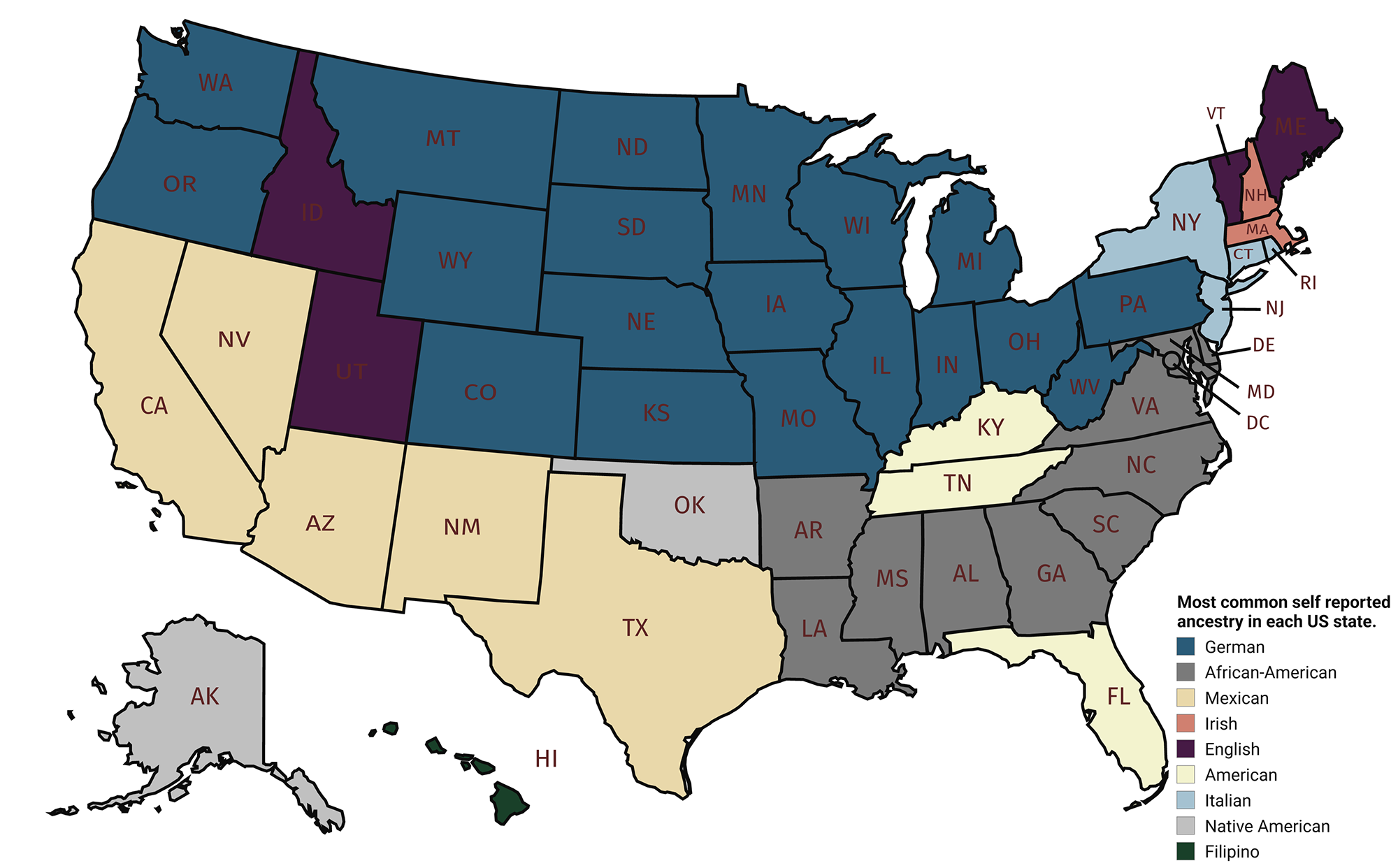
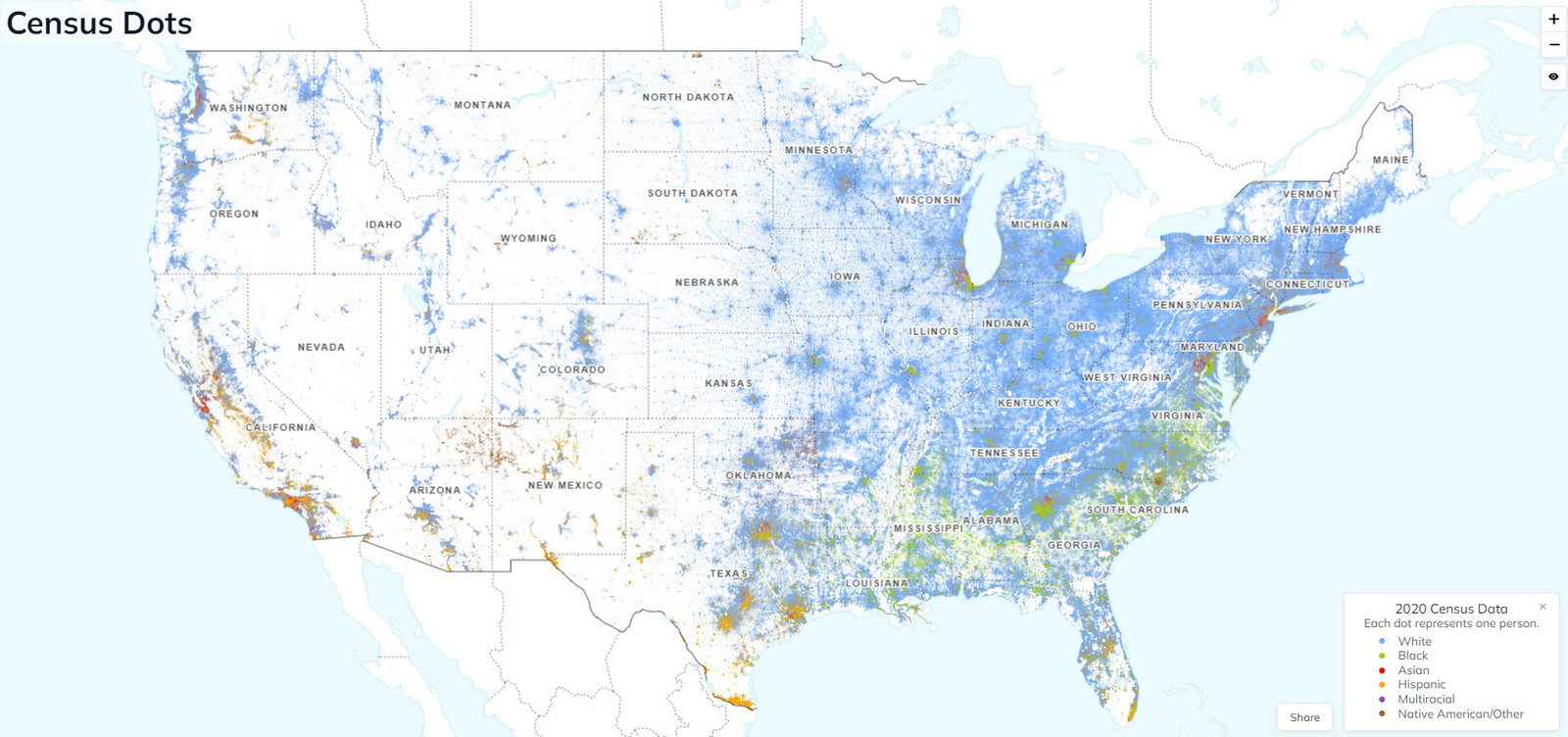
The spatial distribution of Black Americans across the United States is characterized by notable regional patterns. Historically, a significant proportion of Black Americans have resided in the Southern states, a trend that continues to this day. However, there has been a gradual migration to urban centers across the country, including the Northeast, Midwest, and West.
The map of the U.S. below, created using census data, shows the Black population by county in 2022.

Here are the U.S. counties with the highest percentage of Black Americans according to 2022 U.S. Census data.
| Rank | County | State | Percentage |
|---|---|---|---|
| 1 | Claibone | Mississippi | 86.0 |
| 2 | Jefferson | Mississippi | 84.8 |
| 3 | Holmes | Mississippi | 82.9 |
| 4 | Greene | Alabama | 79.6 |
| 5 | Macon | Alabama | 79.5 |
| 6 | Coahoma | Mississippi | 77.9 |
| 7 | Tunica | Mississippi | 77.9 |
| 8 | Petersburg | Virginia | 77.2 |
| 9 | Humphreys | Mississippi | 75.7 |
| 10 | Leflore | Mississippi | 75.1 |
Changes Over Time: Animated Map of Black Population by County (1990-2022)
The distribution and percentage of Black Americans have evolved over the decades. To illustrate these changes, I have created an animated map showing the U.S. Black Population by County from 1990 to 2022. This visualization highlights several trends:
- 1990s: The Black population was heavily concentrated in the Southern states and major urban areas in the North.
- 2000s: There was noticeable migration to suburban areas and states with growing economies like Texas and Georgia.
- 2010s: Continued growth in metropolitan areas, along with increased dispersion to states in the West and Northwest.
- 2020s: The latest data show a persistent trend of urbanization and suburban spread, with significant populations in diverse regions across the country.
Curious to learn more about Black Americans? Check out these recommended books.


I would like to see the movement by a decade. Especially now that a lot of black people are moving south due to more racism in the north. Reversal of previous movement trends.
Crazy to look at this and remember that the black population prior to the 1920-1930s was concentrated almost entirely in the south and it still looks heavily their by looking at this. I think doing this by the county may skewer that though.
Mississippi ranks dead last and nearly everything from educations to two parent families etc and California generally ranks 49th …. No one will point it out but Mississippi has the most blacks and California the most Hispanics … oh sure call me a racist for noting the the truth.
This graph shows proportion, not absolute number. So, I am calling you racist for not noting the truth actually. You will likely then just construe that is still justifying your point, then I would still think your belief is silly, and back and forth. But I may suggest, if you think to yourself “does this belief make me look like as asshole” then it probably does.
stop calling people racist for stating facts stupid
Cool Map! This might be one of those situations where the absolute population may tell a different story. I am speculating that the absolute population tended to shift NW more than this graph suggestions, but the counties that had primarily Black populations just tended to stay Black b/c Whites didn’t move there and thus didn’t tip the proportions.