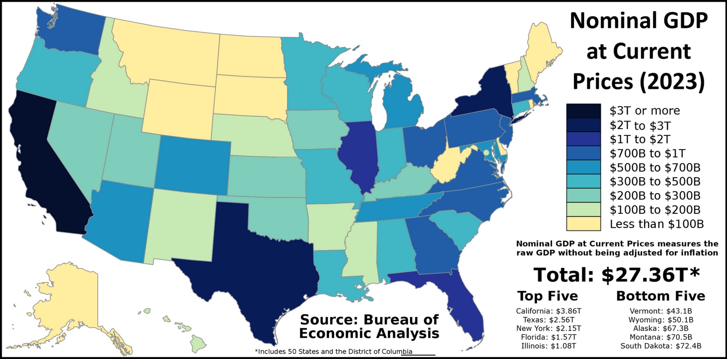
America’s economic geography reveals fascinating patterns about wealth creation and economic power. Using the latest data from the U.S. Bureau of Economic Analysis, let’s explore how different regions and states shape our national economy.
The Southeast stands as America’s largest economic engine, contributing over one-fifth of the nation’s GDP. This powerhouse region includes rapidly growing economies like Florida, Georgia, and North Carolina, with industries ranging from aerospace and automotive manufacturing to technology and tourism.
The Far West follows closely, generating about 20% of national GDP. While California drives much of this output, the region’s strength also comes from Washington’s tech sector, Oregon’s semiconductor industry, and Nevada’s tourism and entertainment complex.
The Mideast region, anchored by New York’s financial sector, contributes 16.8% to national GDP, while the Great Lakes region adds 13.5% through its mix of manufacturing, agriculture, and services.
Individual State Champions
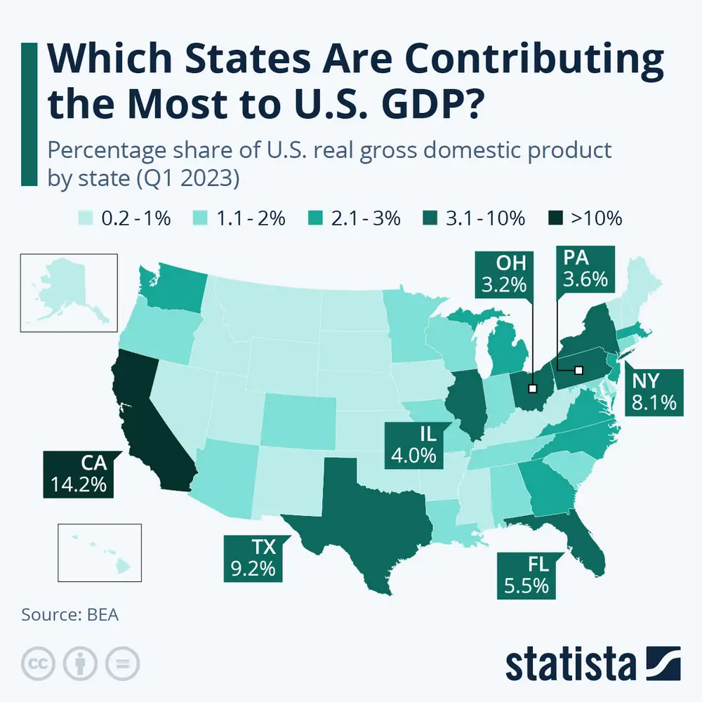
Looking at individual states tells an even more interesting story. According to Statista’s recent analysis, while we might expect each state to contribute about 2% to the national GDP (with 50 states in total), some states dramatically exceed this benchmark. California leads the pack, contributing 14.2% of national GDP while housing 11.7% of the population. New York follows this pattern of outsized contribution, generating 8.1% of GDP with just 5.9% of the population.
Map showing which states contribute the most to U.S. GDP
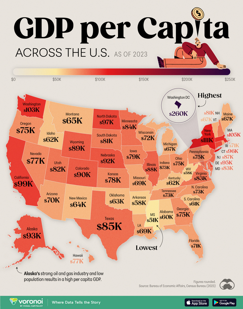
When we examine GDP per capita, we discover some unexpected economic powerhouses. According to Visual Capitalist’s analysis, Washington D.C. leads with $259,954 per person – surpassing even Luxembourg, the world’s richest country by this measure.
The data reveals several interesting patterns:
Metropolitan Powerhouses
New York: $110,980 per capita, driven by financial services
Massachusetts: $105,164 per capita, fueled by technology and education
Washington state: $103,402 per capita, powered by tech and aerospace
Resource-Rich Leaders
North Dakota: $97,003 per capita (energy production)
Wyoming: $89,016 per capita (mining and tourism)
Alaska: $92,794 per capita (oil and natural resources)
Surprising Economic Stories
Delaware: $95,038 per capita, thanks to corporate services and banking
Nebraska: $91,633 per capita, showing the strength of agriculture and insurance
Colorado: $90,109 per capita, reflecting tech growth and aerospace
According to the U.S. Bureau of Economic Analysis, these numbers reflect not just different industries, but varying approaches to economic development, from Silicon Valley’s innovation economy to Texas’s energy and tech hybrid model.