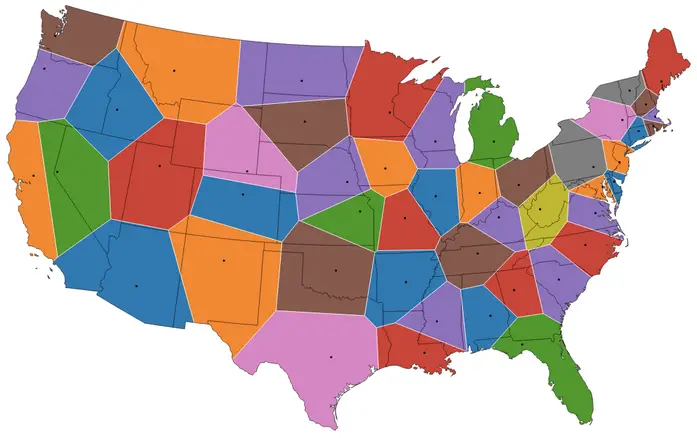
On the map below, U.S. state borders are redrawn based on the locations of the state capitals. Every state owns the land at any given point with the closest capital city.
Voronoi maps/diagrams represent the portioning of a plane into polygons based on a set of points. This is done such that each polygon contains exactly one point, and the area within the polygon is necessarily closer to the point it contains than it is to any other point. In other words, each point translates into a polygon of all the space closer to that point than any other point. The polygons are referred to as Voronoi cells (or sometimes Thiessen polygons or Dirichlet cells). For those who have encountered Delaunay triangulation, a Voronoi diagram is simply the dual graph of a Delaunay triangulation.
So for this map, the state you live in would be determined by which capital city is closest to your home. If you originally lived in Manhattan, you would be a New Jerseyan because you are closer to Trenton than Albany (and Hartford). If you were a proud Chicagoan, you would reside in Wisconsin because you are closer to Madison than Springfield.
As can be seen on the map, some states would barely change shape (e.g., Maine), but most would be unrecognizable. I calculated the revised areas of the states to see which were most affected. Those losing the most area percentages are Massachusetts (37% of original size), California (42%), and Kansas (53%). Benefactors would include Delaware (342% of original size), Rhode Island (319%), and West Virginia (202%). Mississippi and New Hampshire would both be with 1.5% of their original sizes. Based on the area, Utah and New Mexico are the biggest gainers, each adding over 60,000 square miles. Texas ends up as the biggest loser, shedding ~98,000 square miles.