Have you ever wondered how Australia and Brazil match up in size? These two southern giants are often discussed separately, but seeing them side by side reveals fascinating comparisons. Thanks to the creative work of Reddit user: luke_in_the_sky, we can visualize this comparison through an elegant superimposed map that perfectly illustrates their relative sizes.
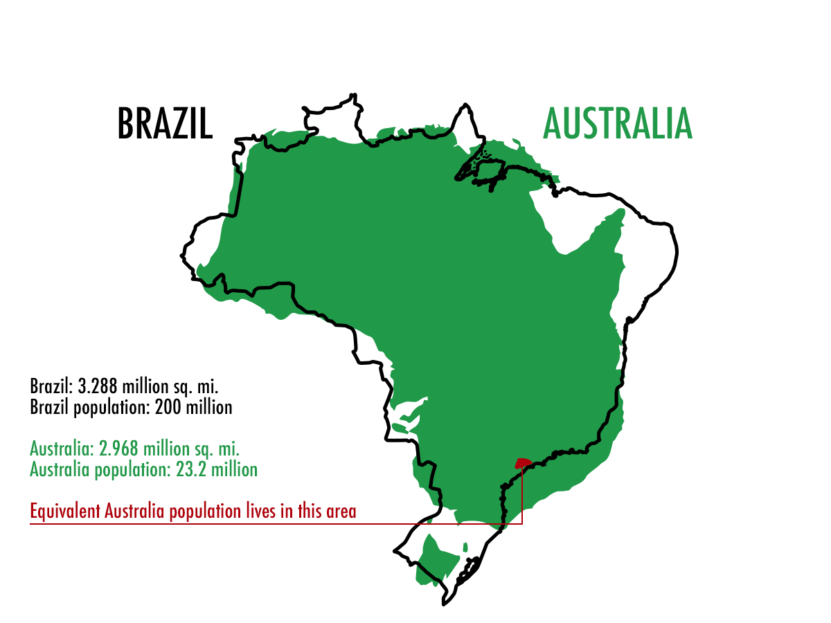
Looking at the raw numbers, Brazil stretches across 8.5156 million km2 (3.288 million sq.mi.) of Earth’s surface, while Australia covers 7.692 million km2 (2.968 million sq.mi.). But what’s truly striking is the population difference: Brazil is home to 200 million people, while Australia’s vast landscape houses just 23.2 million residents.
This population contrast tells an intriguing story. Brazil’s population density sits at about 25 people per square kilometer, while Australia has only 3 people per square kilometer. The reason? Much of it comes down to geography and climate. Australia’s interior is dominated by harsh desert regions, covering about 35% of the continent, while Brazil’s landscape offers more habitable areas.
Both countries share some remarkable similarities: they’re both Southern Hemisphere nations with extensive coastlines and unique ecosystems. Brazil’s Amazon Rainforest blankets about 60% of the country, while Australia’s Outback defines its interior landscape.
The climate differences between these two lands are dramatic. Brazil’s Amazon region receives up to 2,300 mm of annual rainfall, while Australia’s central desert sees less than 250 mm yearly.
One fascinating parallel is how both populations cling to the coasts. In Brazil, about 80% of people live within 200 kilometers of the Atlantic Ocean, while in Australia, nearly 85% of residents make their homes within 50 kilometers of the coastline.