Population Cartogram Reveals Global Demographics
Have you ever wondered what a world map would look like if countries were sized based on their population instead of land area? Well, wonder no more! I recently came across a fascinating cartogram created by Max Roser that does just that, and it’s completely changed my perspective on global demographics.

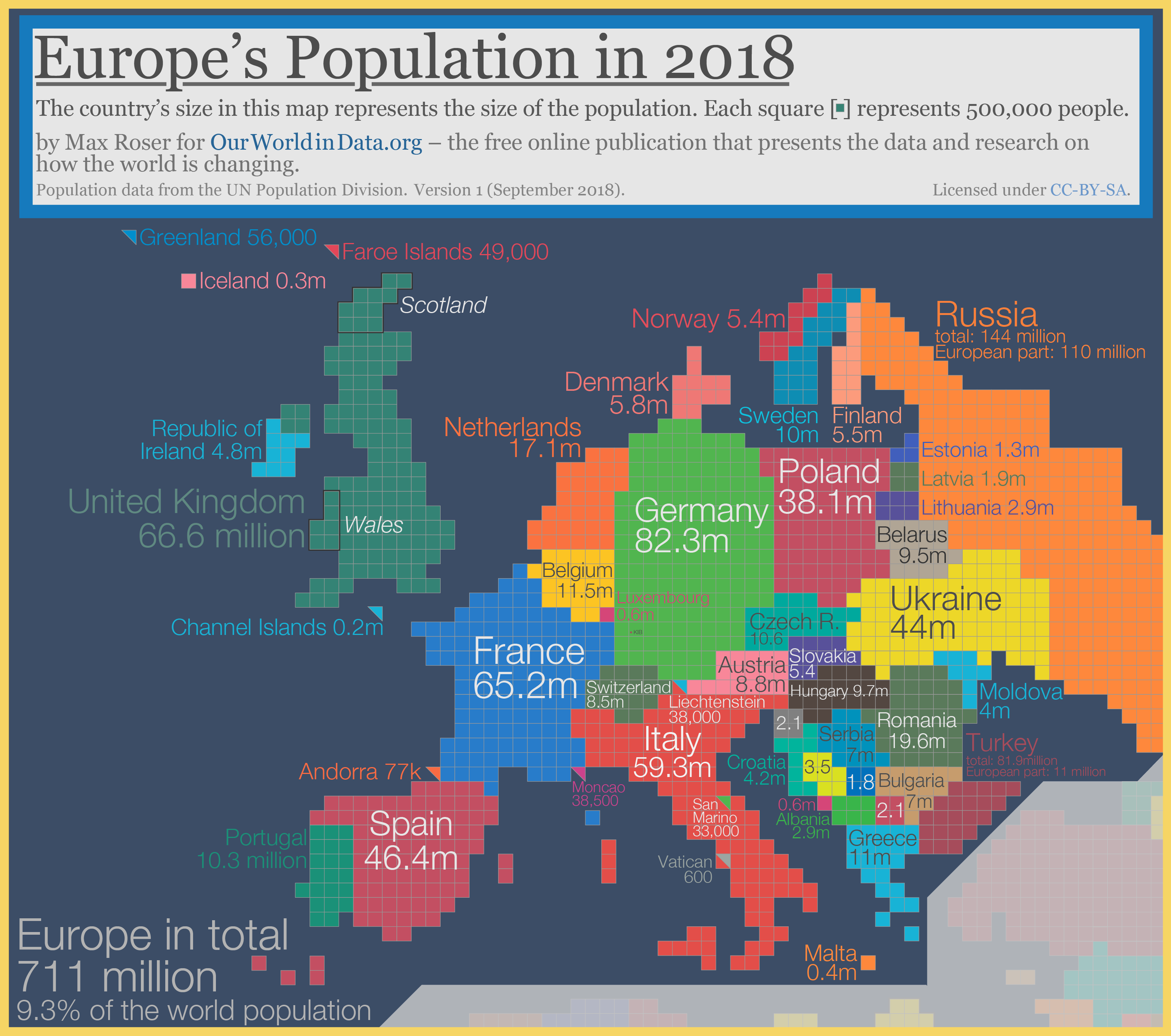
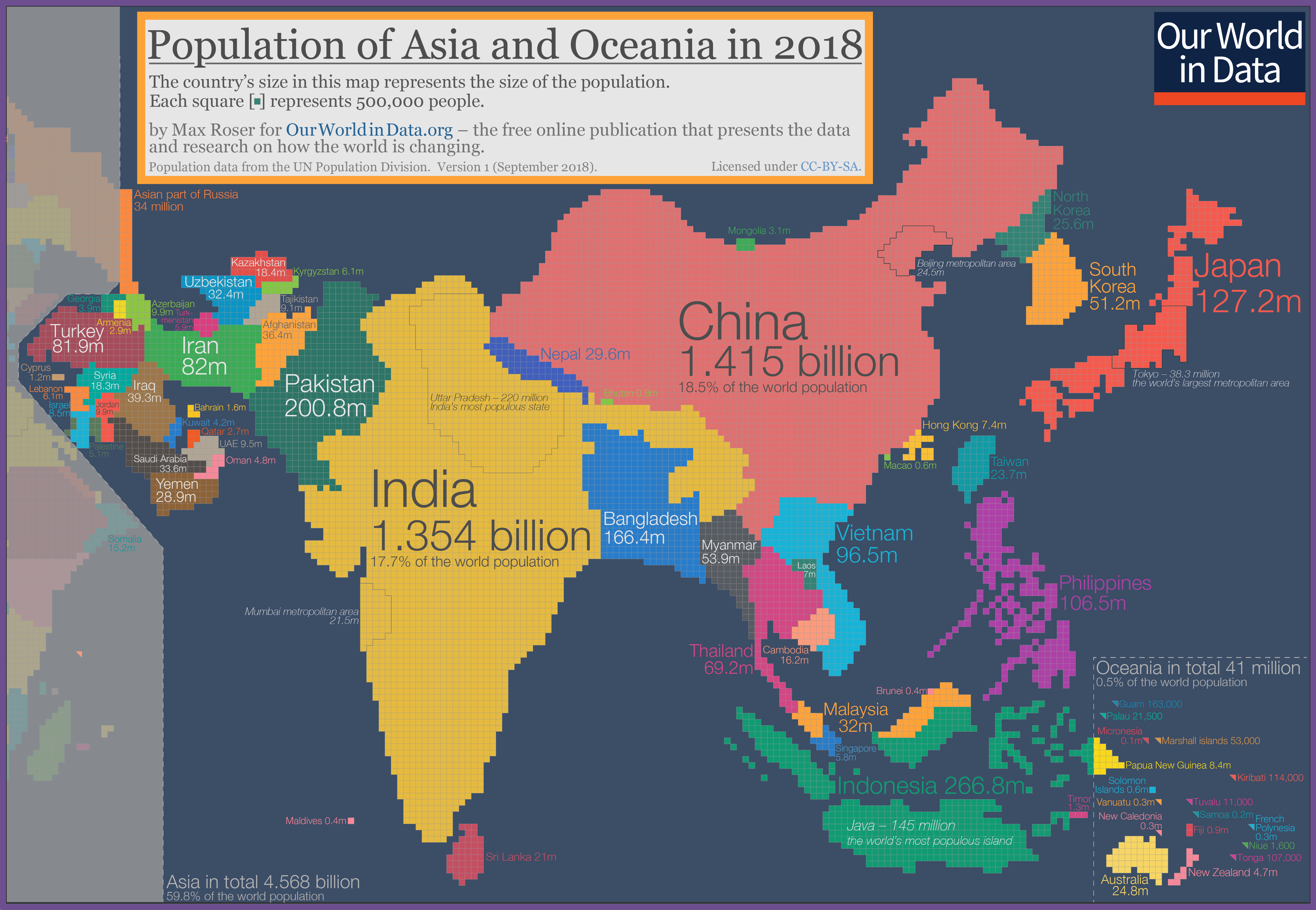
This isn’t your typical world map. Each tiny square represents 500,000 people, with a total of 12,266 squares depicting our planet’s 7.633 billion inhabitants. It’s mind-blowing to see how this unique visualization reshapes familiar continents and countries.
What immediately stands out is how some nations, like India and China, dramatically expand, while others, such as Russia and Canada, shrink significantly. It’s a stark reminder of just how unevenly distributed our global population is.
But here’s something even more intriguing – if we could somehow gather every person on Earth in one place, standing shoulder to shoulder, how much space would we actually occupy?
If everyone on the world stood this close together they would take up this much space

Surprisingly, we’d all fit within a circle just 50 km in diameter! It’s hard to believe, isn’t it? This puts into perspective how small we are compared to the vast expanse of our planet, yet how significant our impact is on it.
This population-based world map not only offers a fresh take on global demographics but also serves as a powerful tool for understanding international relations, resource distribution, and environmental challenges. It’s a reminder that traditional world maps, while familiar, don’t always tell the whole story.
For those of you who love exploring different map perspectives, I’ve found some interesting world maps available on Amazon:


")
Population of the Americas in 2018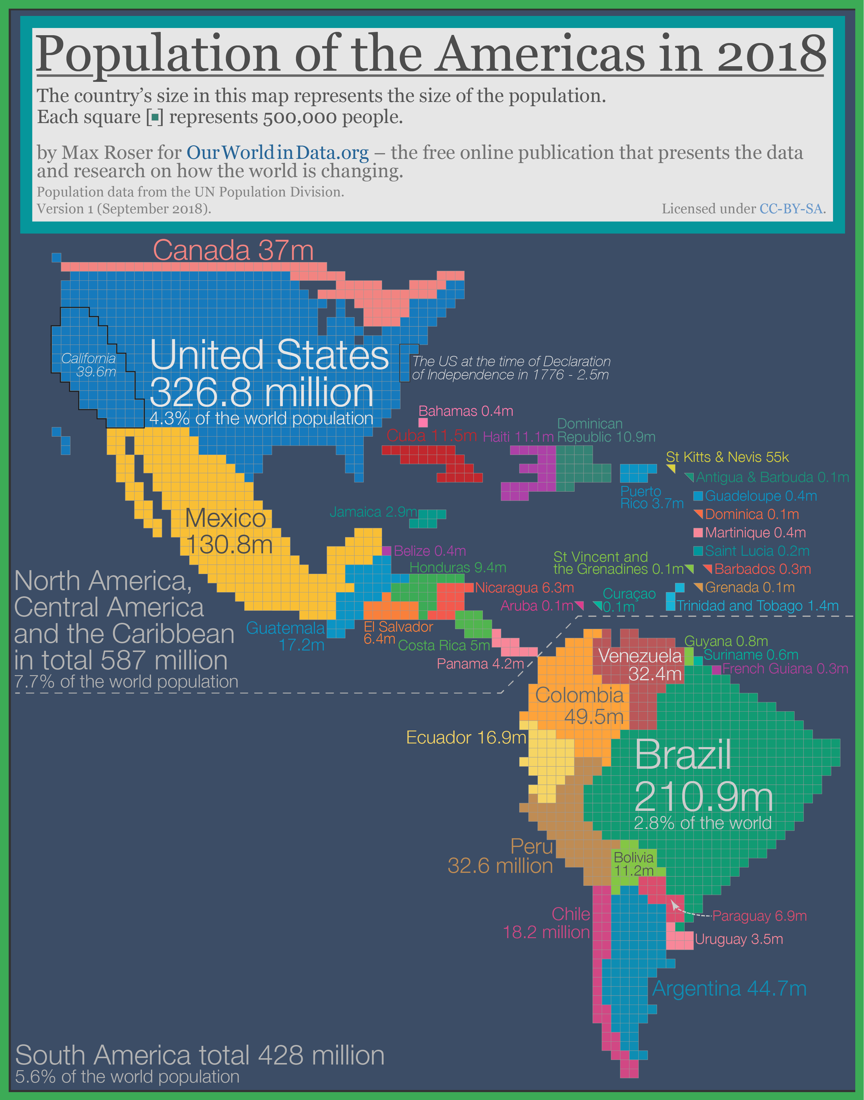
Population of Asia and Oceania
Population of Africa (2018)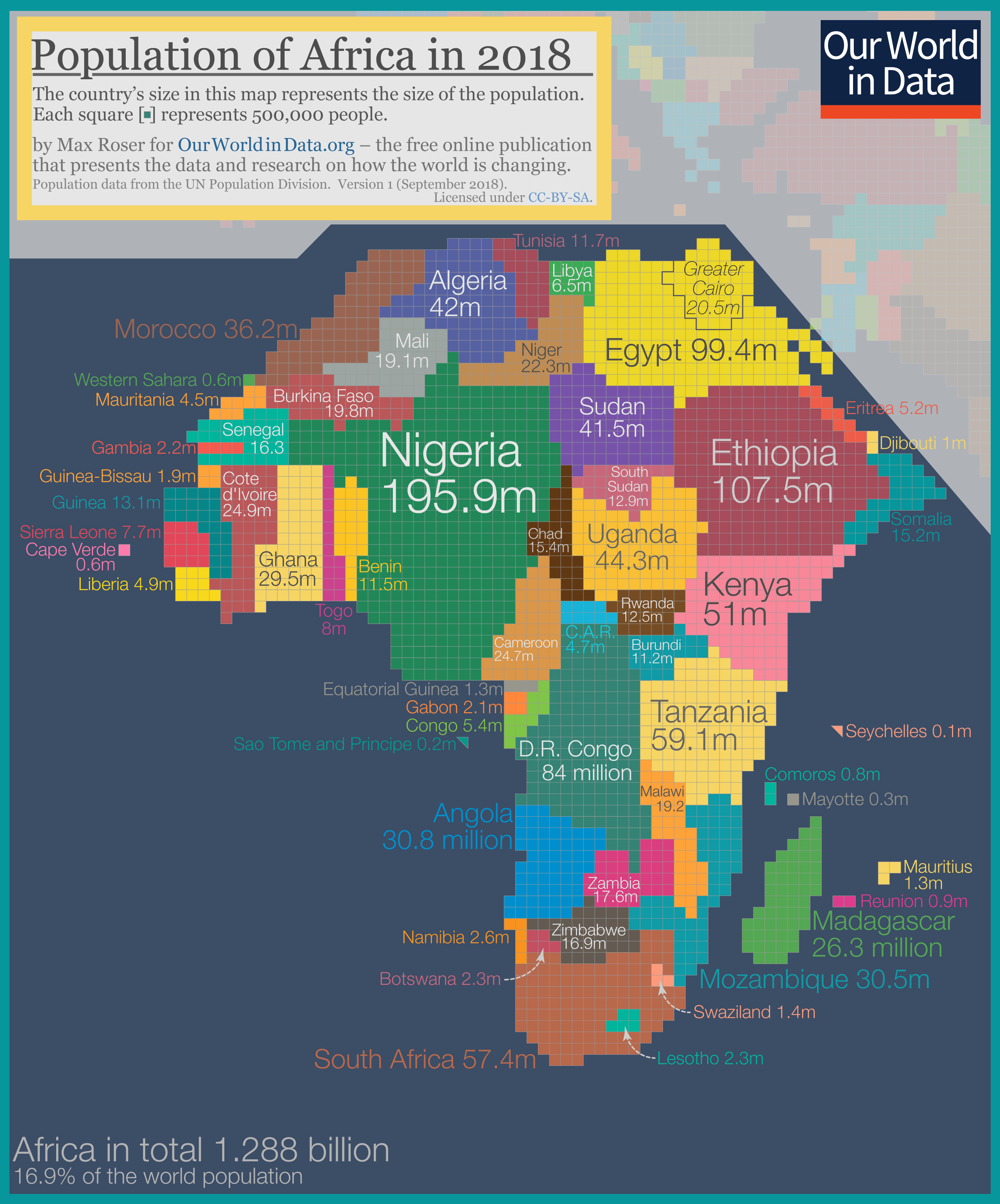
Population of Europe (2018)