Influenza Death Rate by U.S. State
This map shows the influenza death rate across U.S. states from 1999 to 2016. Learn why some states have higher rates and how to protect yourself from the flu.
Read more: Influenza Death Rate by U.S. State
Mapping public health.
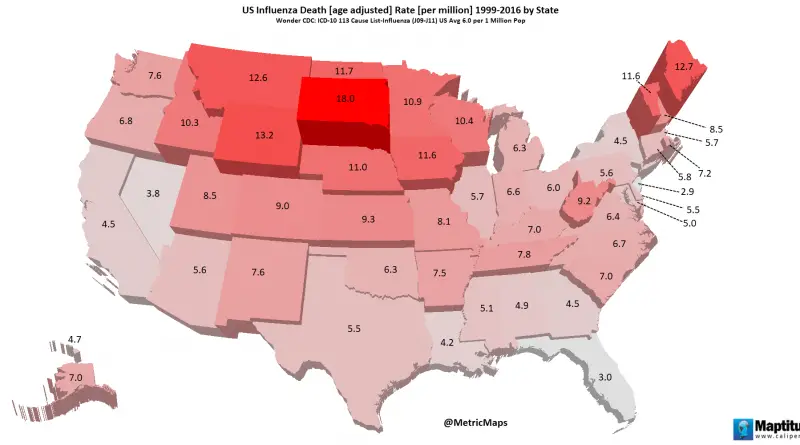
This map shows the influenza death rate across U.S. states from 1999 to 2016. Learn why some states have higher rates and how to protect yourself from the flu.
Read more: Influenza Death Rate by U.S. State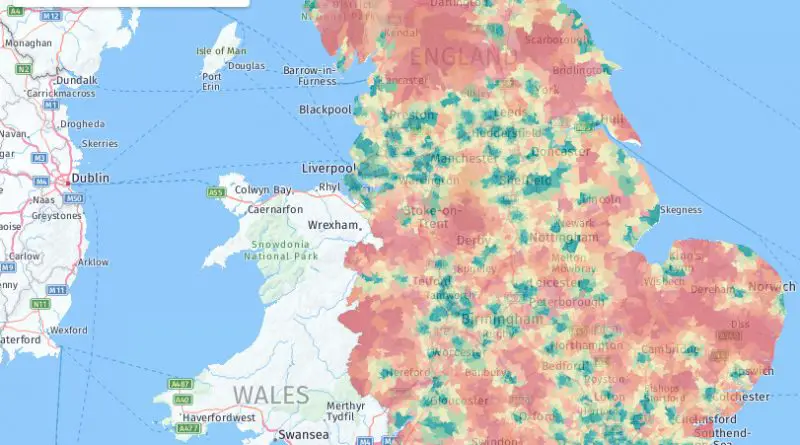
A 2005 study by the Imperial College London’s Carol Propper revealed disparities in England hospital access, based on patient population. The
Read more: NHS Hospital Access in England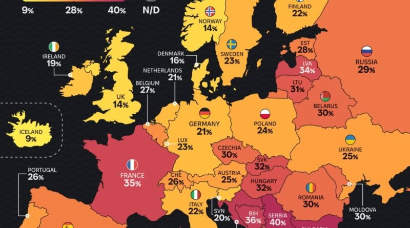
Tobacco use is fading across Europe — but not everywhere. This map-based analysis uncovers the countries still hooked and the surprising success stories.
Read more: Smoking in Europe: A Map of Habit and Change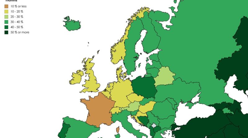
Alcohol consumption patterns vary dramatically worldwide, but what about the people who don’t drink at all? This animated map visualization explores two decades of data showing how abstinence rates changed across different countries and cultures.
Read more: Percentage who have not Consumed Alcohol in the last 12 Months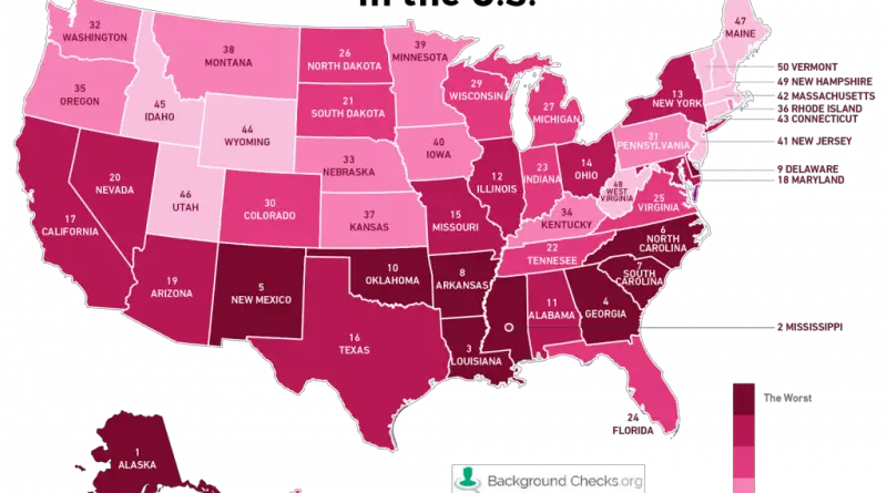
The rate of incidents per 100,000 residents for the two most common sexually transmitted diseases (gonorrhea and chlamydia) and calculating
Read more: The most sexually diseased states in the United States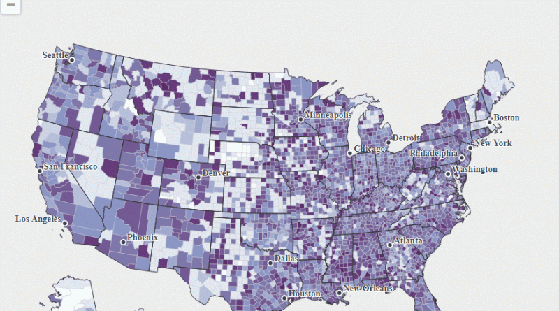
This map below shows the weekly vaccination rate of at least one dose of any vaccine. The data are animated
Read more: Percent of eligible children vaccinated by U.S. county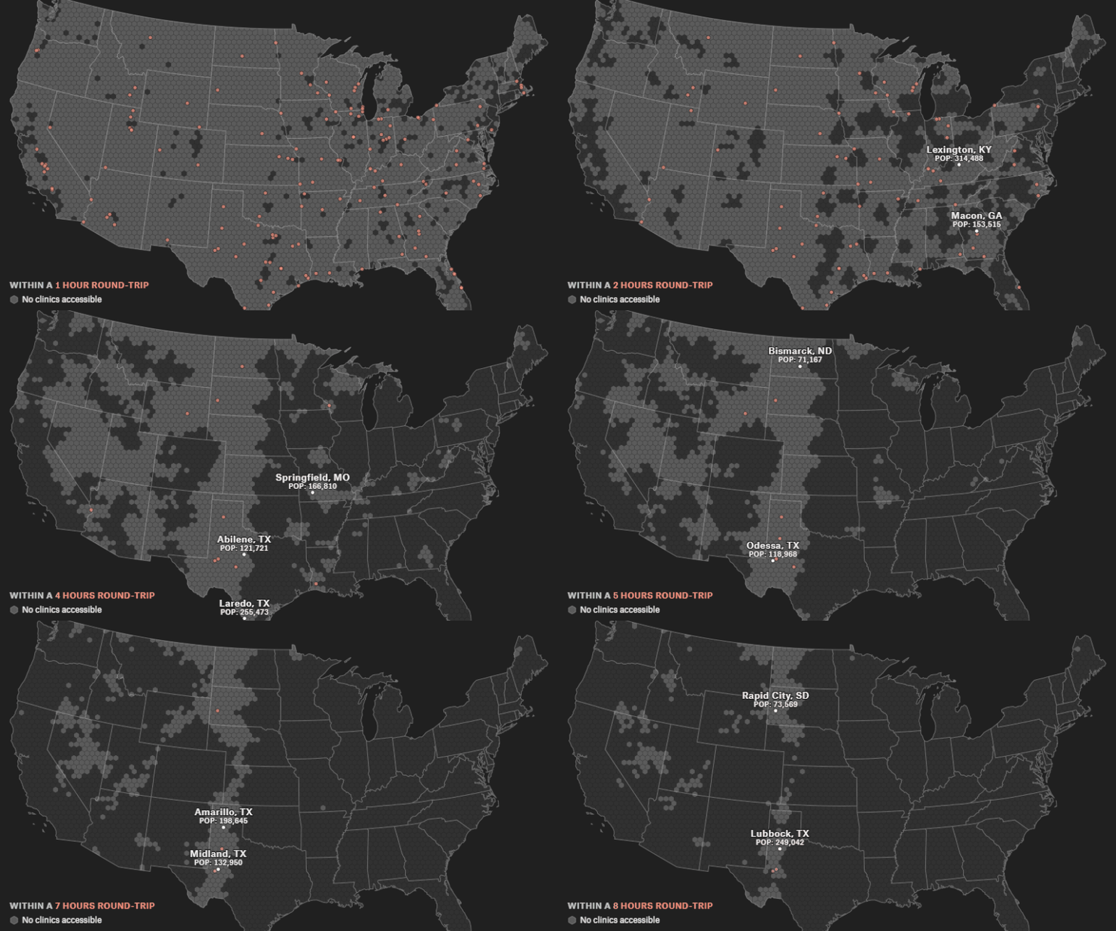
Urban areas in the United States with no accessible abortion clinics within a [X] hours round-trip drive Round-trip time to
Read more: An analysis of driving times to abortion clinics in the United States
Reddit user: trinitronbx; Data: keepeek.com
Read more: Percentage of employed population in European countries who report having depressionThe map above shows the number of plastic surgeons per one million people. Those U.S. states in shades of red
Read more: Plastic Surgeon Density by U.S. State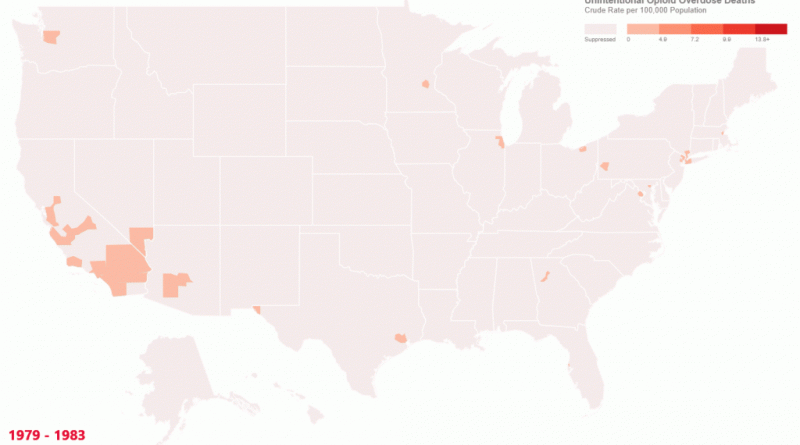
Unintentional opioid overdose deaths. Crude rate per 100,000 population. Related posts:– U.S. Drug Overdose Deaths (1999 – 2014)– The stunning spread of
Read more: Unintentional Opioid Overdose DeathsDoctors in some U.S. counties prescribed up to six times more addictive pain pills than others in 2015. Around two
Read more: This Map Shows How Some U.S. Counties Are Prescribing Way More Opioids Than OthersThe Well-Being Map is an online visualization tool that displays measurements of various characteristics for each U.S. county. For characteristics
Read more: The Well-Being Map