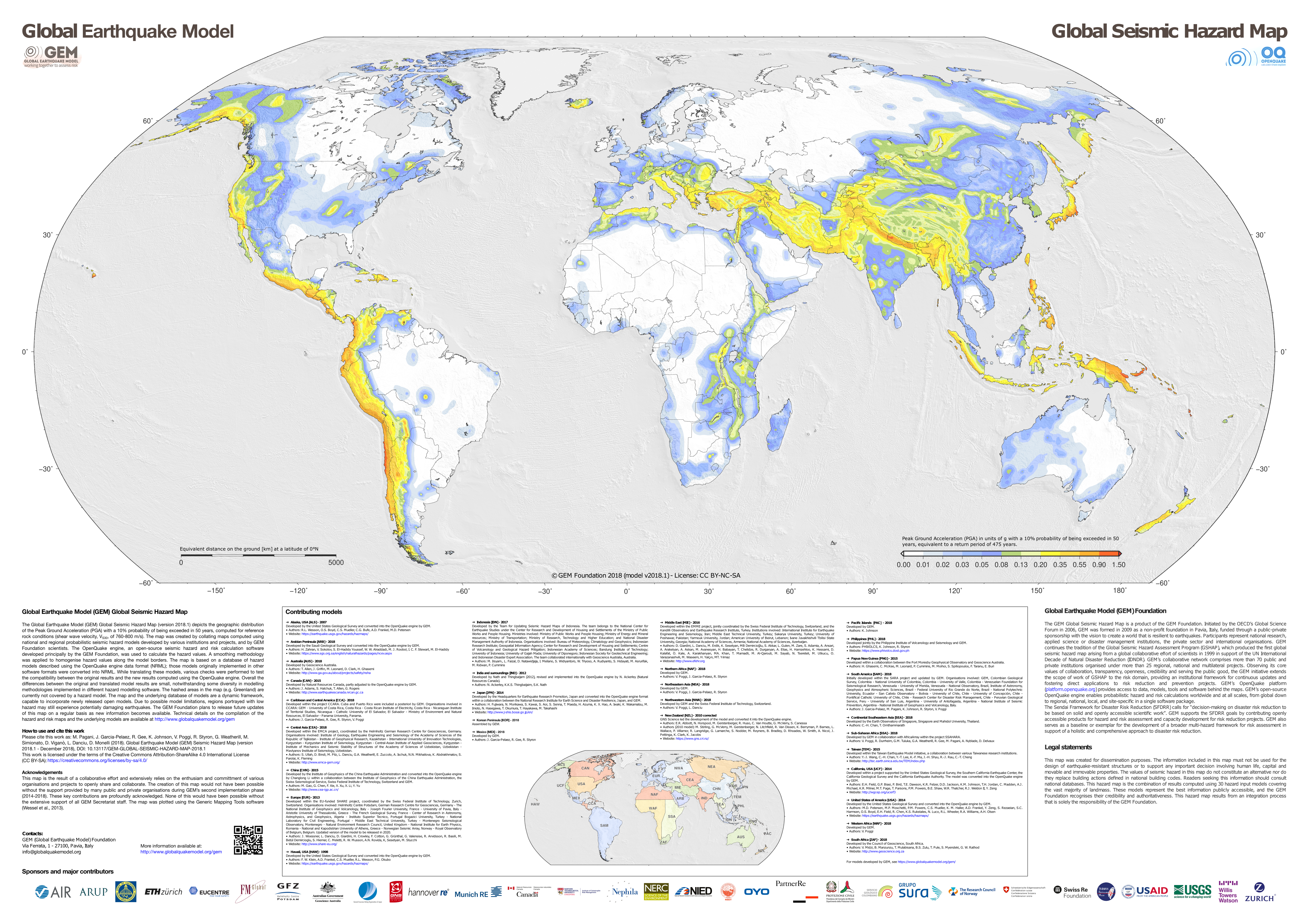
The Global Seismic Hazard Map is a valuable tool used by scientists, engineers, policymakers, and planners to assess earthquake risk and seismic hazards on a global scale. It is a visual representation of the probability and intensity of earthquakes occurring in different regions around the world.
The map typically divides the world into different seismic zones based on the level of earthquake hazard. These zones are often color-coded, with red or darker colors indicating higher seismic risk and blue or lighter colors representing lower risk.
Seismic hazard is often highest along tectonic plate boundaries, where plates interact and create stress that can lead to earthquakes.
The Global Seismic Hazard Map depicts the geographic distribution of the Peak Ground Acceleration (PGA) with a 10% possibility of being exceeded in 50 years, calculated for reference rock conditions (shear wave velocity, VS30, of 760-800 m/s). The map below was made by collating maps computed using national and regional probabilistic seismic hazard models produced by different institutions and projects, and by Global Earthquake Model Foundation scientists.
If you liked this map, you may also be interested in the following maps: