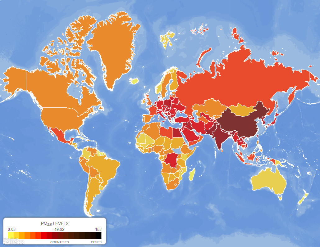
A team of Yale University environmental researchers just released a map tool that shows concentrations of fine particulate matter (PM 2.5) across the whole world in pretty astounding detail: each pixel represents a 10-by-10 kilometer square. They also included visual representations of the world’s dirtiest power plants—a timely feature as the U.S. announces a sweeping new plan to reduce carbon emissions from power plants, especially coal-fired ones.