Millions of U.S. citizens migrate between states every year. These migration movements are affected by many factors, including job possibilities, housing prices, taxes, and climate.
According to Internal Revenue Service data, about 3 percent of households moved to another state in 2018. People are mainly moving out of the Northeast and Midwest to the South and West, but they are also leaving California. The map below shows the source of most residents born out of state.
The source of the most residents born out-of-state
Reddit user: demivus
Over the past year, about 200 thousand people left California, followed by New York (-180 thousand people). As you can see on the map above, many out-of-state residents in eastern U.S. states (Connecticut, Florida, Massachusetts, New Jersey, North Carolina, Pennsylvania, Vermont, Virginia) and California hail from New York on the East Coast. Californians make up the largest number of out-of-state residents in Alaska, Arizona, Colorado, Hawaii, Idaho, Montana, Nevada, Oregon, Texas, Utah, and Washington.
In the past couple of years, California has been losing more people than its gained, but there has not yet been something extreme. The state is losing many residents because of how huge it is (almost 1 in 8 Americans live in California). The map below shows the percentage of California-born residents outside California.
California-born residents outside California
Reddit user: Biohzd05
Below is the list of U.S. states by annual net migration (the total number of people moving to a U.S. state from a state minus people going to another state from that state) based on the Census Bureau’s data.
The U.S. states by net domestic migration
Rank
State
Total net domestic migration
Net domestic migration rate per 1,000 inhabitants
1
Florida
133,910
6.23
2
Texas
125,660
4.33
3
Arizona
91,017
12.5
4
North Carolina
67,338
6.42
5
South Carolina
53,034
10.3
6
Georgia
49,680
4.68
7
Nevada
43,207
14.03
8
Washington
37,476
4.92
9
Tennessee
36,009
5.27
10
Colorado
31,335
5.44
11
Idaho
27,360
15.31
12
Oregon
25,821
6.12
13
Utah
15,588
4.86
14
Alabama
9,387
1.91
15
Delaware
6,961
7.15
16
Maine
6,613
4.92
17
Montana
6,024
5.64
18
New Hampshire
4,469
3.29
19
Indiana
3,997
0.59
20
Oklahoma
3,822
0.97
21
Arkansas
2,515
0.83
22
South Dakota
964
1.09
23
Minnesota
65
0.01
24
Vermont
−682
−1.09
25
Missouri
−710
−0.12
26
Wyoming
−1,012
−1.75
27
North Dakota
−1,267
−1.66
28
Wisconsin
−1,438
−0.25
29
Kentucky
−1,541
−0.34
30
New Mexico
−2,136
−1.02
31
D.C.
−2,203
−3.12
32
Rhode Island
−3,215
−3.03
33
Nebraska
−4,220
−2.18
34
Iowa
−5,011
−1.59
35
West Virginia
−7,073
−3.95
36
Virginia
−9,136
−1.07
37
Alaska
−9,482
−12.96
38
Mississippi
−10,740
−3.61
39
Kansas
−12,357
−4.24
40
Ohio
−12,916
−1.10
41
Hawaii
−13,817
−9.76
42
Pennsylvania
−19,588
−1.53
43
Connecticut
−22,059
−6.19
44
Maryland
−23,665
−3.91
45
Michigan
−23,670
−2.37
46
Louisiana
−26,045
−5.60
47
Massachusetts
−30,274
−4.36
48
New Jersey
−48,946
−5.51
49
Illinois
−104,986
−8.28
50
New York
−180,649
−9.29
51
California
−203,414
−5.15
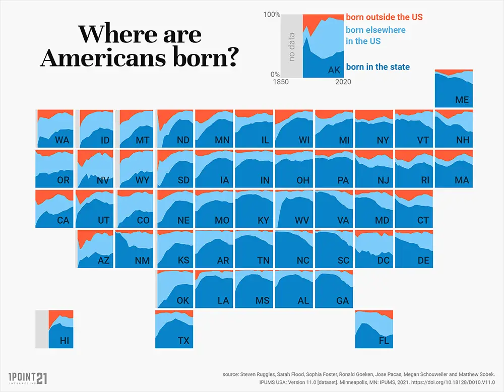
Birthplace of U.S. citizens by state from 1850 to 2020
States of the Midwest and the South of the United States have the lowest percentage of people born outside the states. The map below created by Reddit user beltzy shows where Americans were born from 1850 to 2020.
Moreover, each state has its characteristics of population migration. People getting out are mostly moving to cities.
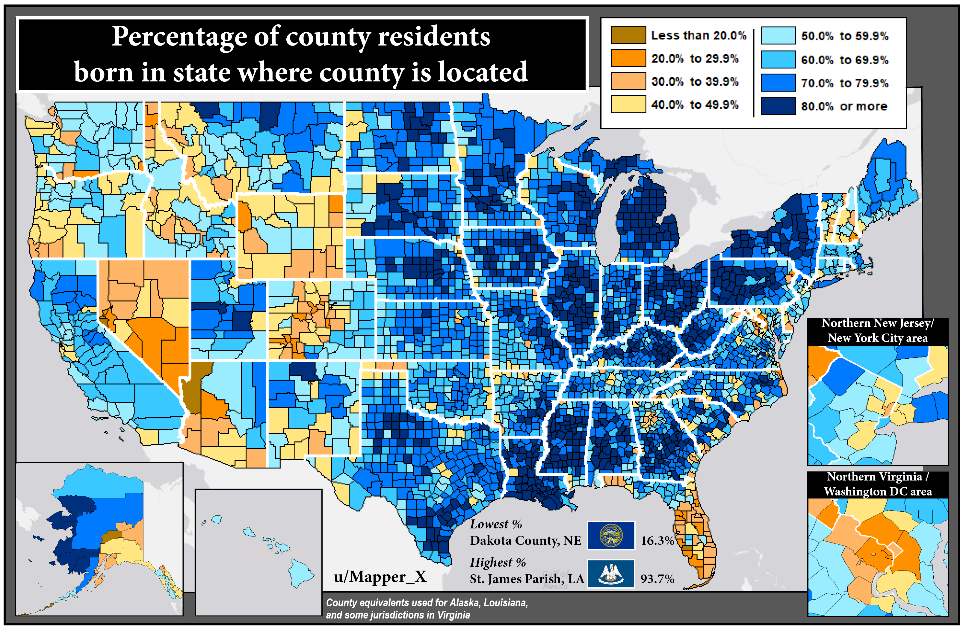
Percentage of a county’s population born in the U.S. state where the county is located
The map below created by Mapper_X shows the percentage of people in every county born in that state.


?")