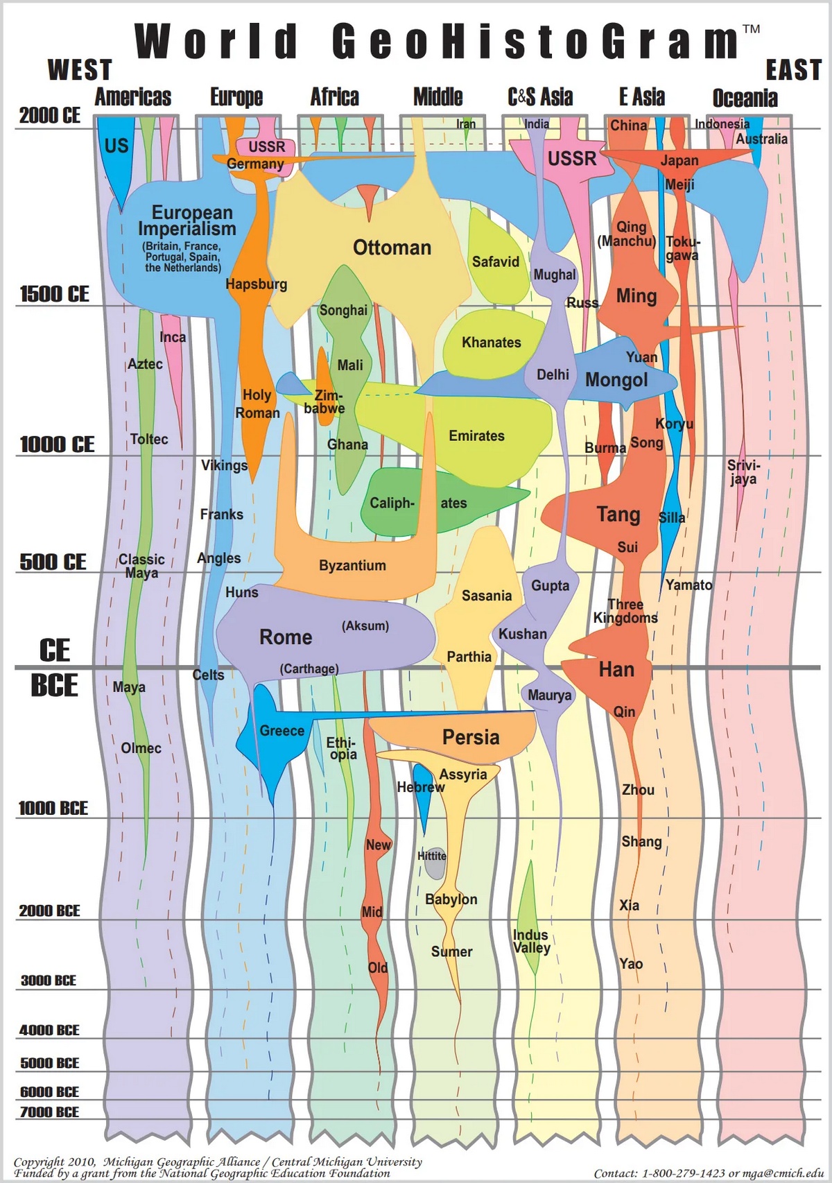
Most historical maps freeze empires at one moment in time. You see Rome in 117 CE or the Mongol Empire at its peak, but not how they got there or what came before. The World GeoHistogram tries something different—it shows 9,000 years at once, letting you compare how long the Ottomans lasted versus Rome, or see which civilizations were actually contemporary with each other.
Michigan Geographic Alliance at Central Michigan University created this as a teaching tool. Seven regions stretch across the page—Americas, Europe, Africa, Middle East, Central and South Asia, East Asia, Oceania. Time goes from 7000 BCE at the bottom up to 2000 CE at the top. Ancient history gets condensed into less space while the last few centuries get more room. Why? We have better documentation for recent periods, plus they’re more relevant to understanding today’s politics.
When Alexander Rewrote the Map
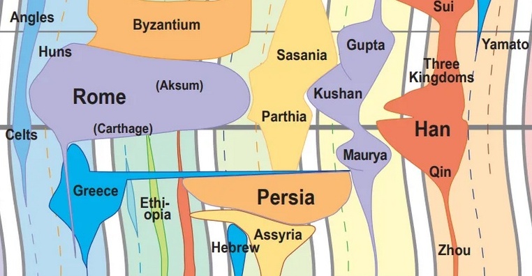
Take one section around 330 BCE. The massive blob representing Persia suddenly fractures, replaced almost overnight by a Greek-colored expansion stretching from the Mediterranean to India. That’s Alexander’s conquest. It shows up as a quick explosion that shatters just as fast when his generals carved up the territory after his death.
Check out the same timeframe. Rome’s starting to grow in Europe. Carthage controls parts of North Africa. The Parthians show up in the east—they’ll become Rome’s main rival for centuries. All of these existed simultaneously. Some knew about each other through trade and conflict, others had no idea the rest existed.
The Mongol Moment
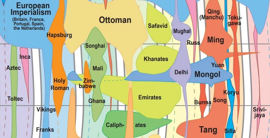
Now jump to the 13th century CE. Color explodes from Central Asia in three directions. The Mongols grabbed territory from Korea all the way to Hungary—bigger than any continuous empire before or since. China fell. So did chunks of the Middle East. Eastern Europe got invaded. Decades, not centuries.
What else was going on at the same time? Europe had the Holy Roman Empire. In West Africa, Mansa Musa controlled Mali and its gold trade, possibly accumulating more personal wealth than any other human in history. Japan was fighting off Mongol invasion attempts. All happening at once, not in isolation.
How to Actually Use This
The real value isn’t memorizing which empire sat where at what time. Instead, you start noticing connections you’d normally miss. European colonial powers started expanding when compared to Ming Dynasty China? How long did the Ottomans actually last versus Rome? Did the Inca and Aztec empires overlap with Renaissance Italy? (They did, and it’s weird to think about conquistadors arriving in the Americas while Michelangelo was painting in Rome.)
The compressed ancient periods and expanded modern ones raise questions too. We give recent centuries more visual real estate partly because we have better records, but also because they connect more directly to current politics. The borders European colonialism drew still shape modern conflicts.
There’s one limitation worth mentioning. This format only captures large territorial empires with written records. What about Indigenous nations, nomadic confederations, city-states, societies with oral traditions? Most don’t show up. Not because they lacked sophistication—they just organized power differently than territorial empires did.
Where to Find It
The Michigan Geographic Alliance at Central Michigan University developed the World GeoHistogram as an educational resource. Their website offers teaching kits that include a 33″x22″ poster, placemats, and classroom materials.
You can also find the poster through various retailers, including Amazon. On Amazon, different versions exist for world history and US history.