ChartsPopulation

World population distribution and density by latitude & longitude

This post may contain affiliate links. As an Amazon Associate, we earn from qualifying purchases.

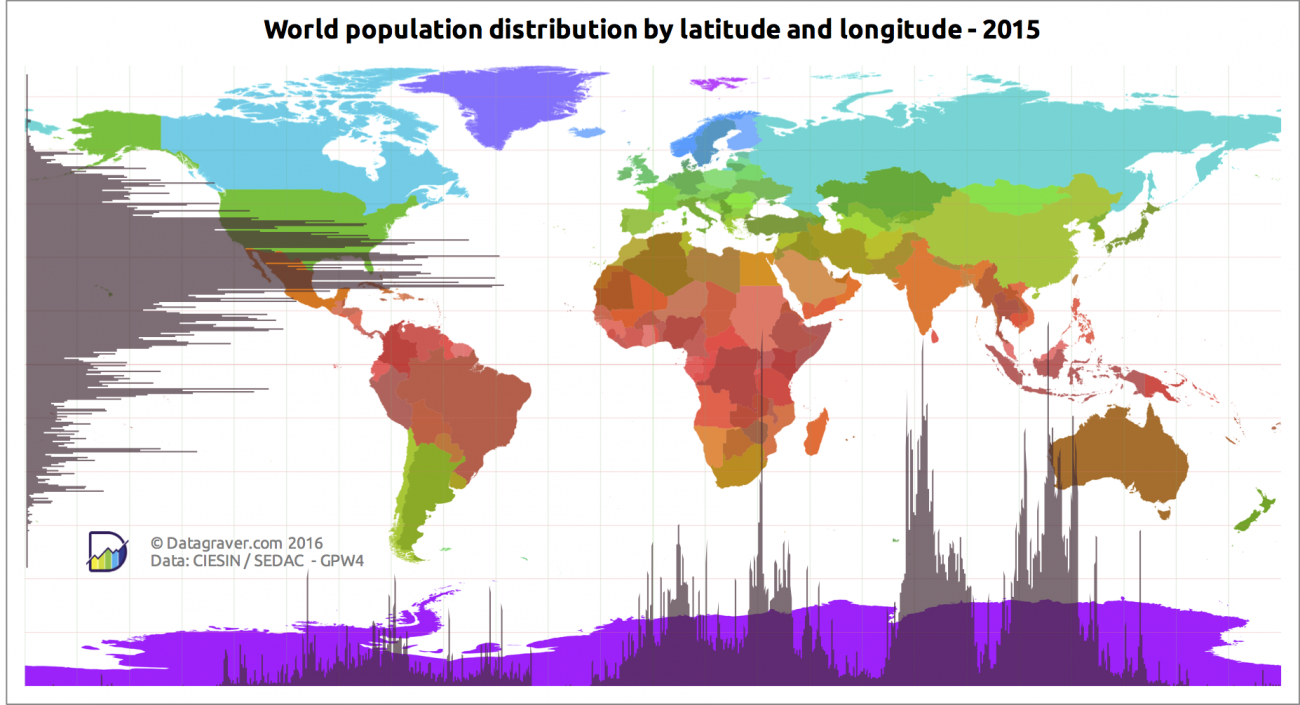
People are distributed on the planet extremely unevenly. Most people are concentrated in areas with a comfortable climate, which are mainly located in subtropical and tropical latitudes. Asia has the highest concentration of people in the world.

The maps below illustrate the world population by latitude and longitude.

World population density by longitude

Charts on the map that go down show the highest-density spots.

world map of the highest-density population spots


Reddit user Datagraver made other fantastic maps of world population distribution and world population density distribution by latitude and longitude.

World population distribution by latitude and longitude
World population distribution by latitude & longitude
World population density distribution by latitude and longitude
World population  density by latitude & longitude
Via datagraver.com
Map of spread of humanity

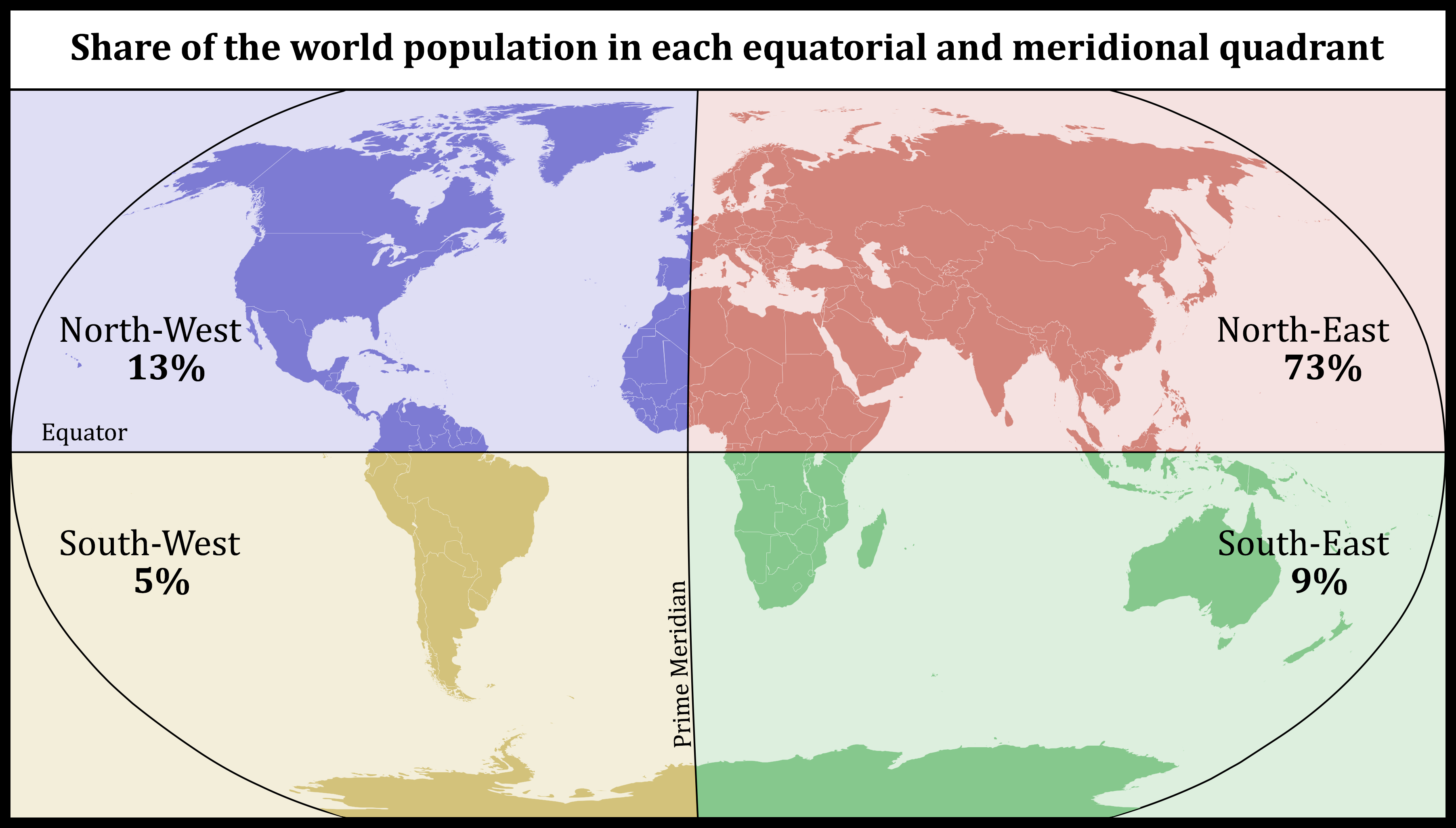
Here is the map that shares the world population in each equatorial and meridional quadrant. The most populated is the North-East quadrant which lives about 73% of the whole world’s population.

World map: Share of the world population in each equatorial and meridional quadrant

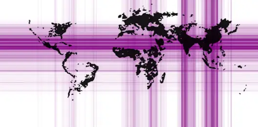
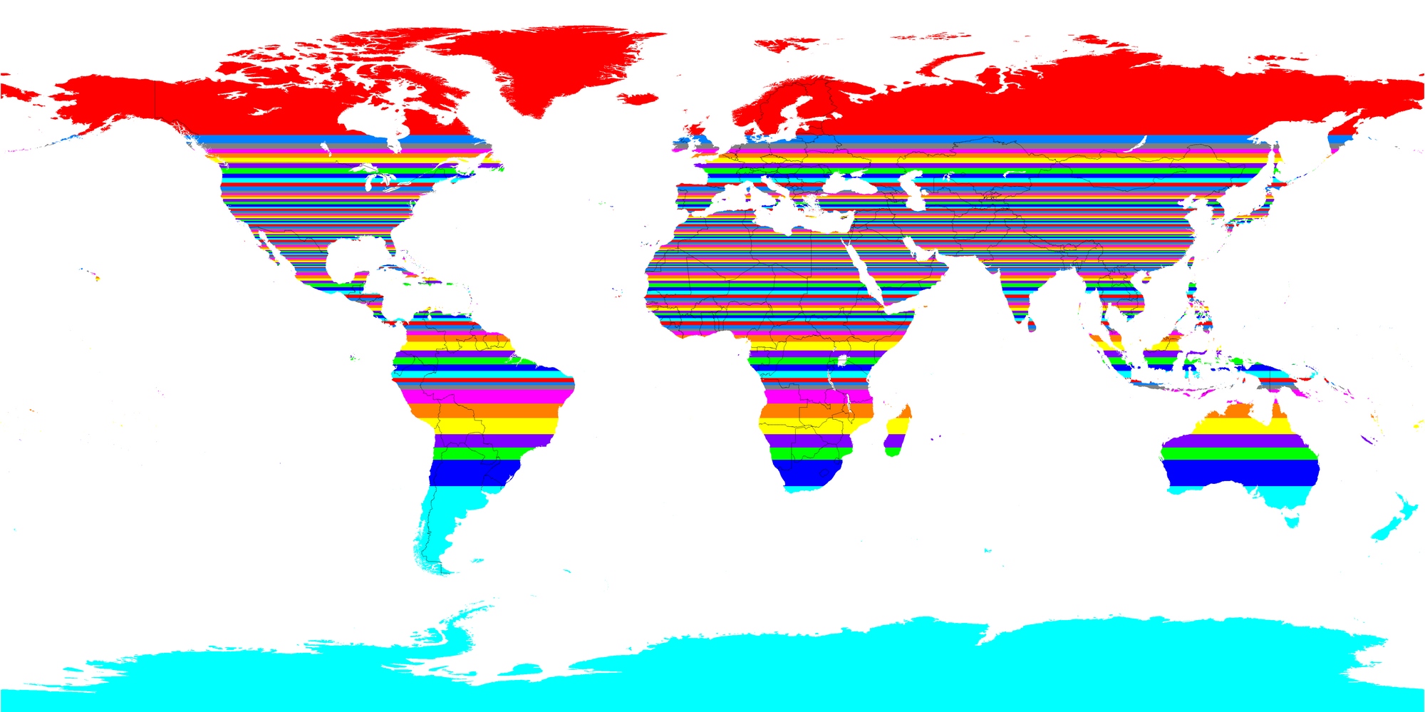
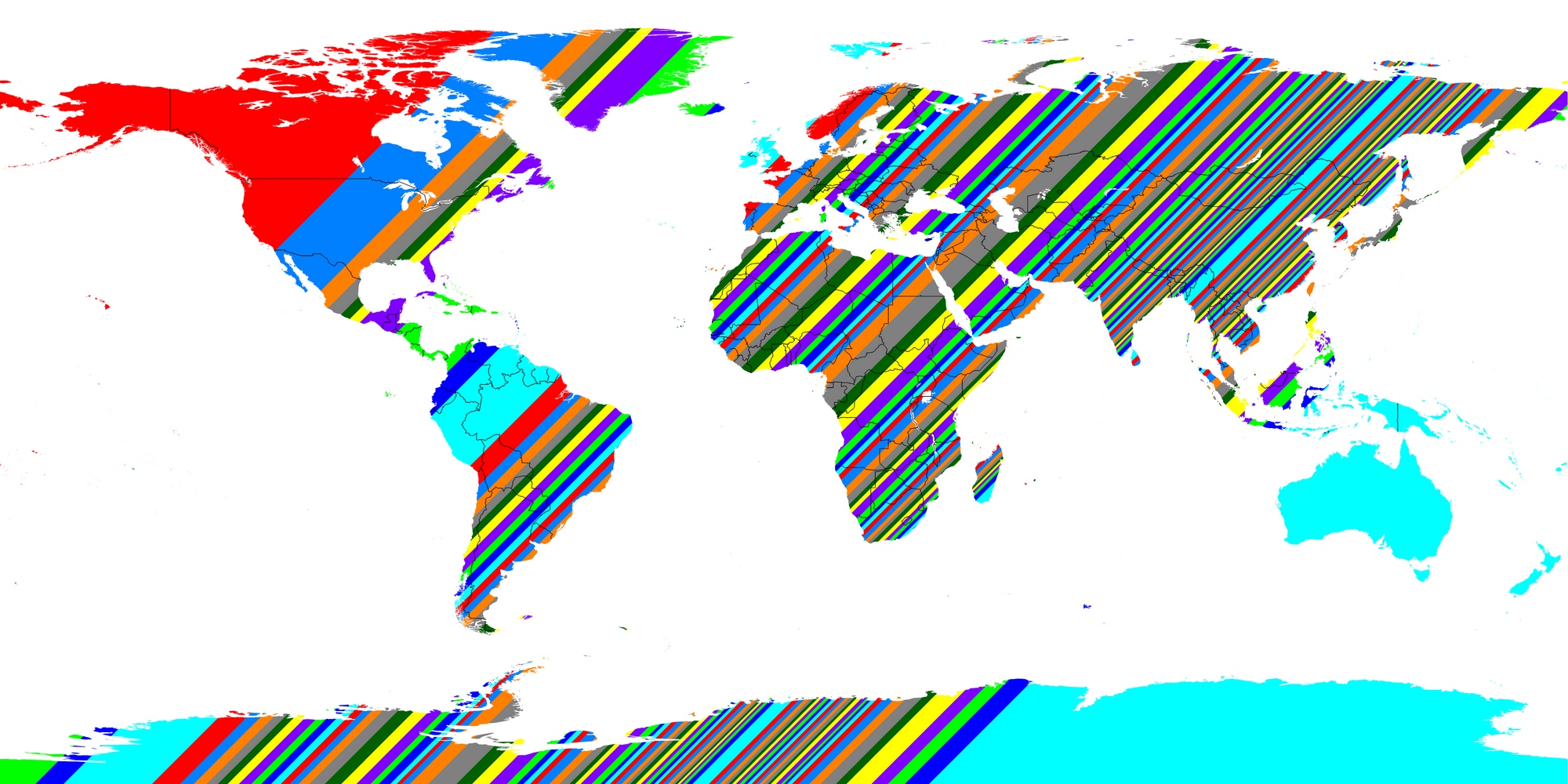
Reddit user alexmijowastaken created bizarre vivid maps, each band of which contains 1% of the earth’s population.

Each horizontal band contains 1% of the planet’s population
Each horizontal band contains 1% of the planet's population
Each vertical band contains 1% of the planet’s population
Each vertical band contains 1% of the planet's population
Each diagonal band contains 1% of the planet’s population
Each diagonal band contains 1% of the planet's population

It took over 200 thousand years of human history for the world’s population to touch one billion, and just two hundred years more to reach seven billion.

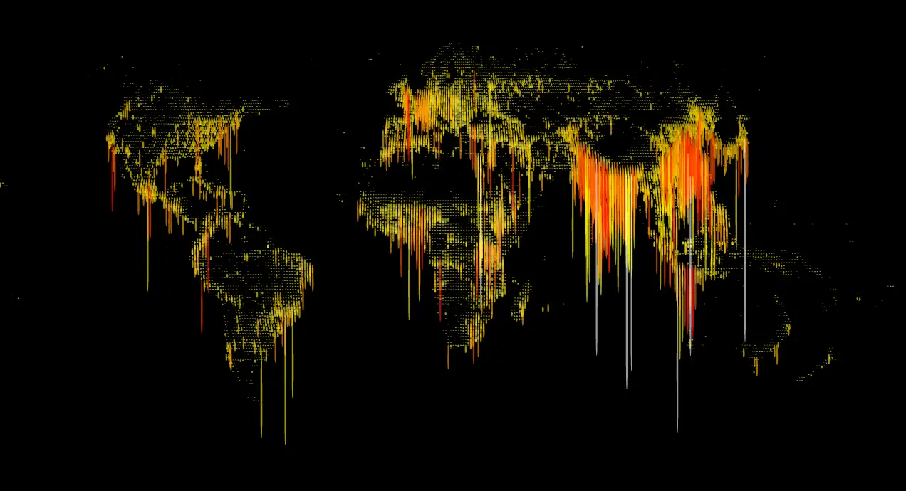
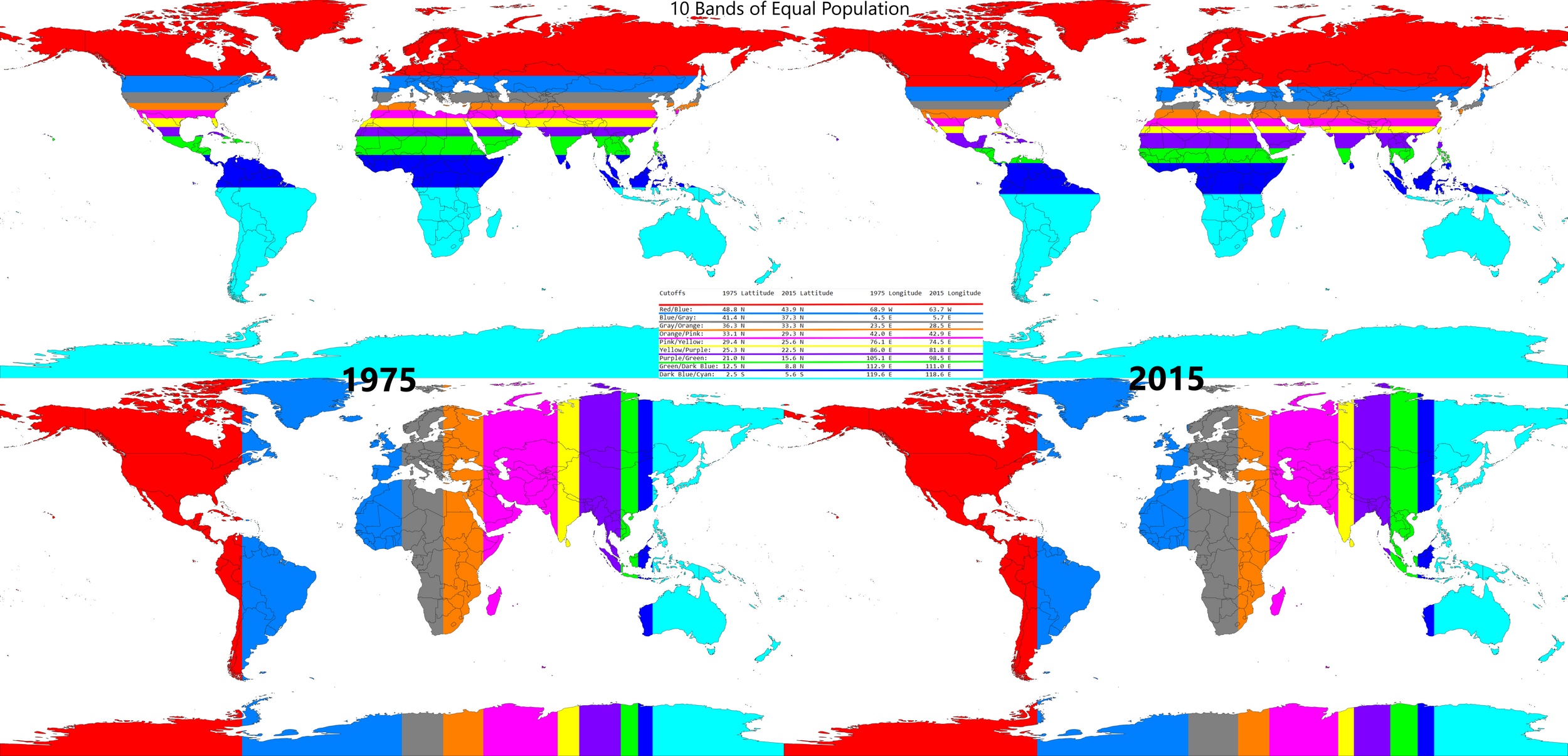
The map below created by Reddit user alexmijowastaken illustrates how the distribution of the human population has changed over the past 40 years.

Ten bands of the equal population: Latitude and Longitude, 1975 vs. 2015
Map of 10 bands of the equal population
0 0 votes
Article Rating
Subscribe
Notify of
guest

0 Comments
Oldest
Newest Most Voted
Inline Feedbacks
View all comments
0
Would love your thoughts, please comment.x
()
x