What if we could walk through the political landscape of America? Not metaphorically, but as an actual physical terrain where voting patterns create mountains, valleys, and seas?
For the third presidential election in a row (my previous electoral terrain visualizations: 2016, 2020), I’ve transformed voting data into topographical maps that reveal patterns often hidden by traditional red/blue maps. These visualizations help us see not just who won where, but the intensity of support across the country.
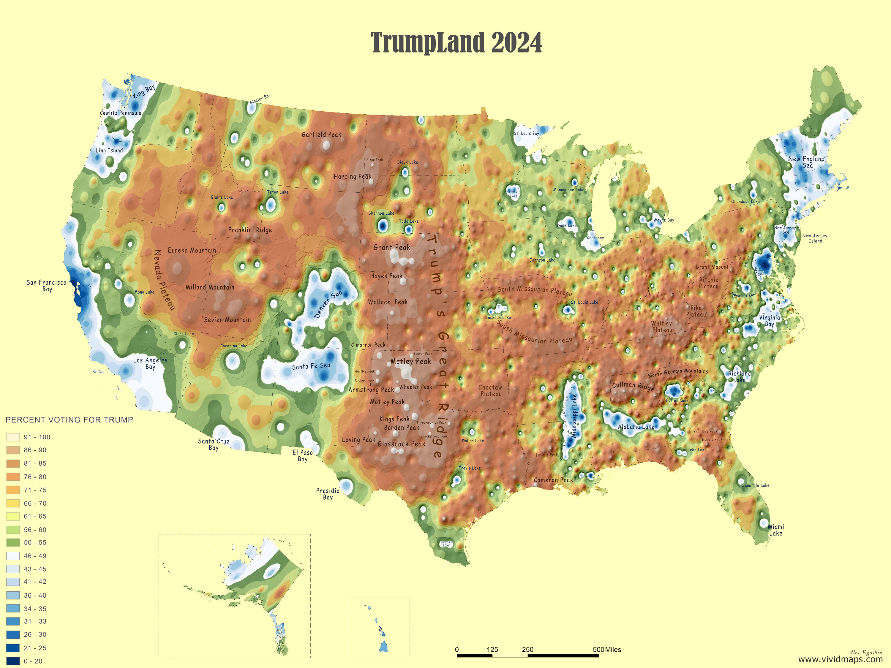
Trumpland: Where Republican Support Creates Mountains
On this map, areas with strong Trump support rise as mountains, while Democratic strongholds sink below sea level:
The height of each land feature directly corresponds to Trump’s percentage of votes – the higher the mountain, the stronger his support. Areas where Trump received less than 50% appear as water, with the depth representing Harris’s strength.
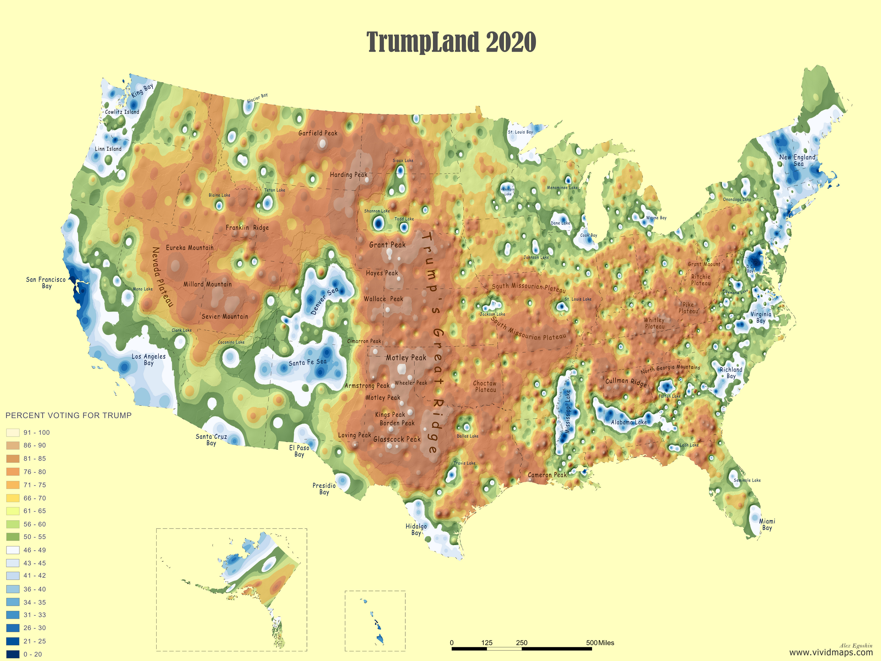
What Changed Since 2020?
Use the slider below to compare Trump’s support landscape between 2020 and 2024:
The geography has shifted dramatically in certain regions:
South Florida’s transformation is particularly eye-opening – Miami-Dade County, once a Democratic bay, has emerged as land in 2024, reflecting Trump’s significant gains among Latino voters.
The “Trump Ridge” running through central Pennsylvania has grown taller, with several counties showing increased support.
In the Southwest, what were once Democratic waters around Phoenix have become shallower, indicating Harris’s weaker performance compared to Biden.
What’s happening in your region? Did your local landscape rise or sink?
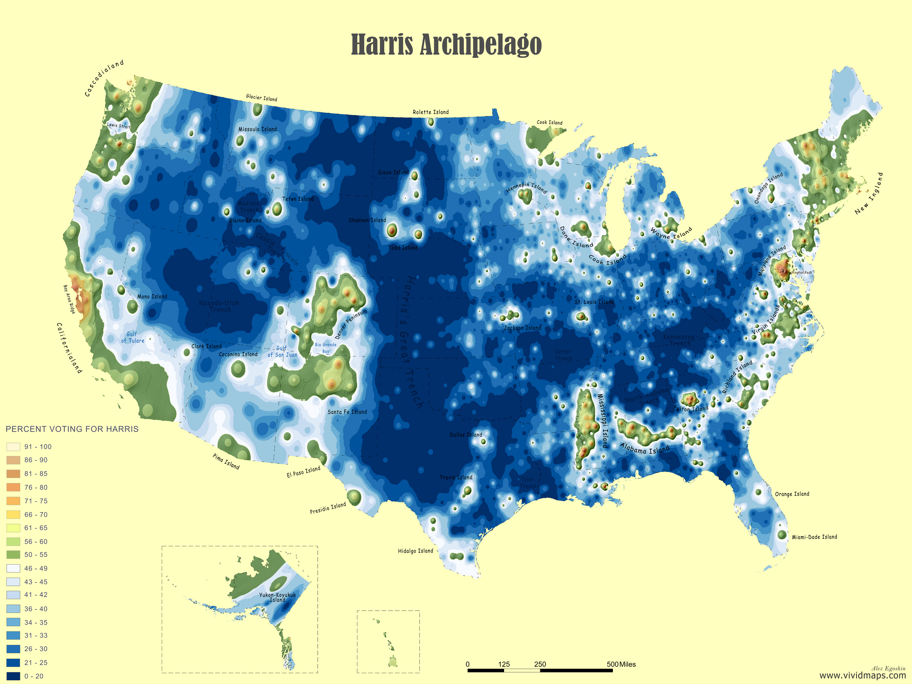
The Harris Archipelago: Democratic Islands in a Republican Sea
This alternative visualization flips the perspective, showing Democratic strongholds as islands in a Republican sea:
Urban centers with high Democratic support form archipelagos, while Republican-leaning rural areas become the surrounding ocean. The size and elevation of each island correspond to Harris’s vote share.
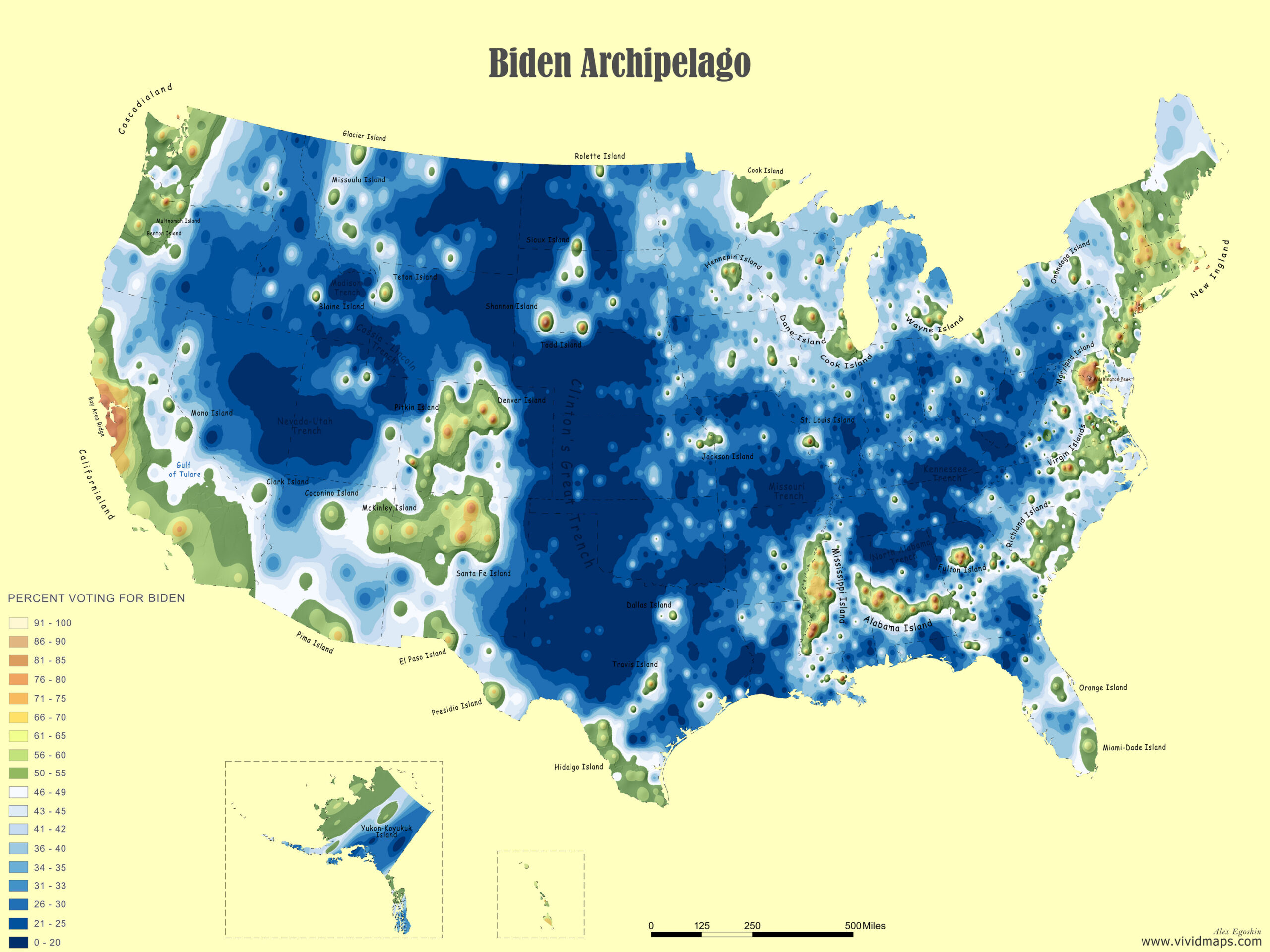
Shrinking Islands: 2020 to 2024
Compare how the Democratic archipelago changed from Biden’s 2020 performance:
The changes convey a powerful narrative:
Several urban “islands” that stood tall in 2020 have diminished in size or been partially submerged.
The Detroit metropolitan area shows a noticeable reduction in island size, reflecting decreased Democratic turnout.
In contrast, some areas like Atlanta’s core have maintained their elevation, though their surrounding “shores” have eroded.
Beyond Red and Blue
These visualizations reveal nuances that traditional election maps often miss. Rather than simple red/blue divisions, we see gradients of support that flow across the landscape.
What patterns do you notice in your region? Has your local political geography shifted dramatically, or remained relatively stable? Share your observations in the comments below!
For those interested in the methodology, I’ve created these maps using ArcGIS with precinct-level voting data, applying elevation algorithms based on vote percentages. The technique transforms flat electoral data into a three-dimensional story of American politics.
Love this. Fantastic maps. Such a great/creative idea.
Brian
1 year ago
The Democrat map looks like what the Left has been warning us about for decades on rising sea levels due to global warming. But in this case it is due to a drastic change in the political climate! These are great maps!


Love this. Fantastic maps. Such a great/creative idea.
The Democrat map looks like what the Left has been warning us about for decades on rising sea levels due to global warming. But in this case it is due to a drastic change in the political climate! These are great maps!