The way wealth is distributed within countries tells us a powerful story about economic opportunities and social structures. One of the most reliable ways to measure this distribution is through the Gini coefficient, which has revealed some surprising patterns across the globe.
The Gini coefficient ranges from 0 to 100, where 0 represents perfect equality (everyone has the same income) and 100 represents perfect inequality (one person has all the income). What’s fascinating is how dramatically these numbers vary across different regions. For instance, Denmark consistently ranks among the most equal societies with a Gini coefficient of around 28.2, while South Africa shows one of the highest inequalities at 63.0 (World Bank Data, 2022).
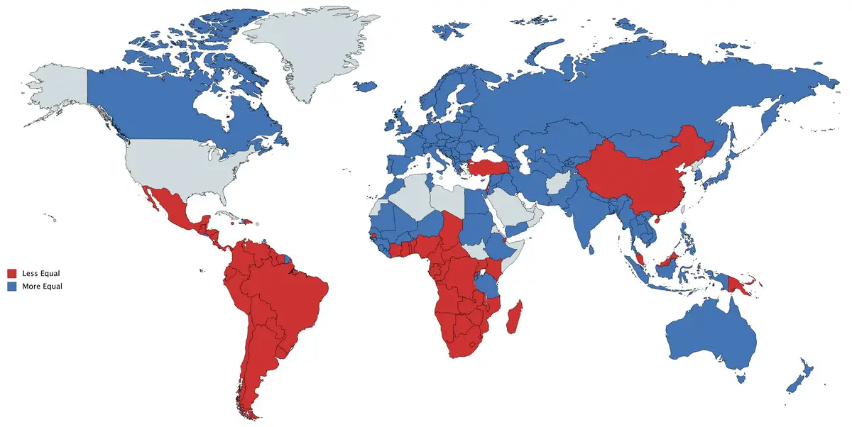
An interesting pattern emerges when we use the United States as a reference point. Countries marked in red have greater inequality than the US, while blue indicates more equal income distribution. According to the Organisation for Economic Co-operation and Development (OECD), despite being one of the wealthiest nations, the United States shows higher income inequality than most other developed countries.
A striking example of this disparity is that the top 1% of Americans own more wealth than the entire middle class. According to the Federal Reserve’s 2021 Survey of Consumer Finances, the wealthiest 1% of Americans held $45.9 trillion in wealth at the end of 2021, while the middle 60% of households held $42.7 trillion.
This final map focuses specifically on household income inequality. The total disposable household income is calculated by adding together all of the household members’ personal incomes, plus any other income at the household level. This provides a more complete picture of economic inequality as it considers the combined resources available to families rather than individual earnings.
The green areas represent countries with lower family income inequality than the United States, while red indicates higher inequality. Nordic countries consistently show lower inequality, with Finland, Norway, and Sweden all maintaining Gini indices below 30. Meanwhile, several Latin American nations demonstrate higher inequality levels, influenced by historical economic structures and policy choices, according to the World Bank’s Global Economic Prospects report.
An interesting trend revealed by the World Inequality Database shows that global inequality has been rising since the 1980s. While technology and globalization have contributed to overall economic growth, the benefits haven’t been distributed evenly. For example, in the United States, the share of total income going to the top 10% increased from about 34% in 1980 to nearly 45% in recent years.
Did you know? The COVID-19 pandemic has further widened these gaps. According to Oxfam’s “Inequality Kills” report, the world’s ten richest men more than doubled their fortunes during the first two years of the pandemic, while 99% of humanity’s income fell.
For those interested in exploring world geography further, here are some excellent physical world maps available on Amazon: