Few military commanders in history have left such a detailed trail of their conquests as Napoleon Bonaparte. Through battle records and one remarkable visualization, we can trace his path from triumph to catastrophe, understanding the true cost of his ambitions.
Twenty Years of Warfare: Napoleon’s Campaigns by Numbers
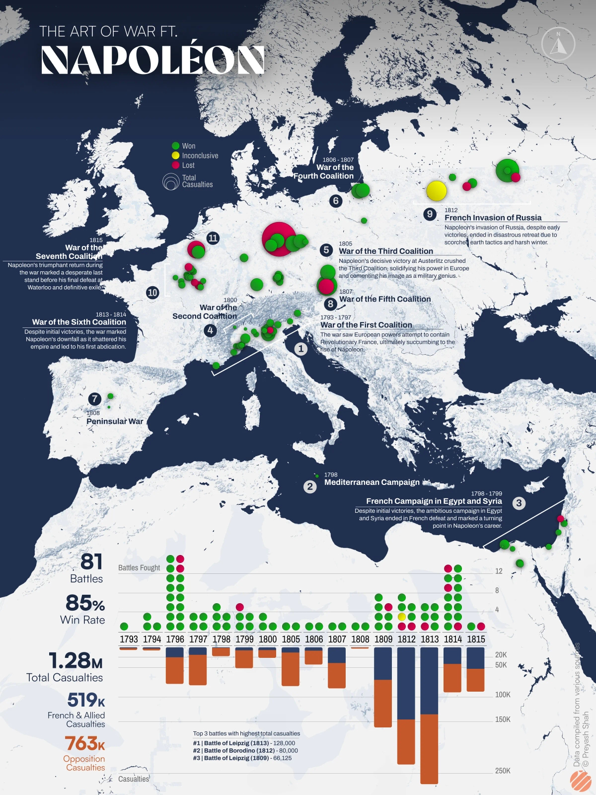
The map above created by Preyash Shah, using data from Wikipedia, shows the scope of Napoleon’s military campaigns from 1793 to 1815. Over this period, he led French forces in 81 major battles, achieving an remarkable 85% win rate. The total human cost was staggering: 1.28 million casualties, including 519,000 French and Allied losses and 763,000 opposition casualties.
Key Campaigns That Shaped Europe
The War of the First Coalition (1793-1797) launched Napoleon’s career. His Italian Campaign demonstrated his tactical brilliance, though at significant cost. The Siege of Mantua alone resulted in over 39,000 casualties before French victory.
During the War of the Third Coalition, the Battle of Austerlitz (1805) – often considered Napoleon’s masterpiece – saw 44,852 casualties. Known as the “Battle of Three Emperors,” it established French dominance in Central Europe (According to David Chandler’s “Dictionary of the Napoleonic Wars” [Amazon affiliate link]).
The War of the Fourth Coalition brought the brutal Battle of Eylau (1807), fought in a blinding snowstorm with 42,820 casualties. By 1809, during the War of the Fifth Coalition, the Battle of Wagram claimed over 66,000 lives in what was then the largest battle in European history.
The Russian Catastrophe: A Visual Story of Disaster
In 1869, French civil engineer Charles Joseph Minard created what would become one of history’s most celebrated data visualizations. His ingenious flow map combines six different data types in a single image – troop strength, geography, time, temperature, direction, and location relative to specific dates. Created when Minard was over 80 years old, this visualization has been hailed by data pioneer Edward Tufte as “the best statistical graphic ever drawn“.
The March to Moscow: Numbers Tell the Tale
The visualization traces the Grande Armée’s strength from its crossing of the Neman River with 422,000 men (recent research suggests up to 680,000 when including all supporting forces) to its retreat with only 10,000 survivors. The thick orange band shows the advancing army gradually thinning as it moves eastward, while the black band traces the horrifying retreat, with temperature data showing the brutal cold that claimed so many lives.
The black line of retreat, matched with temperature data showing drops to -30°C (-22°F), reveals how nature proved a deadlier enemy than Russian forces.
The Final Years
After the Russian disaster, Napoleon’s empire crumbled. The Battle of Leipzig (1813), known as the “Battle of Nations,” saw 128,000 casualties over four days. His final defeat at Waterloo in 1815 added another 52,700 to the war’s toll.