If you enjoy looking at maps, you might sometimes wonder why a map looks the way it does. The circumstances leading to a particular demographic being more prevalent here, or a border being created there, can often be very confusing and exciting.
Below are maps that illustrate the fascinating relationship between the phenomena currently being observed and processes that, at first glance, seem to have nothing to do with them.
How a coastline 100 million years ago influences modern election results in Alabama
Reddit user IamShartacus made six maps of the American state of Alabama. Collectively, these maps tell a story that ties a coastline from the time of the dinosaurs via slavery to contemporary political demographics.
Map 1 presents the Cretaceous sediments in Alabama. These sediments are rocks and minerals laid down along the marshy southern coast of the Appalachia landmass (named for the Appalachian Mountains) , which existed about 100 million years ago. North America had not yet appeared at that time.
Map 2 shows the whereabouts of Blackland Prairie soil. This type of soil is known for its high fertility because of the nutrients accumulated during the Cretaceous period.
Map 3 illustrates the current farm sizes in the state. The largest farms (red color) can be found in territories with the most fertile soil. This map presents how economically essential Blackland Prairie soil is.
Map 4 pictures slave populations according to the 1860 census. At that time, slaves considered for 45% of the Alabama’s population. Merely 3% of the state population comprised free Black citizens. In the dark-colored regions of the map, black enslaved people considered for over 80% of the population. Slaves mainly labored on cotton plantations, and these plantations were most common in the territories with the most fertile soil.
Map 5 shows us the modern Black population of Alabama. The darkest red areas show more than 44% of the population of the region is Black. Despite the 150 years between these maps, these is still a close correlation between the historic slave populations, and the modern Black populations.
Map 6 presents the results of the 2020 election. Territories with large African American populations are much more expected to vote for the Democratic party (blue color). This tendency continues to the east and west of Alabama, along the so called “Black Belt” of the southern United States, and along the buried shoreline of the Cretaceous continent of Appalachia.
When we look at maps and data about the contemporary world, it’s easy to forget that everything about our world has been dictated and formed by the events of prehistory and history. From ancient continents to awful atrocities, our world is a product of its past, and knowledge that past can be key to facilitating us better understand the present.
Arizona voting precincts and Arizona Native American reservations
The maps below illustrate the relationship of voting results to the location of Indian reservations.
This coincidence seems to be explained because the Democrats provide more grant funding for tribes, including child care, school fund, rental/mortgage assistance, food help, water clean-up, fire mitigation, and infrastructure help.
Spanish election in 2019 and military coup in 1936
The map below, created by @simongerman600 shows correlation between areas where the 1936 military coup against the democratic government initially succeeded and the 2019 national Spanish elections.
Location of mosques and the former border between East and West Germany
The disappearing border between East and West Germany still affects immigration in Germany. Emigrants from Turkey prefer to settle in the more economically developed former West Germany.
Although decades have passed since the unification of East and West Germany, the former border between the countries is visible even from space.
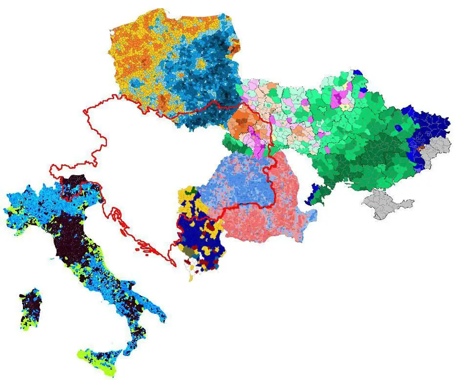
Elections and the borders of Austria-Hungary Empire
But it is not just the border between East and West Germany that has faded into oblivion that is influencing various aspects of life in the newly emerged state. There are many such examples. Austria-Hungary was a great power in Europe between 1867 and 1918, and this power is visible, even in the twenty-first century.
Election in Poland and Population of wild boars
On the election map of Poland, you can clearly see the old German borders in Poland.
Soviet resettlement program was about concentrating people around cities when they resettled the polish people onto the former German territory – much of the rural land was much less populated.
This rural vs urban balance is much of what leads to the political, social, and ecological differences. Wild boar can survive a lot easier if there’s fewer people in the country to mess with em.
Sweden’s pornography preferences vs. radiation level received from Chernobyl
These maps illustrate a very unexpected correlation between the radioactive fallout from Chernobyl and a genre of Japanese anime defined by overtly sexualized characters and sexually explicit pictures.