This post may contain affiliate links. As an Amazon Associate, we earn from qualifying purchases.
The hottest years on record globally have occurred in recent times, with years like 2016, 2019, and 2020 being among the warmest due to the ongoing trend of global warming.
In North America, recent years such as 2012, 2016, and 2020 have been exceptionally warm. Similarly, Europe has experienced some of its warmest years in recent history, with 2019 and 2020 standing out.
Australia faced extreme heat in recent years, with 2019 being one of the hottest years recorded.
Various Asian countries also have reported record heat in recent years, including 2019 and 2020.
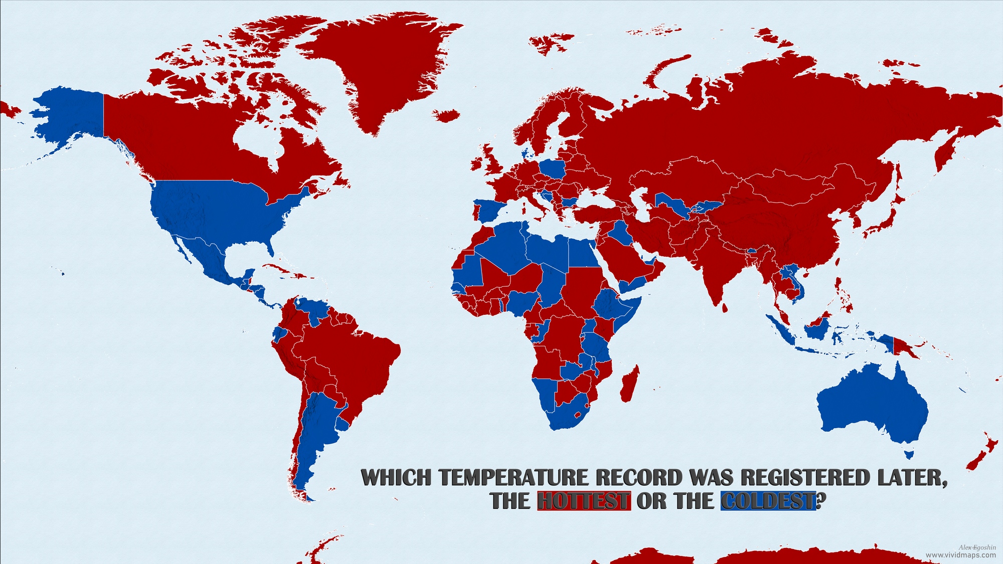
World maps below created by @Neilrkaye shows number of years since it was a “record hottest year” and “record coldest year”.
These maps clearly illustrate that the most of the hottest records were not so many years ago. While the coldest records are in full opposite.
This map is clearly wrong. How many examples are needed for it to be fixed. Record for Alabama was set in 1925. Death Valley record for USA is even older,1912.
They aren’t specifying a single day, they are saying as an average over a year.
EndOfPatience
6 years ago
Now update it to show the records set during the 2019 Polar Vortex event across most of the United States.
old doc
6 years ago
You realize that a lot of those areas colored dark red, for hot, especially in Africa, have few, or no temperature monitors?
The temperatures are “implied”
Fake data!
Bill
6 years ago
What they don’t show, nor could they,is how the average temperatures for 1997 and 2003 and other benchmark years have been “adjusted” down to make the current temps more extreme than they truly are. If you look at the raw data from those years you see it isn’t as extreme and in some cases cooler. But what do i know. I am just a guy looking at numbers on a screen.


?")
This map is clearly wrong. How many examples are needed for it to be fixed. Record for Alabama was set in 1925. Death Valley record for USA is even older,1912.
Agreed. Especially with respect to the record cold temp map.
They aren’t specifying a single day, they are saying as an average over a year.
Now update it to show the records set during the 2019 Polar Vortex event across most of the United States.
You realize that a lot of those areas colored dark red, for hot, especially in Africa, have few, or no temperature monitors?
The temperatures are “implied”
Fake data!
What they don’t show, nor could they,is how the average temperatures for 1997 and 2003 and other benchmark years have been “adjusted” down to make the current temps more extreme than they truly are. If you look at the raw data from those years you see it isn’t as extreme and in some cases cooler. But what do i know. I am just a guy looking at numbers on a screen.