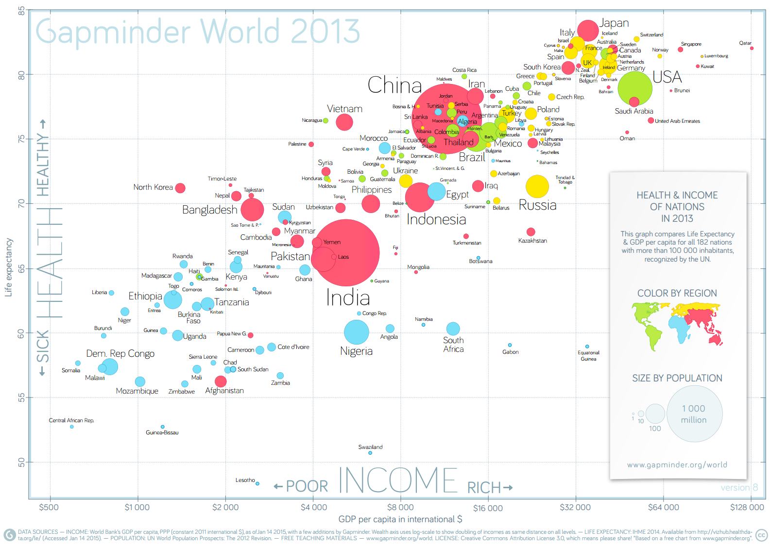
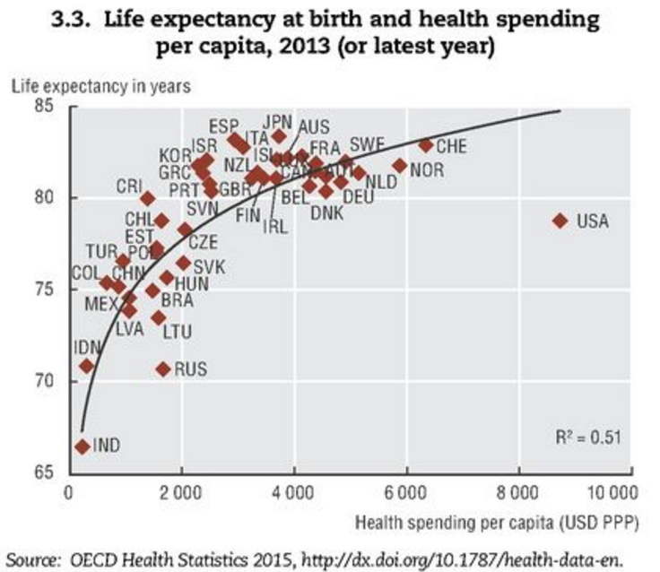
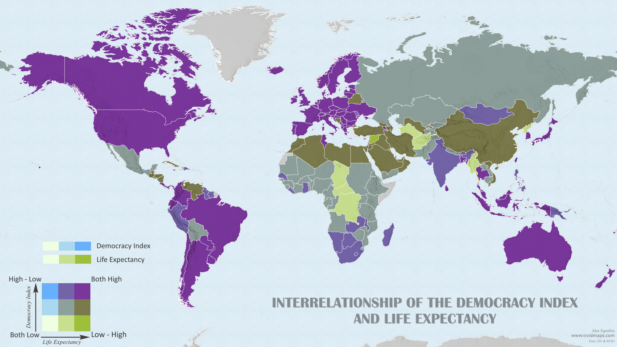
ChartsEconomic maps Income and life expectancy around the world July 20, 2015 Alex This graph compares Life Expectancy and GDP per capita for all 182 nations with more than 100 000 inhabitants, recognized by the UN. Life expectancy at birth & health spending per capita Related Posts:When Demographers Tried to Predict 2025… Back in 1990Life Expectancy Worldwide Mapped (2000-2022)The Intrinsic Value of DemocracyPetroleum consumptionGDP per Capita Worldwide MappedHow does U.S. life expectancy compare to other countries?Largest Cities Throughout HistoryHow the World’s Income Groups Are Changing