Mapping where immigrants settle in London
This post may contain affiliate links. As an Amazon Associate, we earn from qualifying purchases.
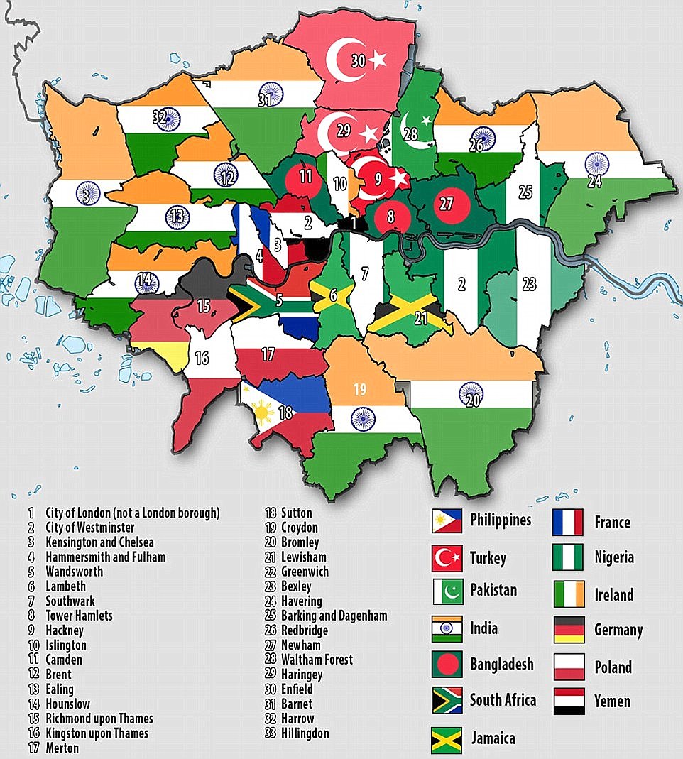
The map shows areas where more than 8 percent of the residents were born abroad.
The interactive map was created by geographer Oliver O’Brien of University College London’s Consumer Data Research Centre (www.maps.cdrc.ac.uk).
The map below reveals one in three London residents were born abroad.

Related posts:
– Another way of looking at London
– Average London property prices (1995 – 2015)
– What a difference 400 years makes (the London skyline 1616 – 2016)
– London is the World’s most expensive city to live and work in
– 5 maps that quantify exactly how rammed London is
– London Smellscape
– Isochronic distances in days from London (1914)
– Isochronic distances in days from London (1881)
– A 2016 version of the 1914 isochronic London