Mapping 6 Years of American Television News
A choropleth map visualizing the total number of times each country in the world has been mentioned on American television news shows monitored by the Internet Archive over the last 6 years
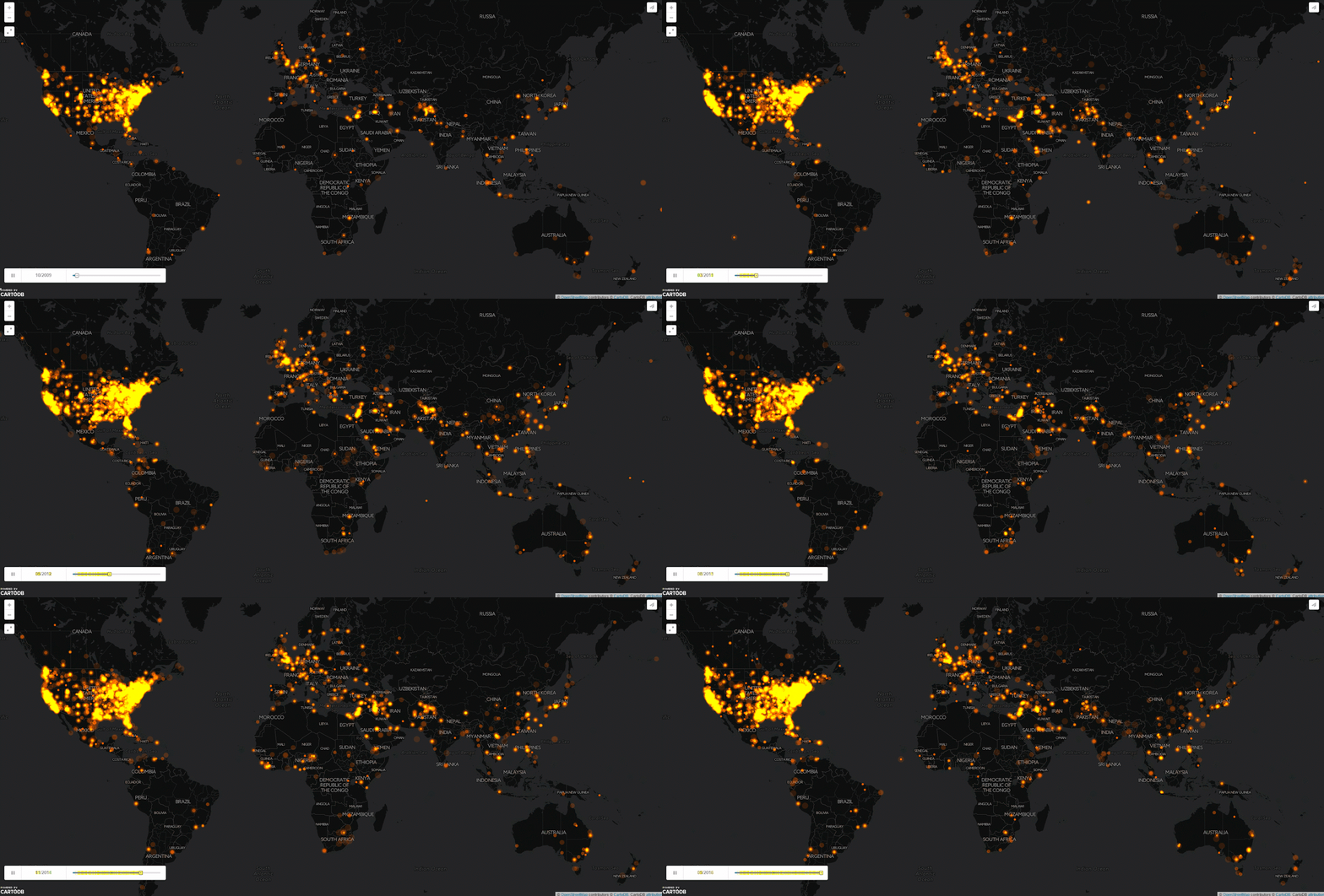
An animated daily map of American television news (2009 – 2016)
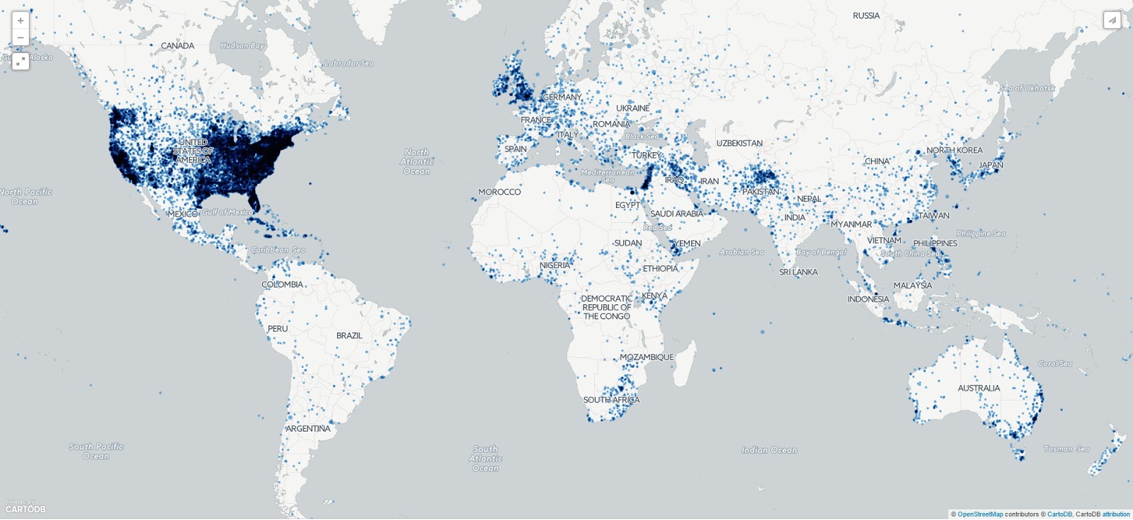
A city-level look at 6 years of American television
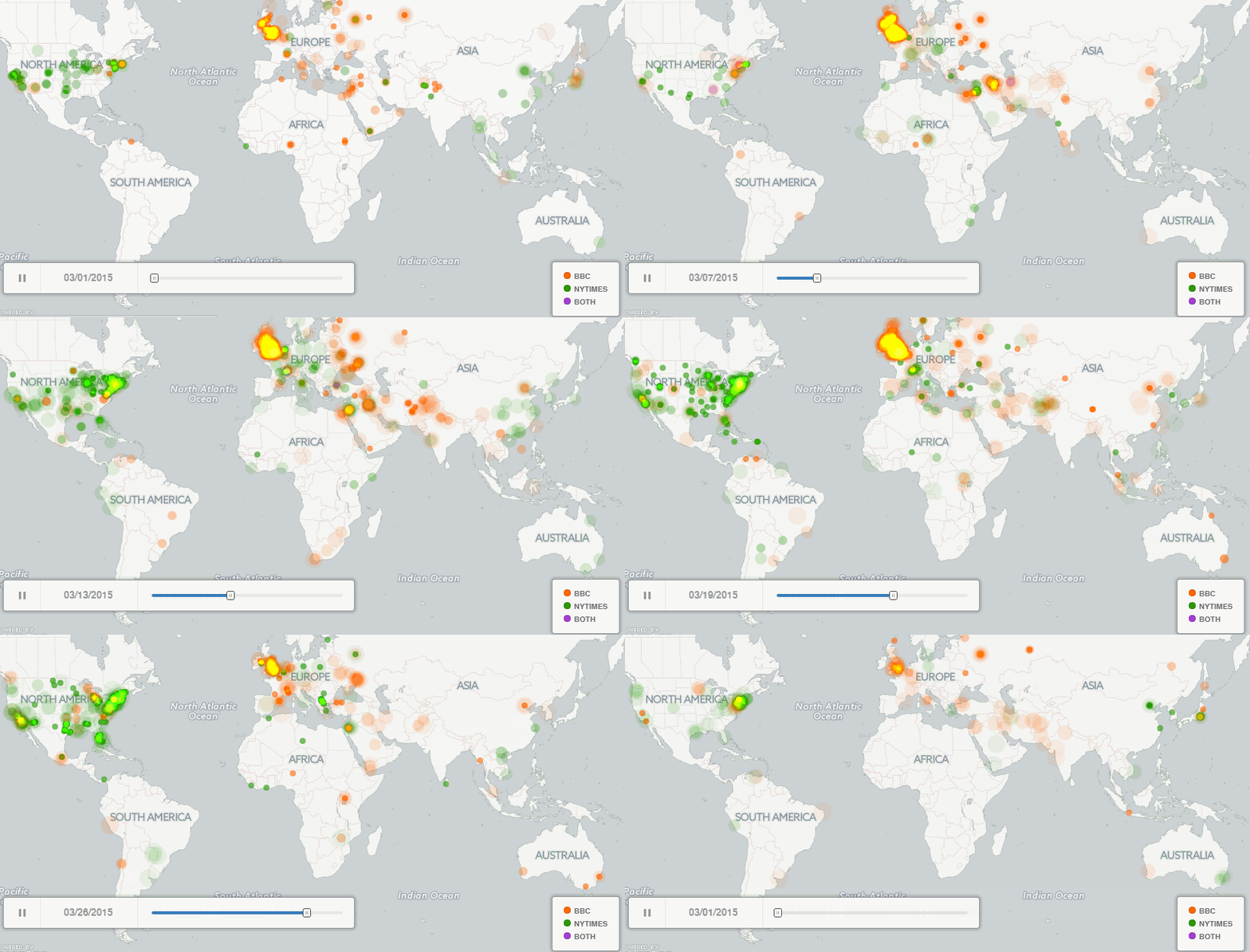
Animation of all city-level locations mentioned in BBC (orange/yellow) and New York Times (green) during March 2015 in 15 minute increments
Via gdeltproject.org (1, 2, 3) & forbes.com


