How Every U.S. County Voted Over the Last Three Elections
Discover how every U.S. county voted over the last three presidential elections with this fascinating map. Learn about the trends and political divides shaping America.
Read MoreMaps of the US
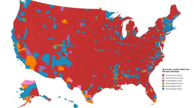
Discover how every U.S. county voted over the last three presidential elections with this fascinating map. Learn about the trends and political divides shaping America.
Read More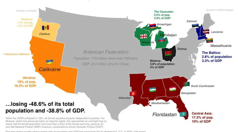
What if the U.S. broke apart like the Soviet Union? Marko Jukic’s map imagines the outcome, highlighting lessons from history and sparking debate on national cohesion.
Read More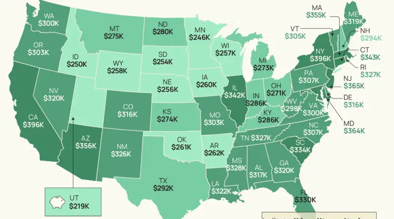
Women face an unprecedented retirement savings challenge that goes far beyond simple numbers. From workplace inequalities to longer life spans, the path to financial security is fraught with obstacles that demand our immediate attention.
Read More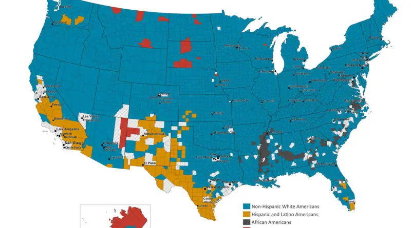
Journey through three decades of America’s changing demographics with animated maps that reveal where different racial and ethnic groups form county majorities, telling the story of the nation’s increasing diversity.
Read More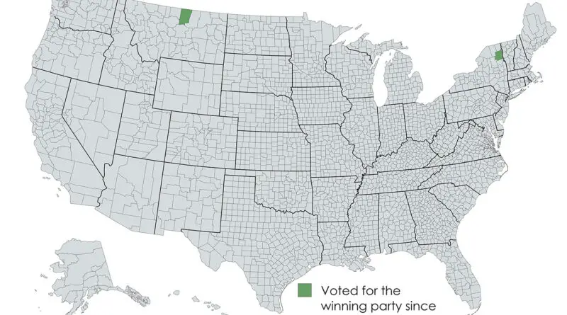
In the vast landscape of American electoral politics, two counties stand out for their uncanny ability to predict presidential winners. Here’s the story of Blaine County, Montana and Essex County, New York – America’s most reliable political crystal balls.
Read More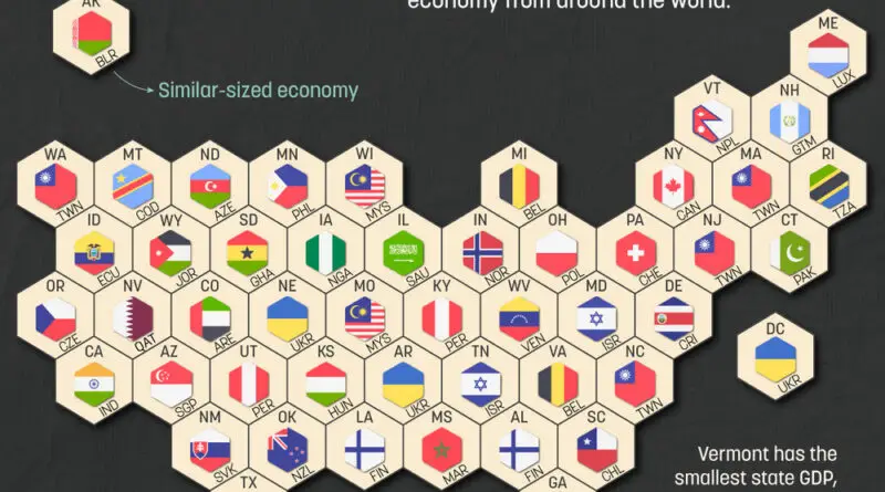
A revealing look at how U.S. state economies compare to countries worldwide, with California matching India’s GDP and Texas rivaling Italy. This United States map and analysis shows the true scale of American economic power at the state level.
Read More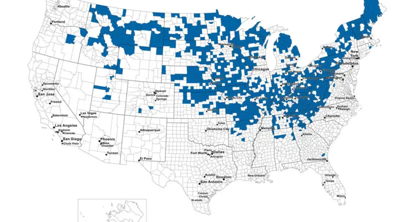
Discover the changing geographic distribution of non-Hispanic white Americans through animated maps showing county-level population patterns from 1990 to 2022, revealing fascinating demographic shifts across the United States.
Read More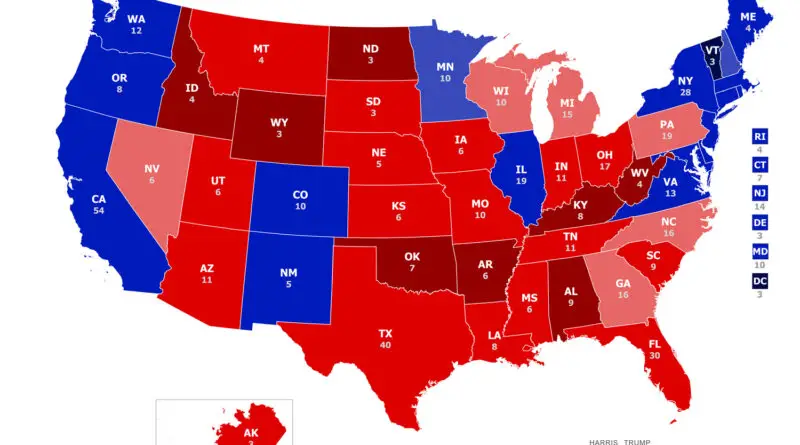
From battleground state dramas to surprising electoral vote shifts, explore how the 2024 election transformed America’s political landscape.
Read More
A recently released map from World in Maps provides a fascinating glimpse into the commuting patterns of Americans across the country. This insightful visualization showcases the most prevalent modes of transportation used by workers to get to their jobs in each U.S. county.
Read More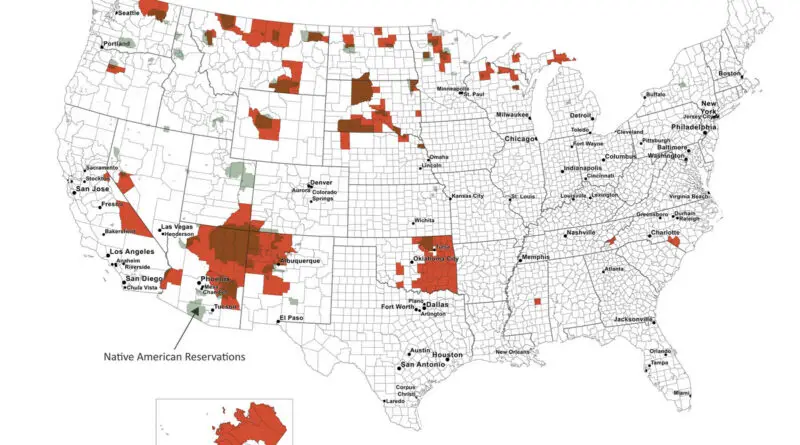
A detailed look at Native American population distribution across the United States, featuring custom-made maps that reveal concentration patterns from 1% to 90% and historical changes from 1990 to 2022. Based on comprehensive U.S. Census data analysis.
Read More