Maps and atlases have long served as powerful tools for understanding how people perceive the world. From 2015 to 2025, cartographers, artists, and media outlets created a fascinating atlas of maps showing Donald Trump’s worldview, combining data visualization with political satire.
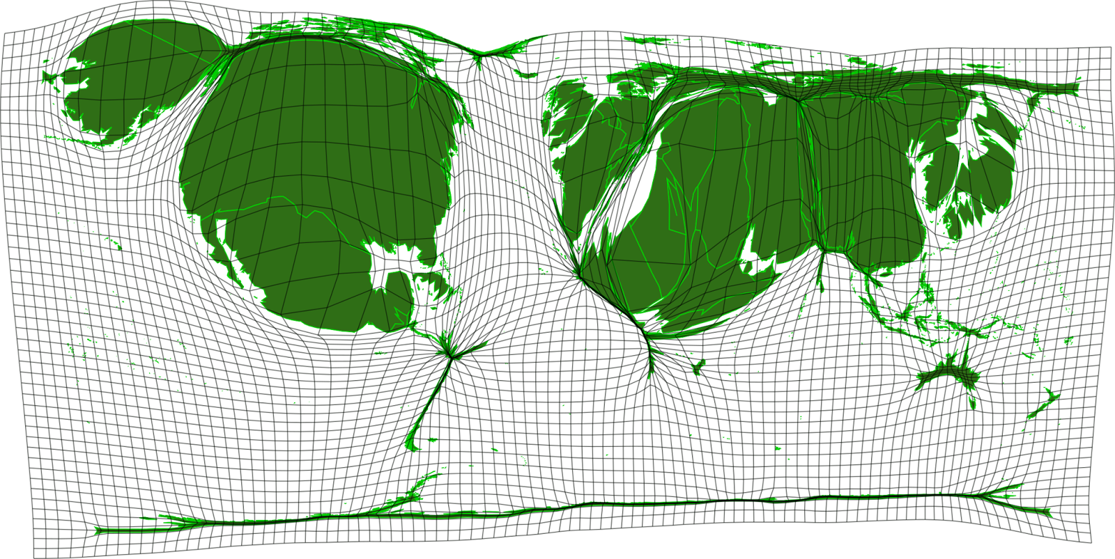
Our atlas begins with a unique cartogram that stands apart from the satirical maps that follow. This data visualization created by githubusercontent.com shows how Donald Trump’s attention is distributed across the globe, with country sizes distorted based on how frequently he mentions them in speeches and statements. The United States dominates the map with the largest area, while China, the Middle East, Japan, France, and the UK also feature prominently. What’s particularly telling is the near-disappearance of South America and Australia, revealing the geographical limits of Trump’s political discourse.
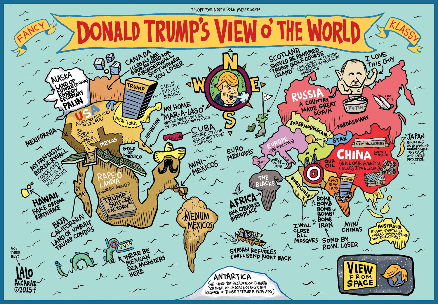
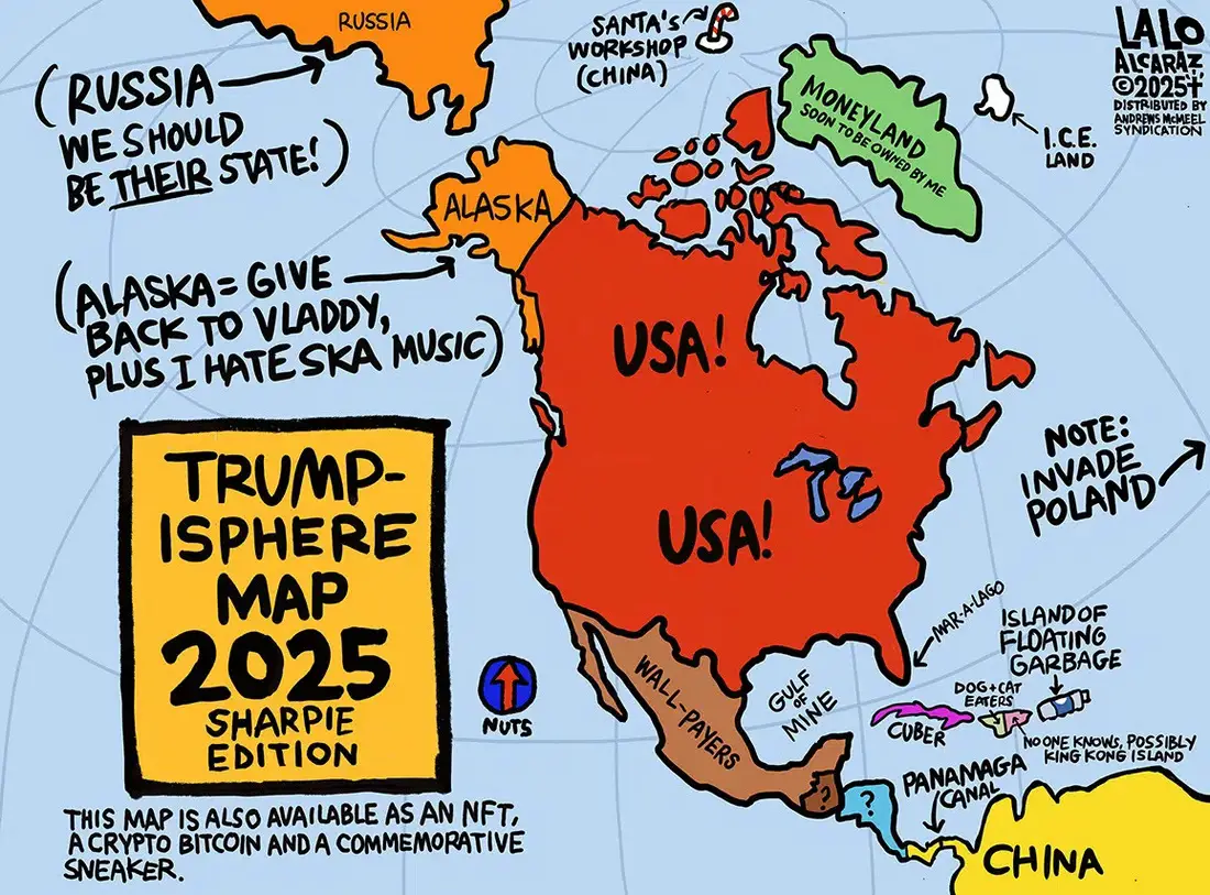
The earliest satirical visualization came in 2015 from cartoonist Lalo Alcaraz, who brought his distinctive style of political commentary to mapping Trump’s global perspective. Alcaraz, known for using humor to cope with challenging political times, drew from his Mexican heritage to create sharp satirical observations.
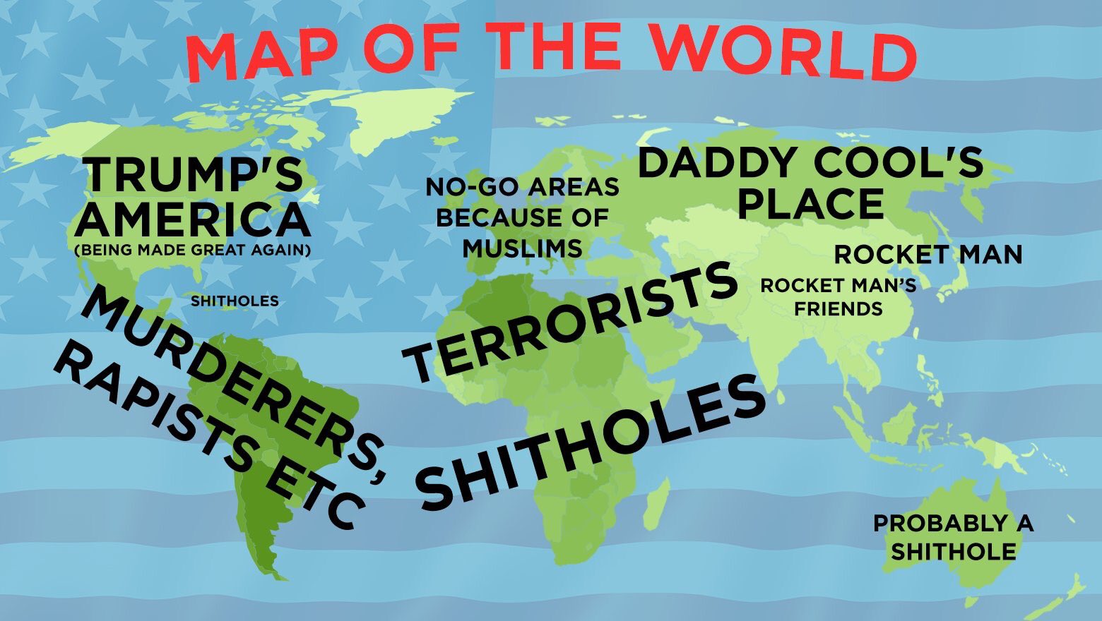
In 2016, several notable maps emerged. The Huffington Post produced a detailed analysis where reporters Dana Liebelson and Jessica Schulberg meticulously researched Trump’s statements about various countries. Their map featured signature elements like labeling Europe simply as “Germany” and marking large regions as “Muslims” or “Commies,” reflecting Trump’s tendency to make broad generalizations.
That same year, another significant visualization came from Huffington Post’s US edition, offering a different perspective on Trump’s global outlook.
Adding to the 2016 collection, Aeron Nemo created a particularly witty interpretation of Trump’s worldview. This map reimagined the United States as simply “Trump” (pronounced “yuge”), labeled Greenland as “Climate Change Is a Hoax,” and cleverly renamed China as “The New England Patriots” – a reference to Trump’s comparison between the NFL team and Chinese leadership. The map’s humor extended to marking India as “They Copied My Taj Mahal” and included pointed commentary about Trump’s stance on various regions, including his infamous remarks about Mexico.
Yanko Tsvetkov contributed to the genre through his “Atlas of Prejudice” collection (Amazon link). His map came at a pivotal moment when Trump’s controversial statements about Muslim immigration sparked global debate. Tsvetkov’s work stood out for its detailed analysis of Trump’s rhetoric and its global implications.
The trend continued into 2018 with two significant additions. TerribleMaps created a stark visualization that gained widespread attention for its blunt labeling, including controversial terms Trump had used to describe various nations.
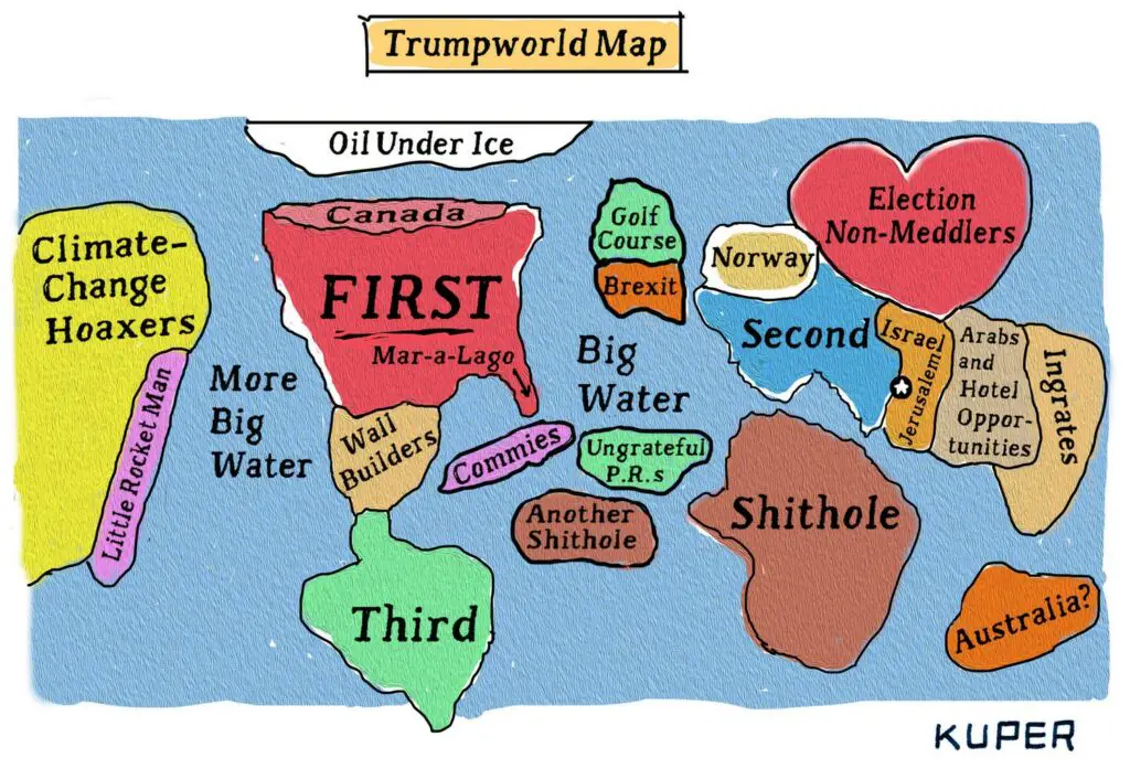
Peter Kuper’s contribution for The New Yorker took a more nuanced approach, incorporating references to Trump’s business interests and political relationships.
The most recent addition to this cartographic collection comes from Lalo Alcaraz in 2025, bringing the narrative full circle. His updated map reflects Trump’s evolving worldview, including new elements like “Moneyland” (Greenland) and “Panamaga,” clever wordplay combining Panama with Trump’s MAGA slogan.
Seen together, these maps tell a story of how political cartography evolved over a decade, reflecting not just Trump’s worldview but also how different artists and media outlets chose to represent it. From data-driven analysis to sharp satire, each map adds a unique perspective to our understanding of Trump’s global outlook.
What’s your take on these cartographic interpretations? Have you noticed any patterns or changes in how Trump’s worldview has been represented over the years? Share your thoughts in the comments below.