How Donald Trump Sees the World
Few politicians in recent history have attracted as much satirical attention as Donald Trump. His combative style, sweeping statements about entire nations, and habit of reducing complex geopolitics to simple labels made him an irresistible subject for cartographers, illustrators, and political commentators. It’s no surprise, then, that the decade between 2015 and 2025 produced an unusually rich collection of maps reimagining the world through his eyes.
Before diving into the satire, it’s worth starting with something more grounded.
Maps and atlases have long served as powerful tools for understanding how people perceive the world. From 2015 to 2025, cartographers, artists, and media outlets created a fascinating atlas of maps showing Donald Trump’s worldview, combining data visualization with political satire.
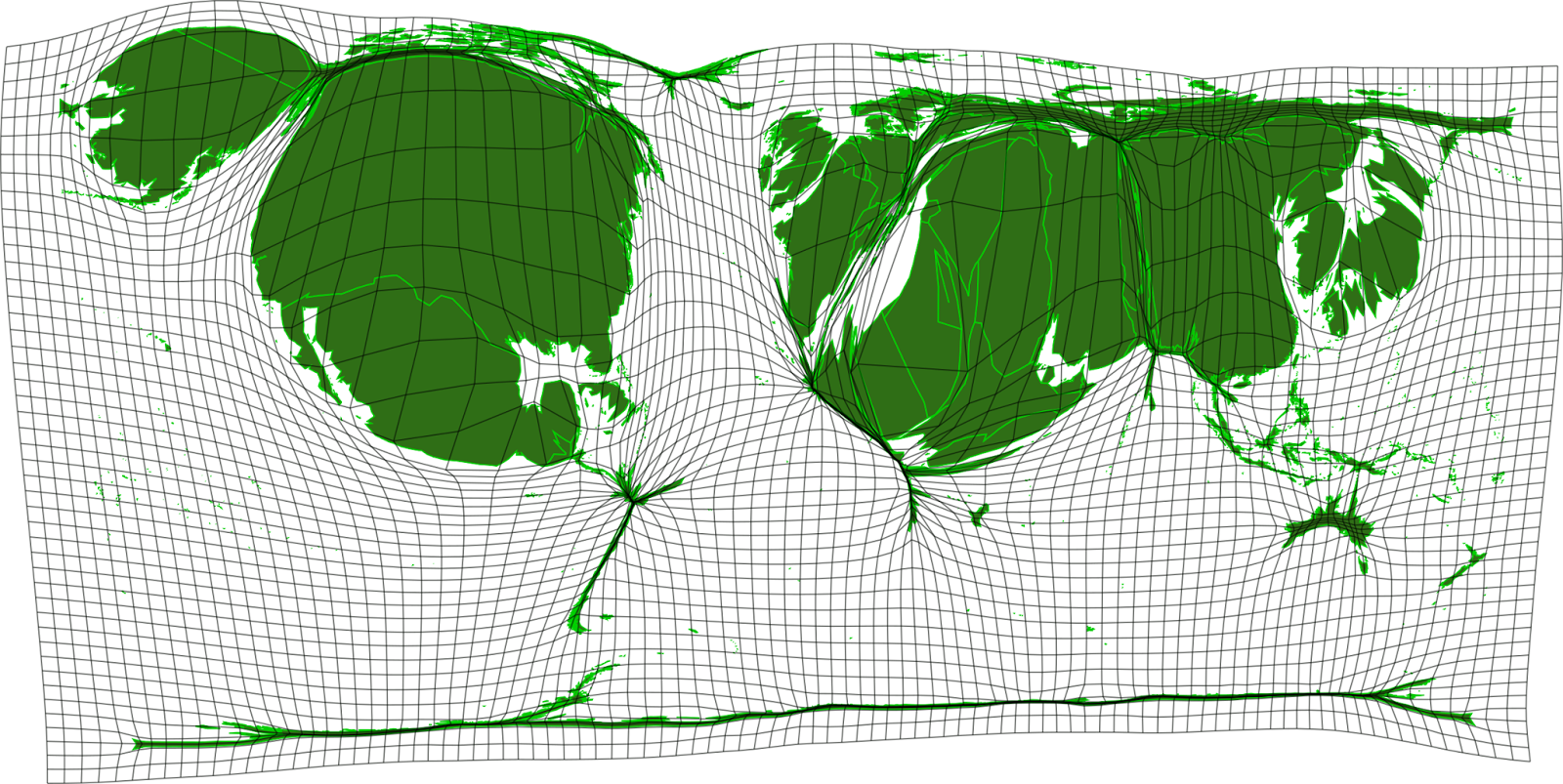
This cartogram from githubusercontent.com resizes countries proportionally to how often Trump mentioned them in speeches and public statements. The United States dominates, naturally. But the countries that hold significant size — China, the Middle East, Japan, France, and the UK — are precisely the ones that would go on to become the main characters in the satirical maps below.
The satirical tradition began in 2015 with Lalo Alcaraz.
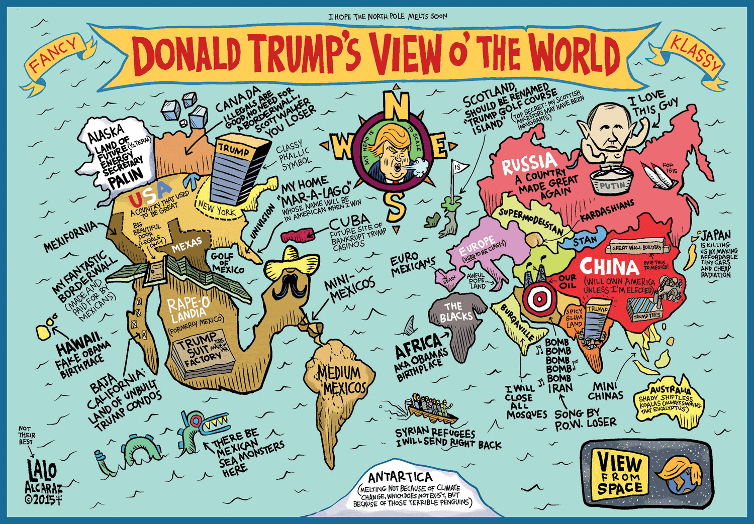
Alcaraz, a Mexican-American cartoonist known for using humor as a form of political commentary, was an early and sharp observer of Trump’s worldview.
Trump won the 2016 election, and the maps kept coming.
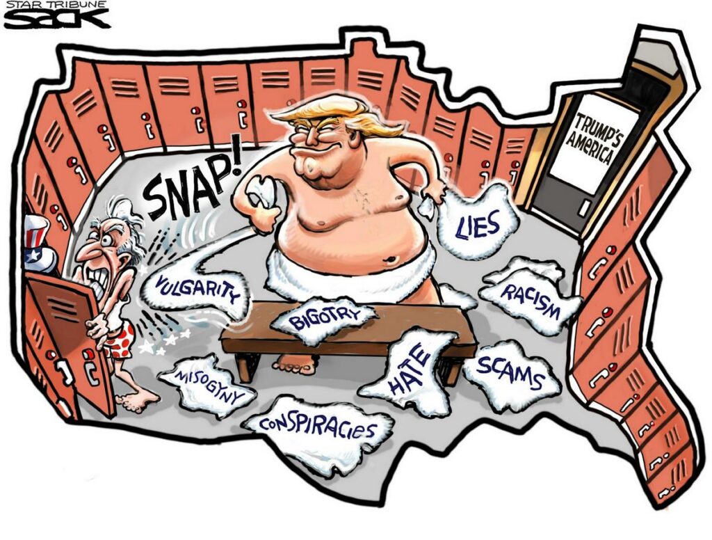
Steve Sack’s contribution to The Minnesota Star Tribune appeared in October 2016, just days after the Access Hollywood tape made headlines. Trump’s dismissal of his comments as “locker room talk” handed Sack a gift. He drew the entire continental United States as a locker room, populated it accordingly, and hung a sign on the door. It’s a good example of how cartographic satire works at its best: the map form adds something that a plain editorial cartoon couldn’t.
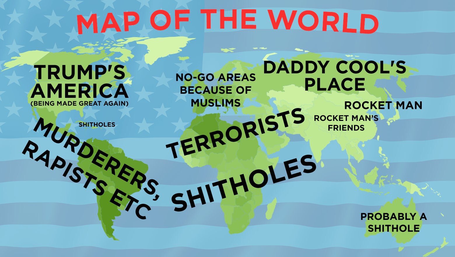
That same year, The Huffington Post took a more research-based approach.

Reporters Dana Liebelson and Jessica Schulberg worked through Trump’s public statements country by country and built their findings into a single map. The labels they chose aren’t inventions — they’re drawn directly from his rhetoric, which is what gives the map its particular charge.
A separate edition from HuffPost‘s US desk offered a slightly different perspective on the same subject.

Also in 2016, Aeron Nemo took things in a more playful direction.

Yanko Tsvetkov brought a more analytical eye to the subject through his Atlas of Prejudice (Amazon link) series.

Tsvetkov’s map appeared at a moment when Trump’s rhetoric about Muslim immigration was generating significant international debate.
By 2018, two more contributions expanded the genre in different directions.
TerribleMaps went for directness, using some of the blunter language Trump had applied to various nations and presenting it without softening.
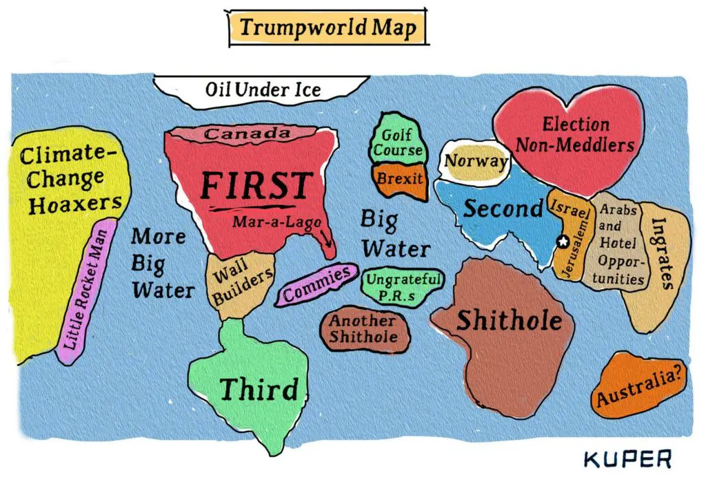
Peter Kuper’s piece for The New Yorker was considerably more layered, threading references to Trump’s business interests and political relationships into the map’s geography. It’s the kind of work that rewards a second and third look.
The collection closes in 2025 with Lalo Alcaraz returning to the subject he first tackled a decade earlier.
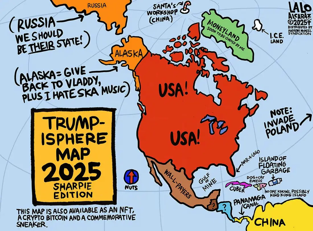
And then, in 2025, the collection came full circle. Lalo Alcaraz — who opened this whole decade of cartographic commentary back in 2015 — returned with an updated map for a new term.
With Trump back in the White House, map makers will surely have plenty of new material to work with. I have a feeling this atlas is far from finished.

