Maps of the world with different sea levels
Over Earth’s history, the level of the world’s oceans has fluctuated within a wide range of sea level extremes.
During the peak of ice ages, sea levels have been as much as 120 to 130 meters (394 to 427 feet) below present-day levels. These lowstands occurred when significant amounts of water were locked up in large ice sheets covering parts of the continents.
During interglacial periods, sea levels have risen, sometimes surpassing present-day levels. The highest sea levels during the past several million years are estimated to have been about 6 to 9 meters (20 to 30 feet) above present levels.
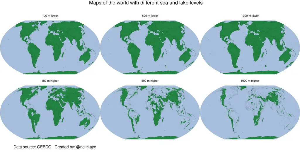
Reddit user neilrkaye created interesting maps of our planet with different sea levels using ggplot in R and GEBCO dtm data.
The maps show the elevations in two classes with green and blue colors set to -1000 meters, -500 meters, -100 meters, 100 meters, 500 meters, and 1000 meters.

These maps are only theoretical because if all the ice on the Earth melts, the sea level will rise by 70 meters. Despite this, a fascinating fact is that Rwanda is the only country in the world whose area will not decrease even if the sea level rises by 1000 meters.


