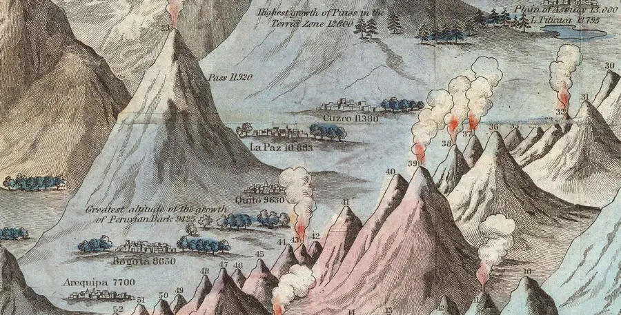
Nowadays, detailed maps of any corner of the Earth are available for everyone. Detailed information about any geographical object on our planet can be got in just a few seconds. But two centuries ago, life was radically different. That’s why comparative infographic maps were viral in the 19th century, which allowed people to get information about the main geographical objects of our planet.
Below is the most famous example of this type of map, illustrated combined view of the principal mountains and rivers in the world. It was one of the first attempts made by J. H. Colton in 1849 to create a detailed rivers and mountains comparison infographic map.
Even in modern times, this map looks astonishingly detailed.
But J. H. Colton was not the first; before him, J. Andriveau and J. Goujon made a similarly detailed wall map.
")