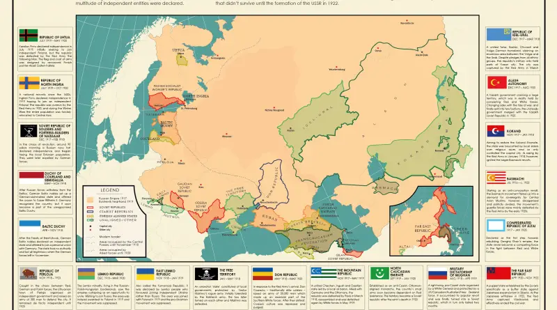
Skip to content
Vivid Maps Logo

  • Atlases
  • Map Posters
  • Scratch Maps
  • Globes
  • Videos
World map of countries based on share of immigrants
DemographyNewsVivid maps

Mapped: Countries With the Lowest Percentage of Immigrants

June 18, 2025 Alex
United States border elevation maped
Environment mapsNewsPolitical mapsVivid maps

United States Border Walls

May 21, 2025 Alex
Cash in the banks by U.S. state mapped
Economic mapsNewsVivid maps

States Where Americans Have the Most Cash in the Bank

May 5, 2025 Alex
Mapped: Which Countries Get the Most Paid Time Off Overall
Economic mapsJob

How Paid Vacation Varies Around the World

August 5, 2025 Alex
Countries wealthier than the global average mapped
Economic maps

Which Countries Are Wealthier Than the Global Average?

July 27, 2025 Alex
Siesta in world countries mapped
Cultural cartography

Siesta Nations: A Map of Midday Rest Traditions Around the World

July 19, 2025 Alex
Difference between male and female BMI by country mapped
Health

Who Has Higher BMI: Men or Women?

June 25, 2025 Alex
All Japanees brands
Business
January 24, 2018 Alex

Mapping Japan’s Brand Landscape

Map of Japan picks out the headquarters of its most valuable brands, offering a new perspective on the economic geography and regional brand distribution of the nation.

Read More
Water for US Census Tracts
Water Bodies
January 24, 2018 Alex

Water Area per U.S. Census Tract

States like Michigan have an abundance of water resources, while others like New Mexico have very little. This is revealed by a thorough analysis of U.S. Census Tracts. This distribution affects the quality of the water and presents problems for water management in the future.

Read More
Tearing apart Germany
Mapping Stereotypes
January 24, 2018 Alex

Tearing Germany apart

How do Germans split up their own nation? These 20 ingenious maps illustrate the numerous unofficial lines that influence life in Germany and Bavaria.

Read More
Tearing apart Ireland
Mapping Stereotypes
January 23, 2018 Alex

Tearing apart Ireland

Ireland might look like one island on the map, but culturally? It’s a wild patchwork of identities. These clever satirical maps show just how many Irelands there really are—and what makes each one tick.

Read More
East-West Schism (1054)
Maps of World Religions
January 20, 2018 Alex

Christianity in 1054: East, West, and the Forgotten Paths

A look at the historic divide in Christianity that shaped Europe and beyond. Here’s what happened in 1054—and what often gets left out.

Read More
World War 2 Deaths
Historical Maps
January 18, 2018 Alex

World War II’s Human Toll: A Global Tragedy in Numbers and Maps

An in-depth analysis of World War II’s unprecedented human cost, examining the conflict’s impact across continents through compelling maps and historical data.

Read More
London underground passengers on a week
Transport
January 18, 2018 Alex

Where do passengers get on and off the London’s tube?

Ever wondered where people actually get on and off the London Underground? This fascinating data visualization maps it out with real passenger data, offering insights into the city’s busiest stations and the hidden geography of movement beneath London.

Read More
The most cultivated crops in the world
Agriculture
January 18, 2018 Alex

World Map of the Most Cultivated Crop in each Country

The most popular crops in the world vary by region and climate, but globally, staples like wheat, rice, and maize (corn) are among the most widely cultivated.

Read More
countries invaded by the Netherlands
Historical Maps
January 17, 2018 Alex

All countries “invaded” by the Netherlands

How did such a small country reach so many parts of the world? A historical map shows the global footprint of Dutch expansion — from colonial outposts to trade wars.

Read More
Historical MapsWars
January 17, 2018 Alex

The True Cost of World War I

Examining the devastating toll of WWI through carefully curated maps and data, showing how military casualties and subsequent food shortages transformed the European continent.

Read More
Page 112 of 672« First«...102030...110111112113114...120130140...»Last »

Trending now

  • Nations with over 20% of the population aged 65+ years mapped
    The World Is Aging: Which Countries Have Over 20% of People Aged 65+?
  • Tautologies
    Tautological Geography: When Place Names Say the Same Thing Twice

Related Products

Push pin maps · Globe drinks cabinets · Maps of the United States · Board games · Monopoly · Map-based strategy board games · History Board Games · Coloring Books · Handheld GPS · GPS Watches · GPS Trackers

Vivid Maps Tools

· Convert Latitude/Longitude
· Elevation Finder
· Distance Calculator
· Kilometers to Miles Converter
· Kilograms to Pounds Converter
· Liters to Gallons Converter
· Temperature Converter
· Find cities with a similar climate
· Find cities with a similar climate (2050)
· How hot cities could be in 2050
· The U.S. Population Lines

About
Privacy Policy

Copyright © 2025 Vivid Maps. All rights reserved.