UK clean electricity
The map shows operation renewable electricity sites over 0.01 MW. The area of circles represents installed capacity (maximum power output).
Read MoreThe map shows operation renewable electricity sites over 0.01 MW. The area of circles represents installed capacity (maximum power output).
Read MoreCurrently, the allocations of Electoral Votes are based on the 2010 Census. They are valid for the 2012, 2016, and 2020 presidential elections (Total Electoral Votes: 538; Electoral Votes needed to win 270). California has the most electoral seats (55) of any U.S. state, while Texas places 2nd with 38 seats. New York and Florida each have 29 seats, while Pennsylvania and Illinois have 20 seats per state.
Read More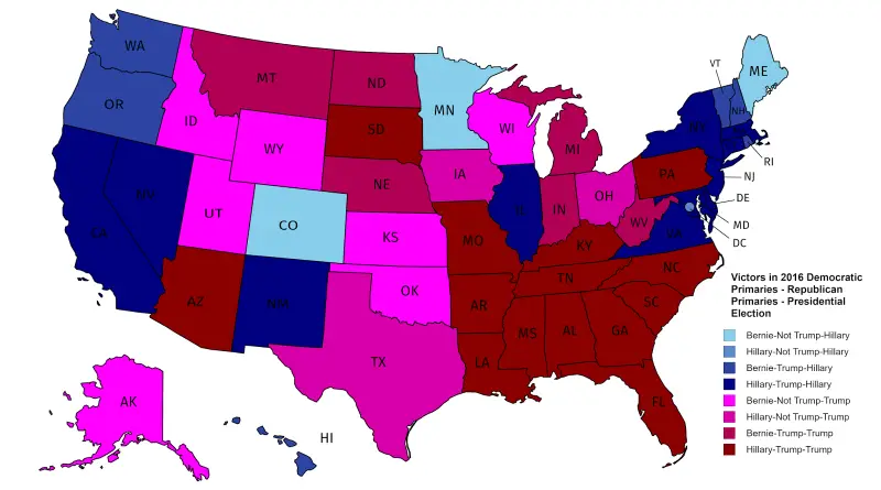
Related posts: – The Clinton Archipelago and Trump’s America – U.S. counties in which party of top vote-getter changed between
Read MoreRelated post: – Map of languages spoken in China
Read More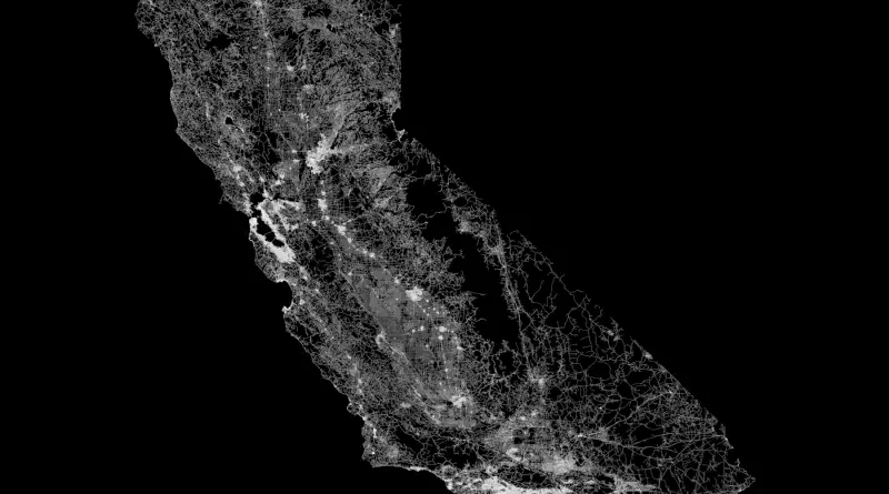
Related post: – The contiguous U.S. mapped only by dirt trails, roads and highways
Read MoreRelated post: – Population density map of China
Read MoreVia fakeisthenewreal.org
Read More